Tile and heatmap plot types

Description

Type functions for tile plots, i.e. a grid of rectangles whose fill colour encodes a third variable. type_tile() is the default building block for these gridded shapes, drawing the values exactly as supplied. It underpins heatmaps, correlation matrices, calendar plots, confusion matrices, and similar displays.

type_heatmap() is a specialised case that first rescales the fill values within each category of one axis. Reach for it when those values are not already on a common scale.

Usage

type_tile(width = 1, height = 1)

type_heatmap(
  width = 1,
  height = 1,
  scale = c("none", "x", "y"),
  method = c("zscore", "rescale")
)

Arguments

width, height Numeric tile dimensions in data units. Both default to 1, which produces contiguous tiles on categorical (or unit-spaced numeric) axes. Values below 1 inset the tiles, leaving gaps between them. Recycled across tiles, so a vector may be used for variable sizes.
scale

Character. Should the by (fill) values be scaled within each category of one axis? One of “none” (default, i.e. the raw values are used), “x”, or “y”. Scaling is what makes a raw matrix legible when its variables span very different magnitudes: left alone, the largest-magnitude column monopolises the entire colour ramp. See Examples.

Note that “x” and “y” refer to the axes as written in the formula, i.e. before any flip = TRUE is applied. We deliberately avoid base R’s “row”/“column” wording, since a tile’s position depends on which variable the user placed where in the formula, so there is no fixed matrix orientation to refer to.

Rescaling is computed independently per facet; pooling across facets would pin a panel on a different scale to one end of the ramp and lose its internal structure. Since rescaled values are no longer in the units of the by variable, the legend title is annotated accordingly.
method

Character. How should the values be rescaled, if scale is not “none”? Either “zscore” (default) to centre each group and divide by its standard deviation, or “rescale” to map each group onto the unit interval [0, 1]. Ignored when scale = “none”.

“zscore” matches base R’s heatmap and keeps values comparable across groups, since -1 means "one standard deviation below this group’s mean" everywhere. “rescale” instead pins every group’s minimum and maximum to the ends of the colour ramp, which uses the palette more fully but makes the endpoints an artefact of the transform rather than a feature of the data.

Groups with no spread—a constant column, or a single tile—would divide by zero, so they are set to the midpoint of the target range (0.5 and 0 respectively) and a warning is emitted.

Details

Tile plots are specified as z ~ x with the fill variable passed as the by grouping, i.e. tinyplot(y ~ x | z, type = “tile”). The x and y variables may be factors, characters, or numerics; the by variable supplies the fill and will typically be numeric, yielding a continuous colour gradient and colourbar legend. Omitting by leaves the tiles unfilled, since there is nothing for the fill to encode; pass an explicit fill (or bg) if you want a uniform colour in that case.

Unlike the closely-related type_rect, which requires explicit xmin/xmax/ymin/ymax bounds, type_tile() derives the tile bounds for you: each tile is centred on its x/y position and extends width/2 and height/2 in each direction. Categorical axes are converted to consecutive integer positions and the axis tick labels are taken from the factor levels automatically.

Explicit bounds still take precedence. Passing any of xmin, xmax, ymin, or ymax leaves that dimension untouched, which is useful for irregular or unequal-width tiles (e.g. binned continuous data). Bounds may be given for one axis while the other is derived.

Note that tiles are opaque and drawn edge-to-edge, so the default axis padding and grid lines of most themes are redundant (and the grid is hidden behind the tiles in any case). We therefore ship a dedicated “heatmap” theme that removes the padding and grid, rotates the tick labels, and switches to a sequential palette. See tinytheme() and the Examples.

type_heatmap()’s scale argument is the analogue of the scale argument in base R’s heatmap, and like the latter it z-scores along the chosen margin by default. Pass method = “rescale” to map each group onto the unit [0, 1] interval instead.

type_heatmap() also reverses the y-axis by default, so that the first row sits at the top, matching how one reads a matrix (and again cf. base R’s heatmap() and image). Pass an explicit ylim to override. type_tile() makes no such adjustment, since it draws the values exactly as supplied.

Either way, note that scaling along a margin necessarily discards the relative spread of each group: a narrow-range column will occupy as much of the colour ramp as a wide-range one, since both are divided by their own measure of spread. That is the price of making a matrix of incomparable units legible; use scale = “none” (or type_tile()) when preserving cross-group magnitudes matters more.
See Also

type_rect for the lower-level rectangle type that type_tile() builds on, and tinytheme() for the companion “heatmap” theme.

Examples

library("tinyplot")

# It is recommended to use the dedicated "heatmap" theme for tile plots
tinytheme("heatmap")

#
## type_tile ----

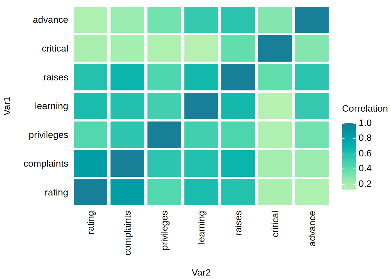
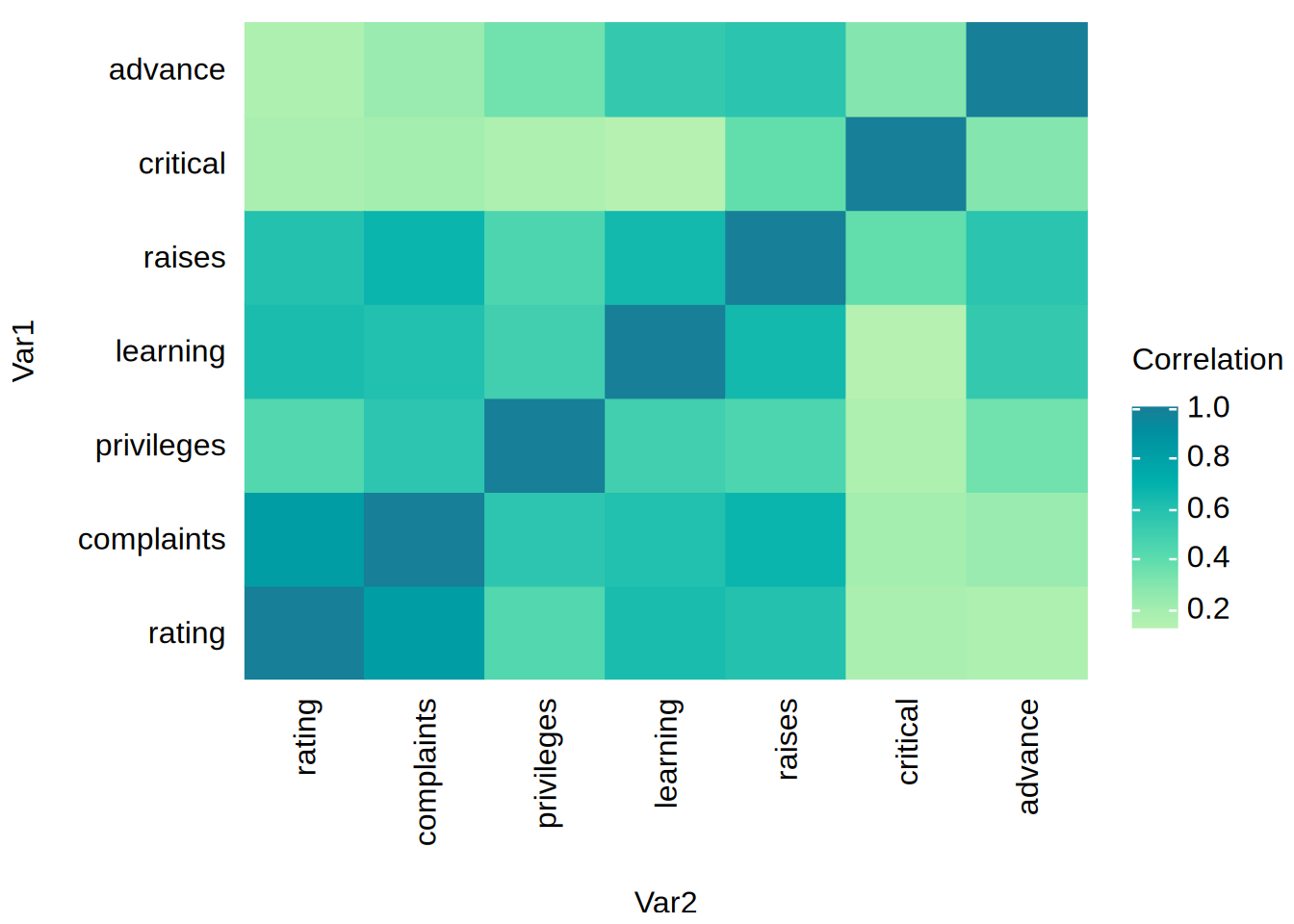
# Correlation matrix of the base `attitude` dataset in "long" form.
catt = as.data.frame(as.table(cor(attitude)), responseName = "Correlation")

tinyplot(Var1 ~ Var2 | Correlation, data = catt, type = "tile")

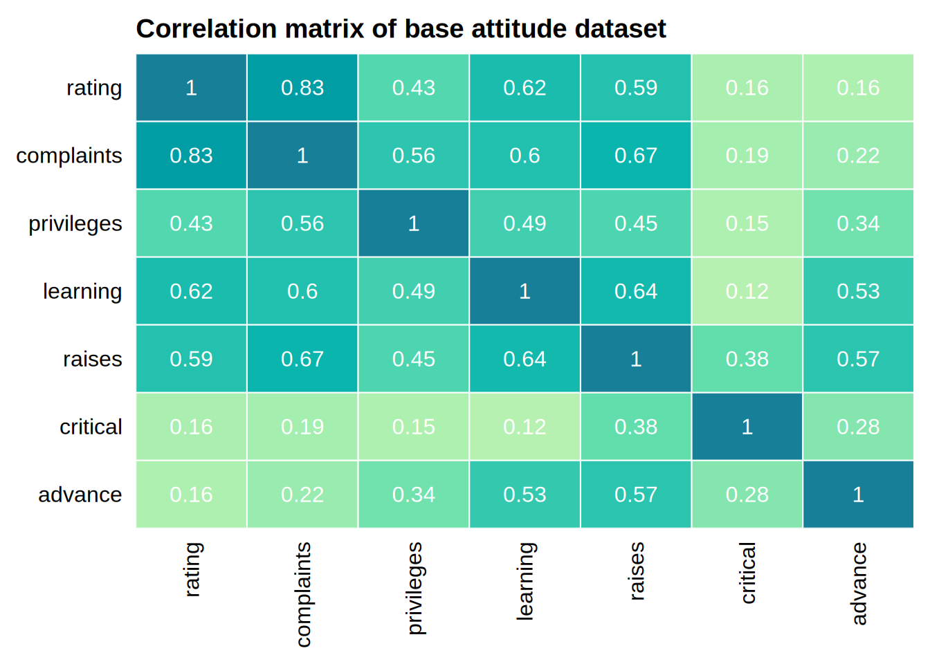
# fancier version where we reverse the y-axis (to mimic the usual correlation
# matrix layout), add white borders around each tile, and suppress the legend
# but layer on the values as text
tinyplot(
  Var1 ~ Var2 | Correlation, data = catt,
  type = "tile",
  col = "white",
  legend = FALSE,
  main = "Correlation matrix of base attitude dataset",
  xlab = NA, ylab = NA,
  ylim = "rev"
)
tinyplot_add(type = "text", labels = round(catt$Correlation, 2))

# Pass scaled tile widths and heights through type_tile() for a gridded look
tinyplot(
  Var1 ~ Var2 | Correlation, data = catt,
  type = type_tile(width = 0.9, height = 0.9)
)

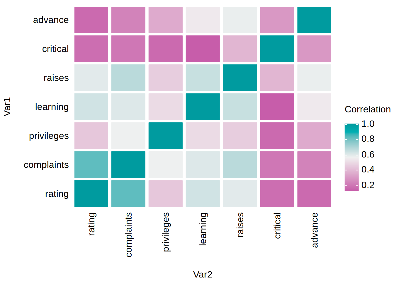
# It doesn't really work for this example, but you can easily switch to a
# diverging palettes if it makes sense for your data
tinyplot(
  Var1 ~ Var2 | Correlation, data = catt,
  type = type_tile(width = 0.9, height = 0.9),
  palette = "tropic"
)

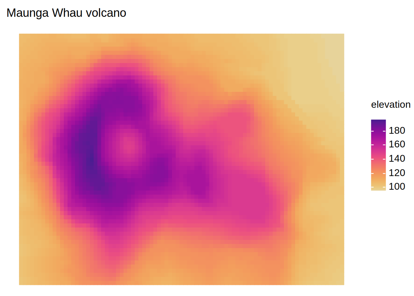
# Numeric axes work too, e.g. a (reshaped long) data.frame of volcano heights
volc = data.frame(
  x         = as.vector(row(volcano)),
  y         = as.vector(col(volcano)),
  elevation = as.vector(volcano)
)
tinyplot(
  y ~ x | elevation, data = volc,
  type = "tile",
  theme = "void", # void theme looks better with this numeric example
  xlab = NA, ylab = NA,
  main = "Maunga Whau volcano"
)

#
## type_heatmap ----

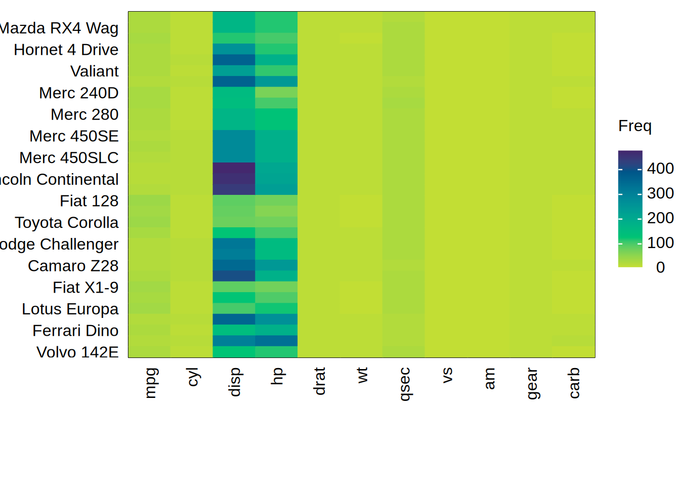
# Raw data matrices are usually dominated by their largest-magnitude column.
# `type_heatmap()` can rescale within each column to make the rest legible.
mt = as.data.frame(as.table(as.matrix(mtcars)))

# first, the unscaled version: only `disp` and `hp` are visible
tinyplot(
  Var1 ~ Var2 | Freq, data = mt,
  type = "heatmap",
  xlab = NA, ylab = NA
)

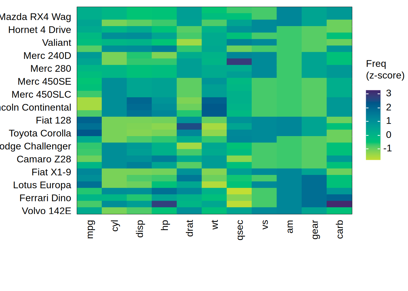
# and now scaled within each x variable (i.e., column). The default is to
# z-score, matching base R's `heatmap(scale = "column")`.
tinyplot(
  Var1 ~ Var2 | Freq, data = mt,
  type = type_heatmap(scale = "x"),
  xlab = NA, ylab = NA
)

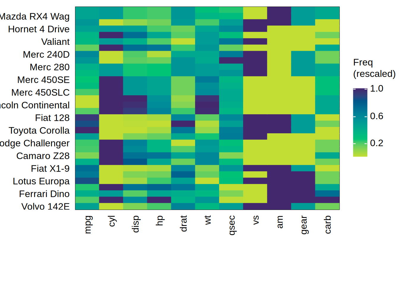
# `method = "rescale"` maps each column onto [0, 1] instead. This uses the
# colour ramp more fully, at the cost of pinning every column's min and max to
# the same two colours.
tinyplot(
  Var1 ~ Var2 | Freq, data = mt,
  type = type_heatmap(scale = "x", method = "rescale"),
  xlab = NA, ylab = NA
)

#
## tips ----

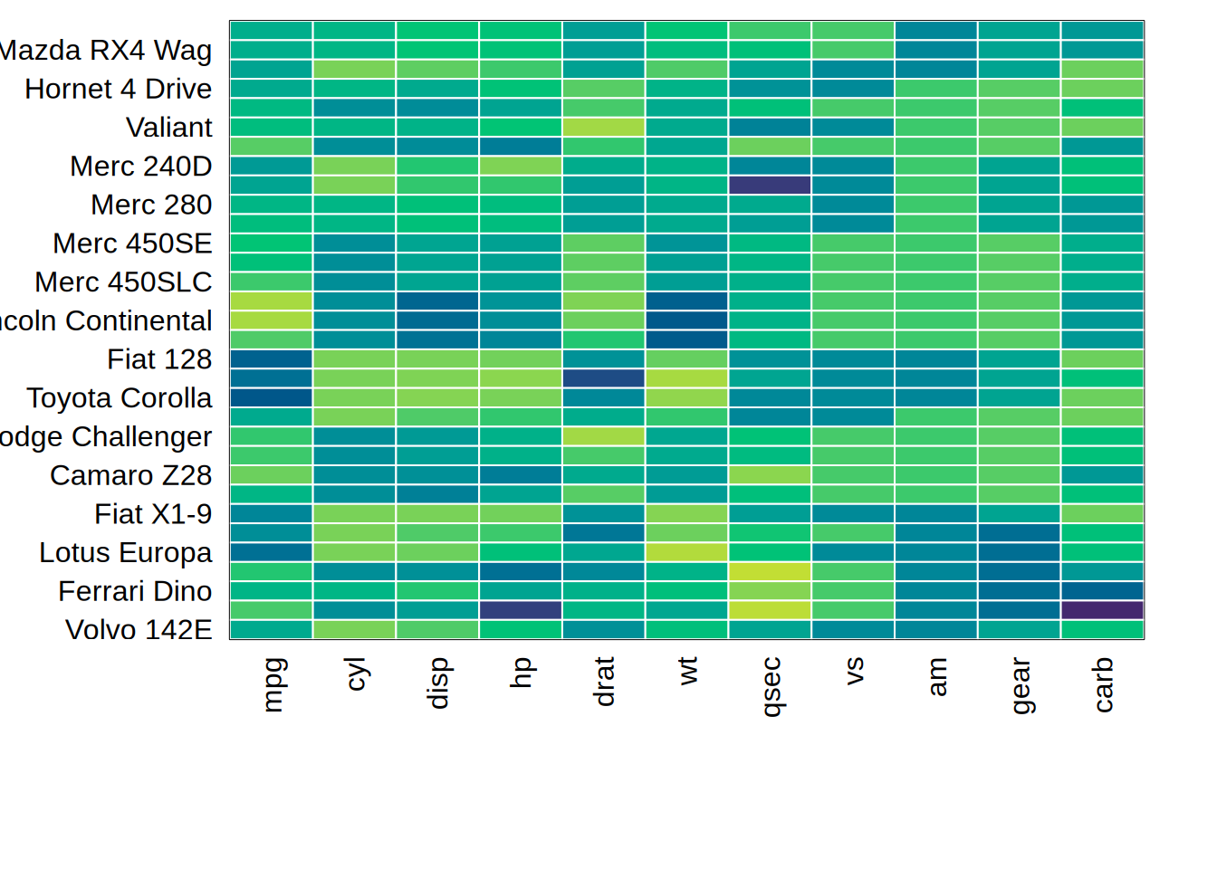
# tip 1: use tinyplot.matrix() directly to avoid reshaping
tinyplot(as.matrix(mtcars), type = type_heatmap(scale = "x"), col = "white")

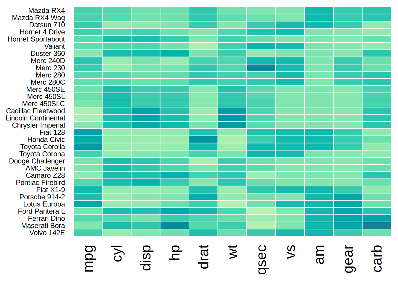
# tip 2: use per-axis tick label scaling (cex) for dense heatmaps
tinyplot(as.matrix(mtcars), type = type_heatmap(scale = "x"), col = "white",
         theme = list("heatmap", cex.yaxs = 0.75, cex.xaxs = 1.5))

## restore the default theme
tinytheme()