Convenience interface for visualizing matrix objects with tinyplot.
Usage
## S3 method for class 'matrix'
tinyplot(
  x,
  type = NULL,
  legend = NULL,
  facet = NULL,
  xlab = NULL,
  ylab = NULL,
  ...
)
Arguments
x
an object of class “matrix”.
type
plot type passed on to tinyplot. Defaults to “p” (points).
legend
specification passed on to tinyplot. The default is to draw a legend when the matrix has named columns, and to suppress it otherwise. For “tile” and “heatmap” types it is suppressed by default.
facet
specification of facet passed on to tinyplot. The only accepted non-NULL value is the “by” convenience string, which facets the plot by matrix column.
xlab, ylab
axis labels passed on to tinyplot. ylab defaults to the deparsed matrix name. xlab defaults to “Index” when the matrix has no row names; when it does, the row names already label the ticks so the x-axis title is suppressed. For “tile” and “heatmap” types both titles default to NA, since the dimnames label both axes.
…
further arguments passed to tinyplot.
Details
Internally the matrix is converted to long form and visualized as a scatter (or other type) of each column’s values against their row index. Each column is mapped to a separate by category, so a matrix with multiple columns produces a grouped plot. Optionally, it can also be faceted via facet = “by”. This mirrors the base R matplot convention of plotting the columns of a matrix against the row numbers. If the matrix has column names, these are used as the group (and legend) labels. Single-column matrices are drawn as a simple index plot with no grouping or legend.
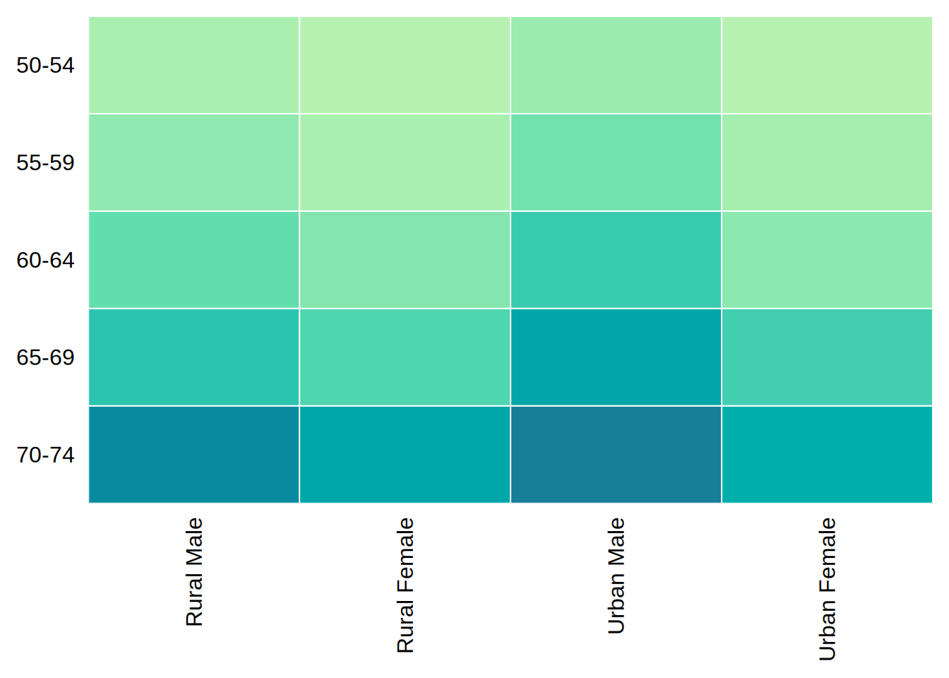
The “tile” and “heatmap” types are an exception, since the matplot convention makes little sense for them. Instead the matrix is laid out as a grid—columns along the x-axis, rows along the y-axis—with the matrix values supplied as the fill. The y-axis is reversed so that the first row sits at the top, matching how one reads a matrix (cf. heatmap and image); pass an explicit ylim to override. Both axis titles are suppressed, since the dimnames already label the ticks, and so is the legend, since the fill merely re-encodes the matrix’s own values. Pass an explicit legend (or xlab/ylab) to override either. See Examples.
Value
By default, no return value; called for the side effect of producing a plot. If record = TRUE (or globally via tpar(record = TRUE)), the plot is instead returned invisibly as a “recordedtinyplot” object, which can be replayed later; see recordedtinyplot.
See Also
tinyplot.array, matplot
Examples
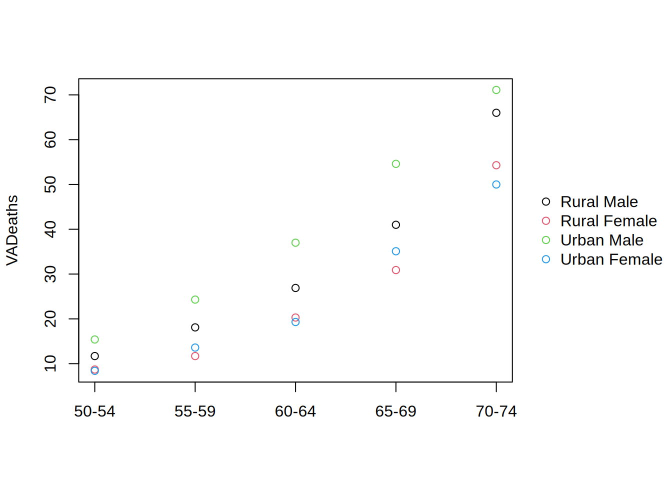
library("tinyplot")# basic usetinyplot(VADeaths)
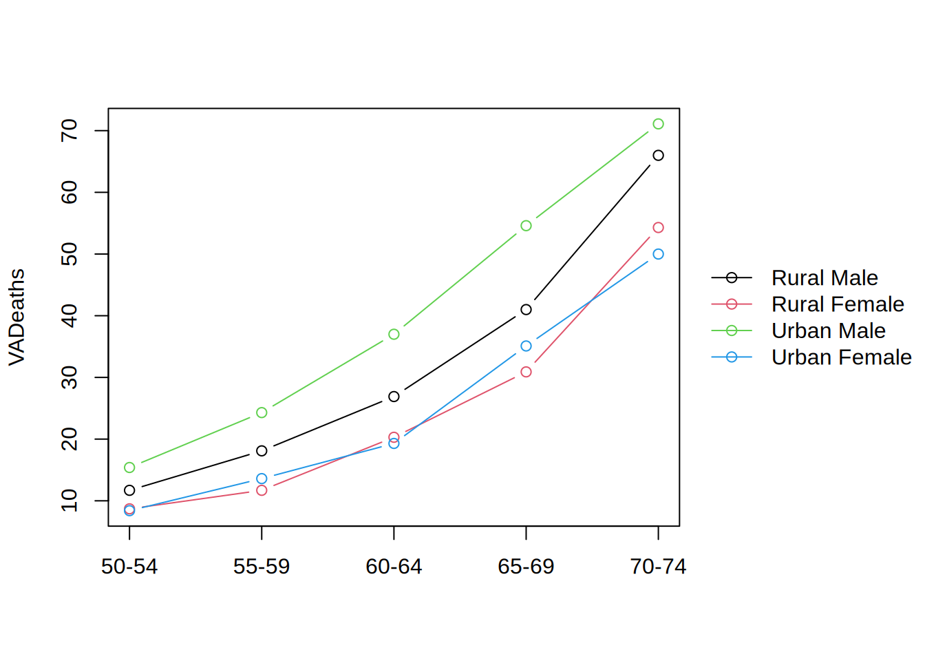
tinyplot(VADeaths, type ="b")
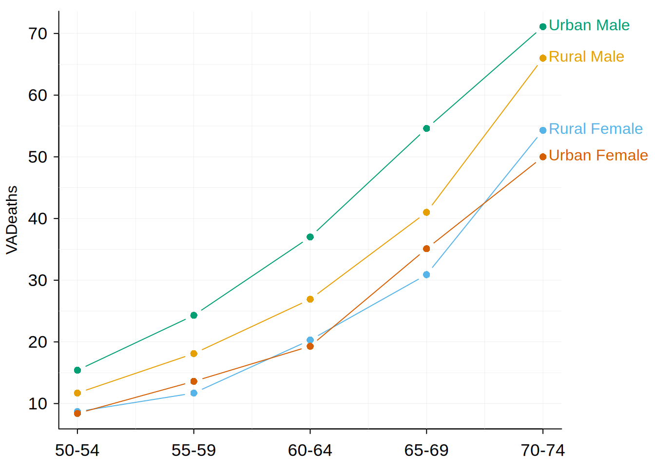
tinyplot(VADeaths, type ="b", legend ="direct", theme ="socviz")
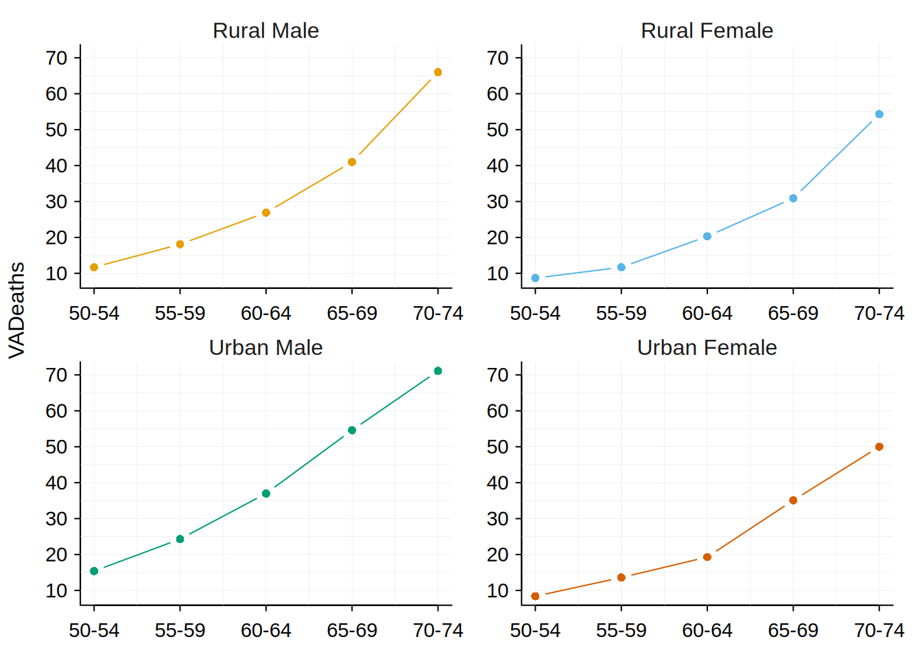
tinyplot(VADeaths, type ="b", legend =FALSE, facet ="by", theme ="socviz")
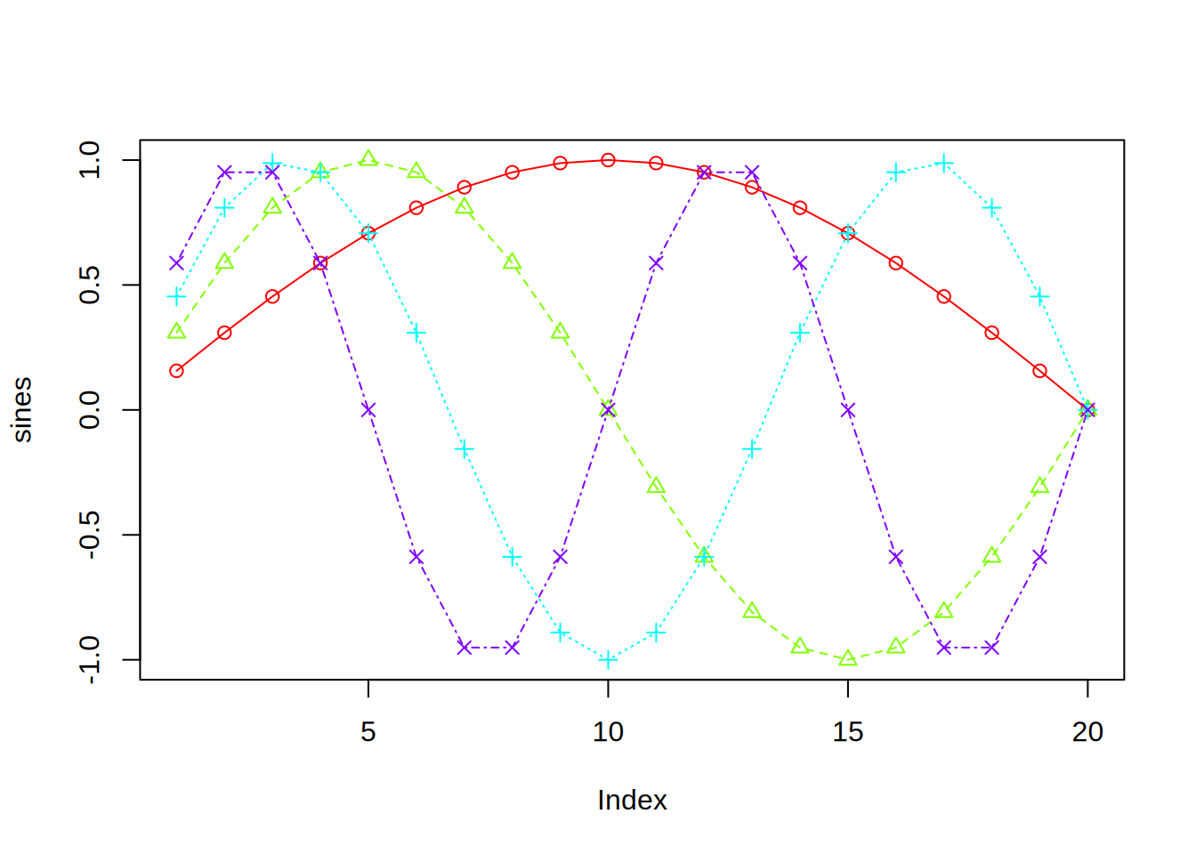
# digression: equivalent "o" plot to an example in `?matplot`sines =outer(1:20, 1:4, function(x, y) sin(x /20* pi * y))tinyplot(sines, type ="o", pch ="by", lty ="by", col =rainbow(ncol(sines)))
# back to VADeaths running example, we can pass down other types too...# heatmaptinyplot(VADeaths, type ="heatmap", theme ="heatmap", col ="white")
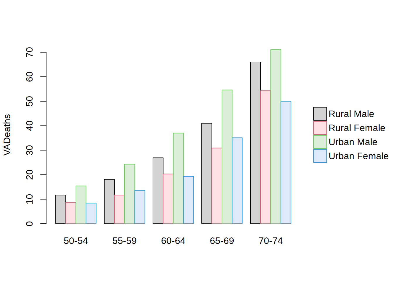
# barplot(s)tinyplot(VADeaths, type ="barplot", beside =TRUE)
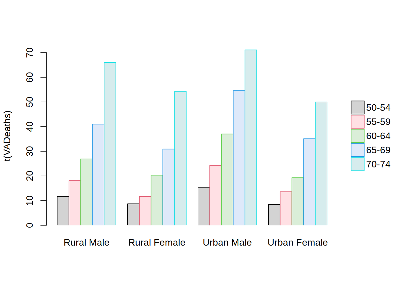
tinyplot(t(VADeaths), type ="barplot", beside =TRUE)
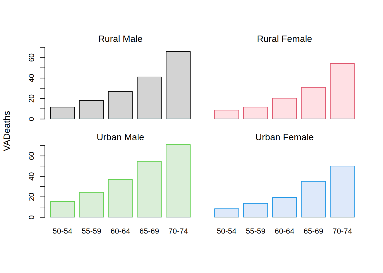
tinyplot(VADeaths, type ="barplot", facet ="by", legend =FALSE)