Barplot type

Description

Type function for producing barplots. For formulas of type ~ x (without left-hand side) the barplot visualizes the counts (absolute frequencies) of the levels of x. For formulas of type y ~ x the value of y within each level of x is visualized, if necessary aggregated using some function (default: mean).

Usage

type_barplot(
  width = 5/6,
  beside = FALSE,
  center = FALSE,
  offset = NULL,
  FUN = NULL,
  xlevels = NULL,
  xord = NULL,
  drop.zeros = FALSE,
  na.as.zero = NULL,
  lighten = TRUE,
  xaxlabels = NULL
)

Arguments

width numeric, optional vector of bar widths. (The distance between the midpoints of the bars is always 1.)
beside logical. In case of a by grouping variable, should bars be juxtaposed? Default is to use stacked bars instead.
center logical or numeric. In case of stacked barplots (beside = FALSE) should the bars be centered (or all start at zero, default)? If set to TRUE the center is at the mid-point of the middle category (in case of uneven number of categories) or between the two middle categories (in case of an even number). Additionally it is possible to set center = 2 or center = 2.5 to indicate that centering should be after the second category or the mid-way in the third category, respectively.
offset

optional specification for shifting bar baselines, accepting one of two distinct forms. See the Examples for illustrations of both.

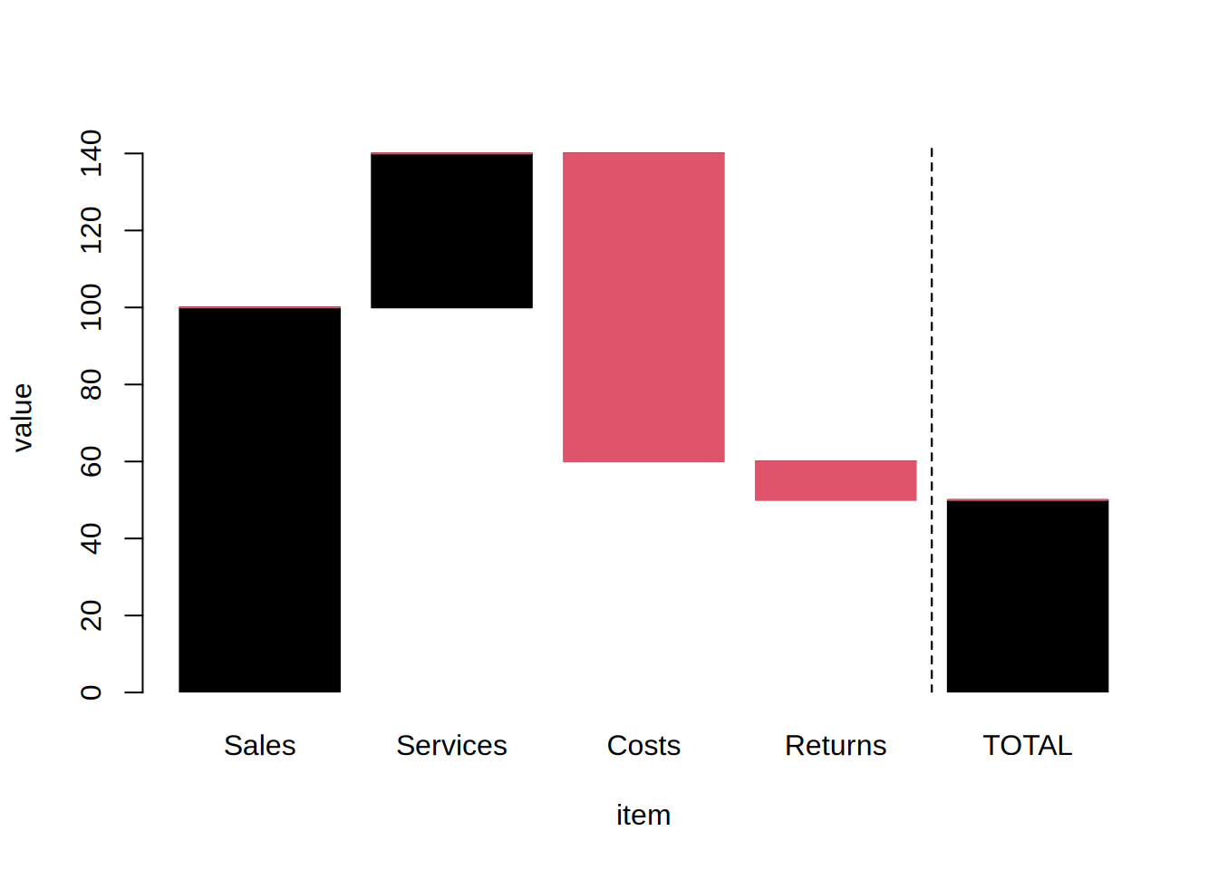
  • Positions via an unnamed numeric scalar or vector. Bars start at the offset value(s) rather than zero, matched per x-level after any xlevels or xord reordering (a scalar is applied to all bars). Useful for waterfall charts. The positional form cannot be combined with center.

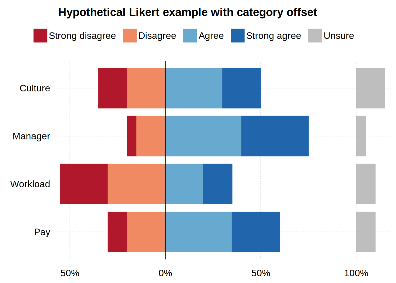
  • Category via a character vector such as offset = “Unsure”, or a named numeric vector such as offset = c(Unsure = 1.1). The named level(s) of the by grouping are "set aside", i.e. pulled out of the (optionally centered) stack and drawn as standalone bars. This is useful for diverging/Likert plots where a neutral category (e.g. "Unsure") is shown apart from the diverging stack. The category form requires a by grouping and beside = FALSE, but can be combined with center.

FUN a function to compute the summary statistic for y within each group of x in case of using a two-sided formula y ~ x (default: mean).
xlevels, xord

arguments controlling the order of the x variable, and hence of the x-axis. Supply one or the other; if both arguments are provided, xlevels takes precedence and xord is silently ignored.

  • xlevels specifies the levels literally, either a character vector of level names in the desired order (e.g., c(“C”, “B”, “A”)), or a numeric vector of the corresponding level indexes (e.g. 3:1).

  • xord instead accepts a keyword or custom function, which then derives the order from the data. Options are:

    • “desc(ending)” and “asc(ending)” rank (sort) the categories by bar height, tallest or shortest first. Both the abbreviated and long form strings are permitted, as are the “decreasing” and “increasing” aliases. Note that the ranking is applied to the aggregated bars, i.e. whatever FUN produced, rather than the underlying rows. With by groups or facets, a single ordering is computed and shared across all of them, by summing each category’s bars over every group and facet. For stacked bars that sum is the height of the full stack; with beside = TRUE it is the group total rather than any individual bar. (A factor carries one level order, so a per-facet ranking is not expressible.)

    • “asis” or “rev” permute the existing levels without consulting the data at all. The former takes the categories in the order that they appear in the data, while the latter reverses the current level order.

    • a custom function that determines both the ranking statistic and its direction. The statistic is always sorted in ascending order, so function(y) -median(y) ranks by median, largest first.

Note that a numeric x is coerced to a factor before the bars are drawn, so it is reordered like any other categorical variable. Each argument defaults to NULL, i.e. keep the existing factor levels.
drop.zeros logical. Should bars with zero height be dropped? If set to FALSE (default) a zero height bar is still drawn for which the border lines will still be visible.
na.as.zero logical. Should a category that no observation reaches be treated as a zero? Defaults to NULL, i.e. let FUN decide; see the "Implicit zeros and empty cells" section below. Set to TRUE to always mark such categories with a zero-height bar, or FALSE to never draw them.
lighten logical. Should the fills use a lighter, opaque tint of the series colour(s)? Default is TRUE, which keeps single- and multi-group displays consistent and lets the fill read cleanly over grid lines. Set to FALSE to use the fully-saturated palette colour(s) instead.
xaxlabels [Deprecated] a character vector with the axis labels for the x variable. Use the top-level xaxl argument instead (see tinylabel). This argument will be removed in a future release.

Implicit zeros and empty cells

Grouping (by) or faceting a barplot asks for a bar per unique combination (i.e., category + group + facet). However, some combinations may not be supported by any observations in the data. In these cases, the bars are still computed off the completed combination set; particularly since stacked and centered barplots have to line up regardless. Yet this in turn invites the question of whether an "empty" cell should be read as an implicit zero, or treated as missing (NA).

In most cases, the question is answered by the FUN aggregation. This is because it computes the actual value that is being plotted. For example, a count of no observations is 0, whereas a mean of no observations is undefined and thus better treated as NA (similarly for other summary statistics like the variance or median). Nonetheless, users can override this behaviour either way with the na.as.zero argument.

Three related points are worth highlighting. First, a zero-height bar only reads as zero when it is measured from zero. So offset layouts (waterfall, diverging/Likert) never draw one unless na.as.zero = TRUE asks for it explicitly. Second, a "zero" combination is still subject to the drop.zeros argument like any other zero. So na.as.zero = TRUE, drop.zeros = TRUE cancel out. Finally, na.as.zero = TRUE marks only the categories that could have held data. Where x, by or facet are mapped to the same variable, for example, most combinations cannot occur at all—and are never drawn, regardless.

Examples

library("tinyplot")

#
## Basic use (raw values)

# (named) atomic vector
tinyplot(c(A = 1, B = 2, C = 3), type = "barplot")
# formula + data.frame method
tinyplot(GNP ~ Year, data = longley, type = "barplot")
tinyplot(demand ~ Time, data = BOD, type = "bar") # "bar" is a shorthand
tinyplot_add(type = "text", pos = 3, xpd = NA)    # add y values as text
# reordering (just to demonstrate; these aren't sensible for a time variable)
tinyplot(demand ~ Time, data = BOD, type = "bar", xord = "asc")
jumble = c("7","1","5","2","4","3") # note: Time = 6 is also missing
tinyplot(demand ~ Time, data = BOD, type = "bar", xlevels = jumble) 
# useful top-level args:
# 1) xaxl to format the x labels, e.g. with a dictionary, keyword, or (here:)
#    function
# 2) xaxr to rotate long category labels (best used with a dynamic theme)
tinyplot(
  demand ~ Time, data = BOD,
  type = "bar",
  xaxl = function(x) paste("Time =", x),
  xaxr = 45,
  theme = "broadsheet"
)
#
## Aggregated vs grouped values (multiple ys per x)

# each person receives two drugs
sleep2 = transform(sleep, drug = group) # less misleading name

# default aggregation FUN is mean
tinyplot(
  extra ~ ID, data = sleep2,
  type = "barplot",
  main = "Mean extra sleep from 2 soporific drugs"
)
# switch to diff (answers a more relevant q: who benefits most from drug 2?)
tinyplot(
  extra ~ ID, data = sleep2,
  type = "barplot", FUN = diff,
  main = "Sleep gain (drug 2 vs drug 1)"
)
# we can sort in descending (or ascending) order too
tinyplot(
  extra ~ ID, data = sleep2,
  type = "barplot", FUN = diff, xord = "desc",
  main = "Sleep gain (drug 2 vs drug 1), ordered"
)
# of course, we don't have to aggregate if we specify groups (stacked or non)
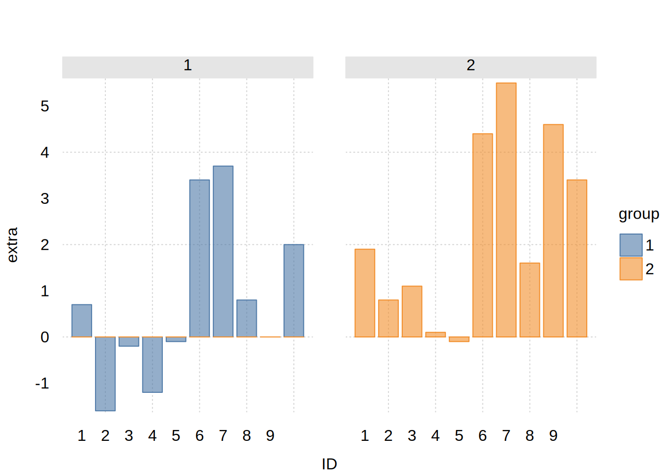
tinyplot(extra ~ ID | drug, data = sleep2, type = "barplot", beside = TRUE)
# Aside: We used automatic argument passing for 'xord', `FUN`, etc. above.
# But this wouldn't work for `width`, since it would conflict with the
# top-level `tinyplot(..., width = <width>)` argument. It's safer to pass
# these args through the `type_barplot()` functional equivalent...
tinyplot(
  extra ~ ID | drug, data = sleep2,
  type = type_barplot(beside = TRUE, xord = "desc", width = 0.5)
)
#
## matrix method (no formula required)

tinyplot(VADeaths, type = "barplot")
tinyplot(VADeaths, type = "barplot", beside = TRUE)
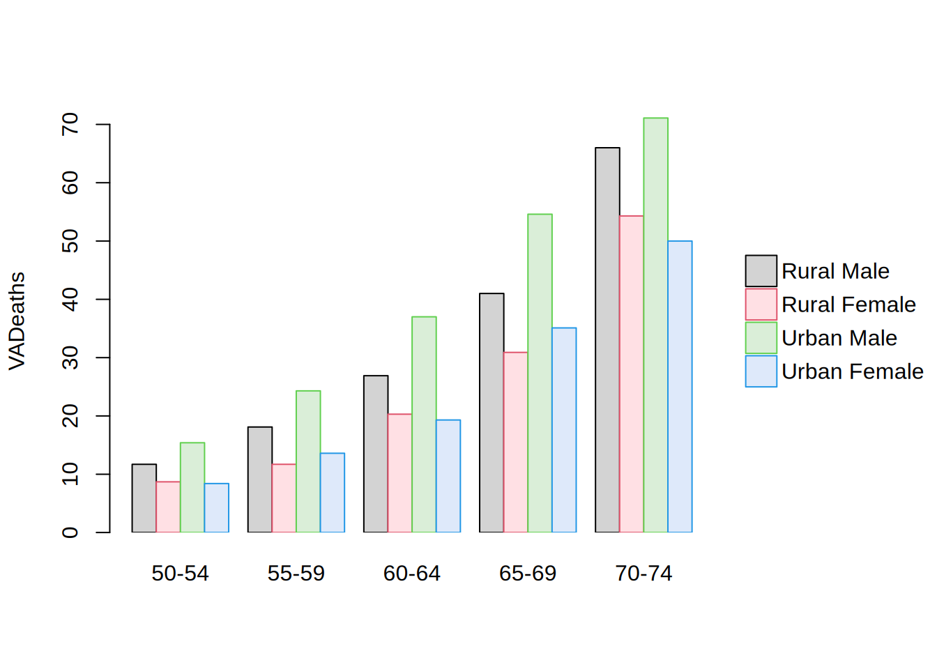
# etc. see ?tinyplot.matrix

#
## Frequency tables

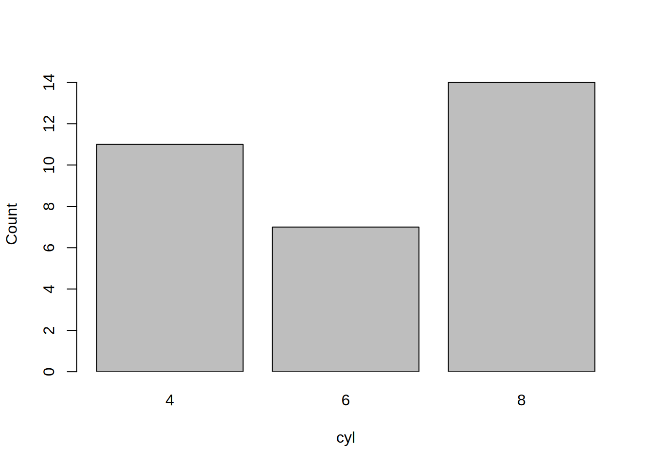
# No y variable (frequency calculated on the fly)
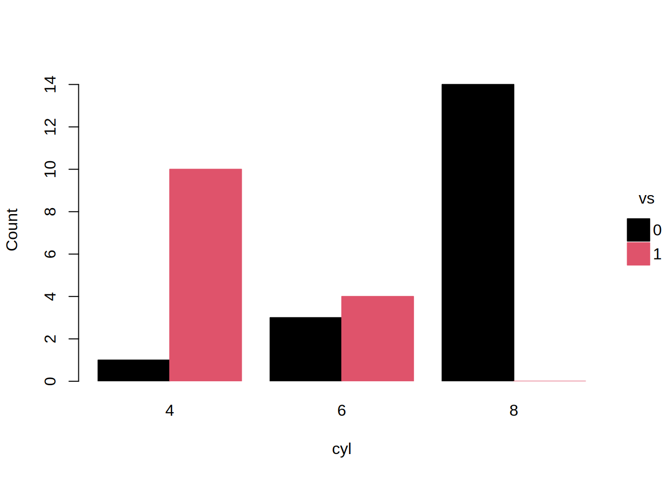
tinyplot(~ cyl, data = mtcars, type = "barplot")
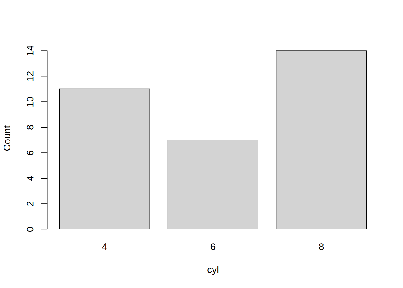
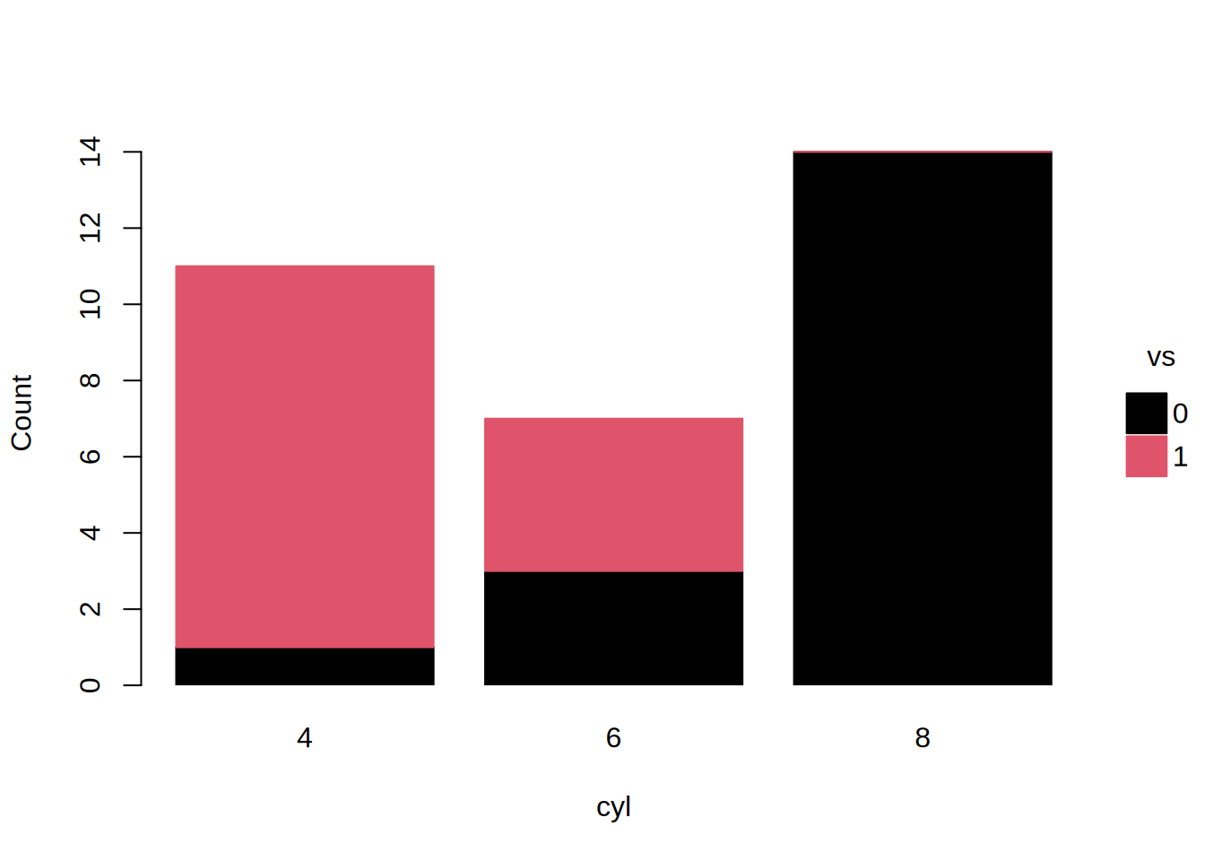
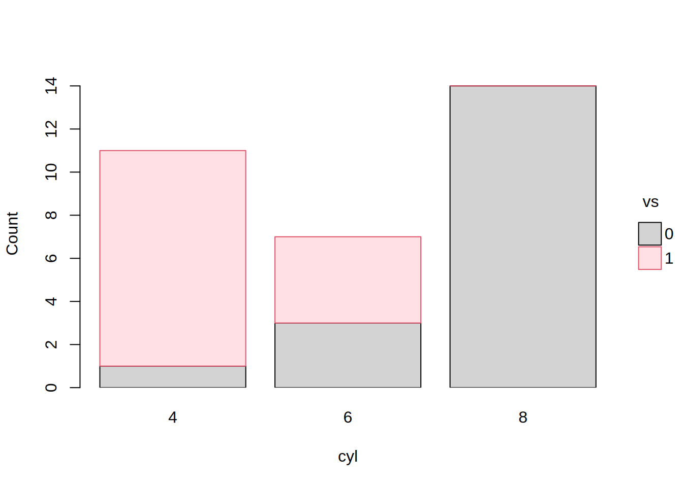
tinyplot(~ cyl | vs, data = mtcars, type = "barplot")
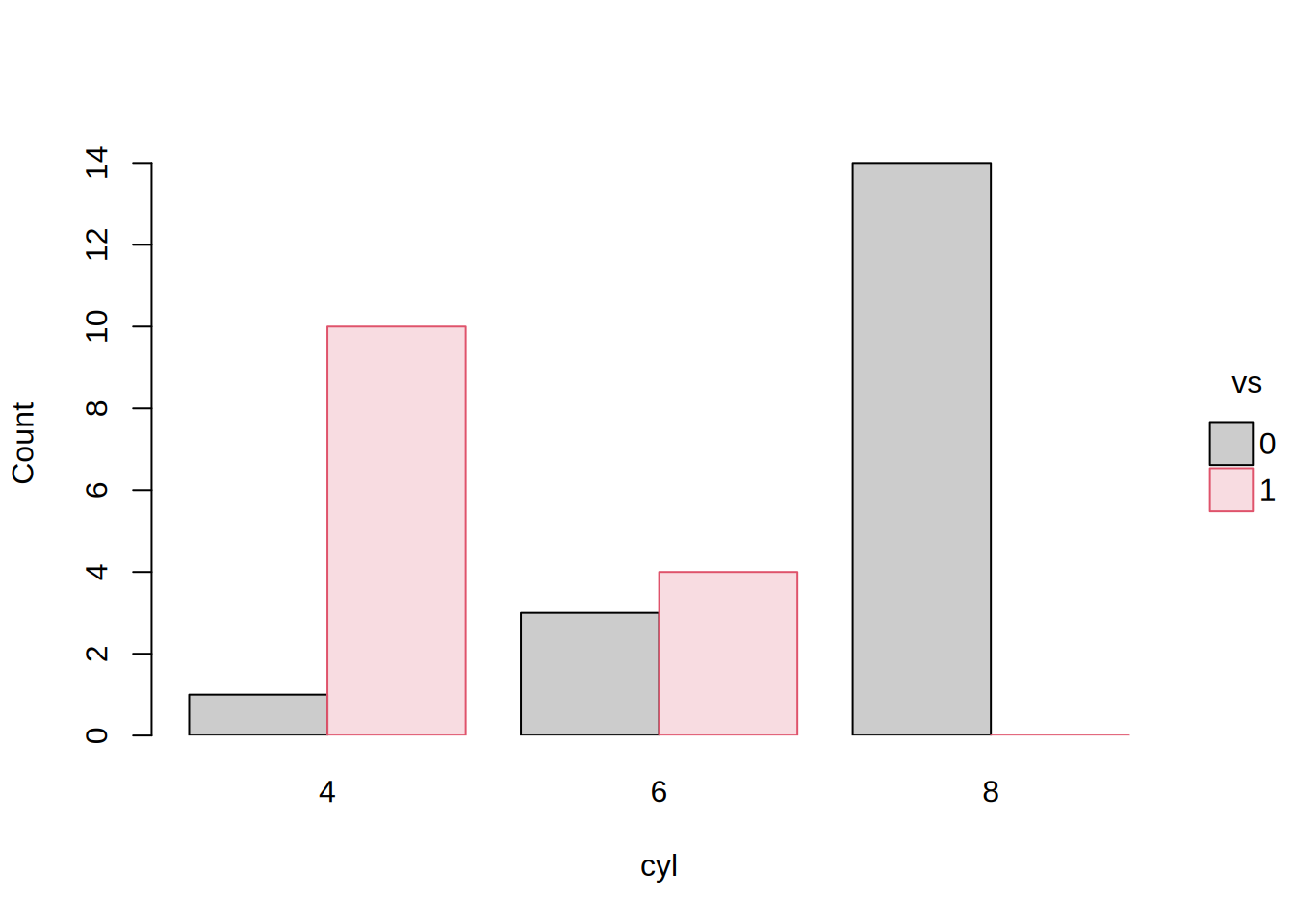
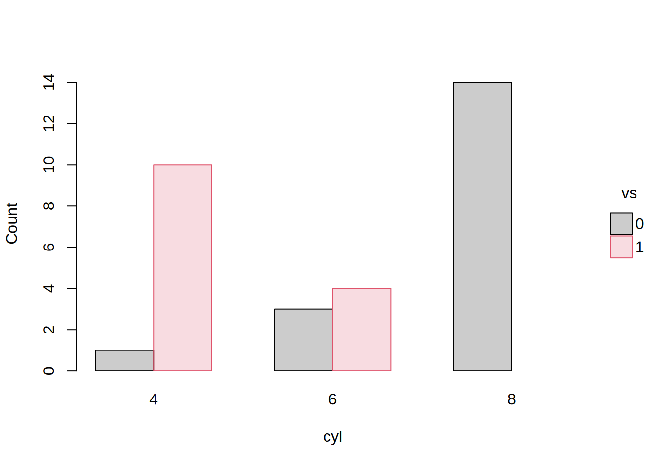
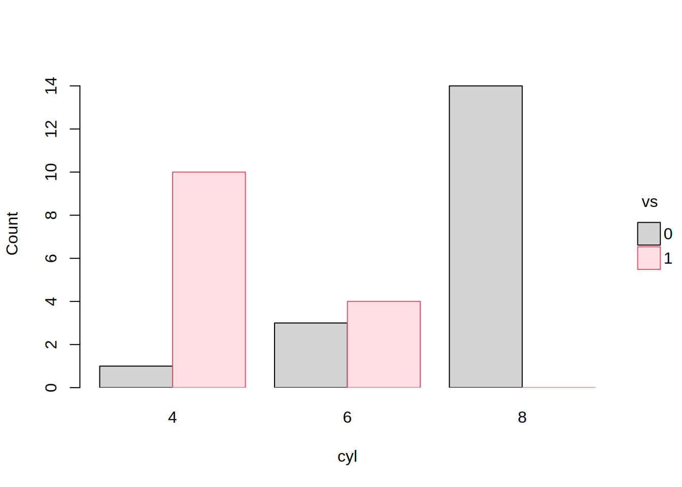
tinyplot(~ cyl | vs, data = mtcars, type = "barplot", beside = TRUE)
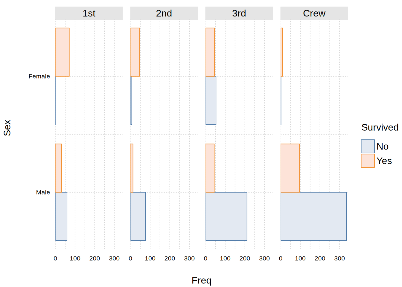
# Fancy frequency table (y = frequency aleady computed)
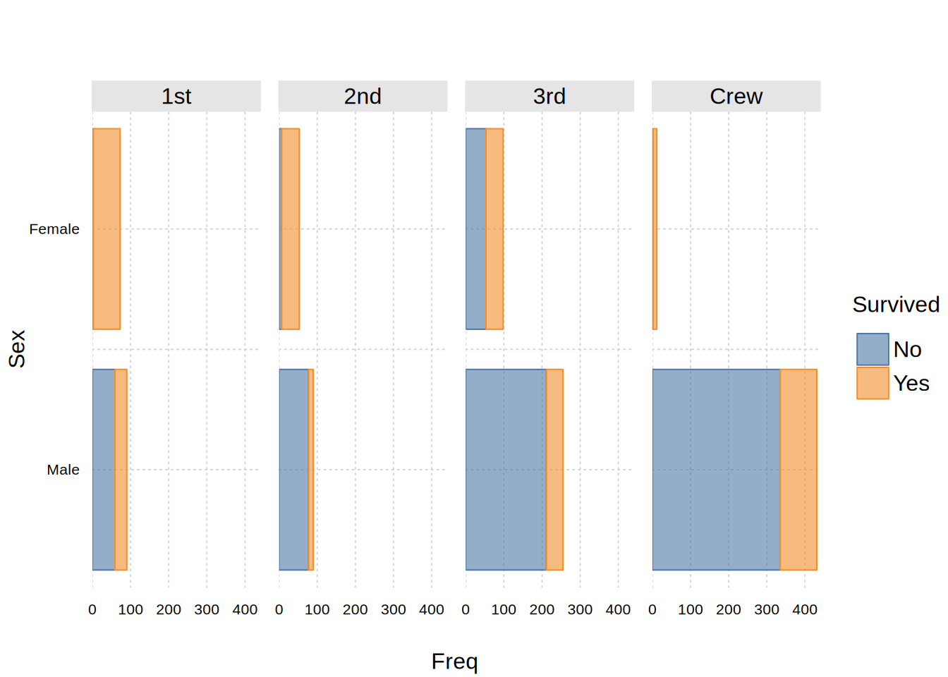
tinyplot(
  Freq ~ Sex | Survived, data = as.data.frame(Titanic),
  facet = ~ Class, facet.args = list(nrow = 1),
  type = "barplot", beside = TRUE, flip = TRUE,
  theme = "clean2"
)
#
## Centering

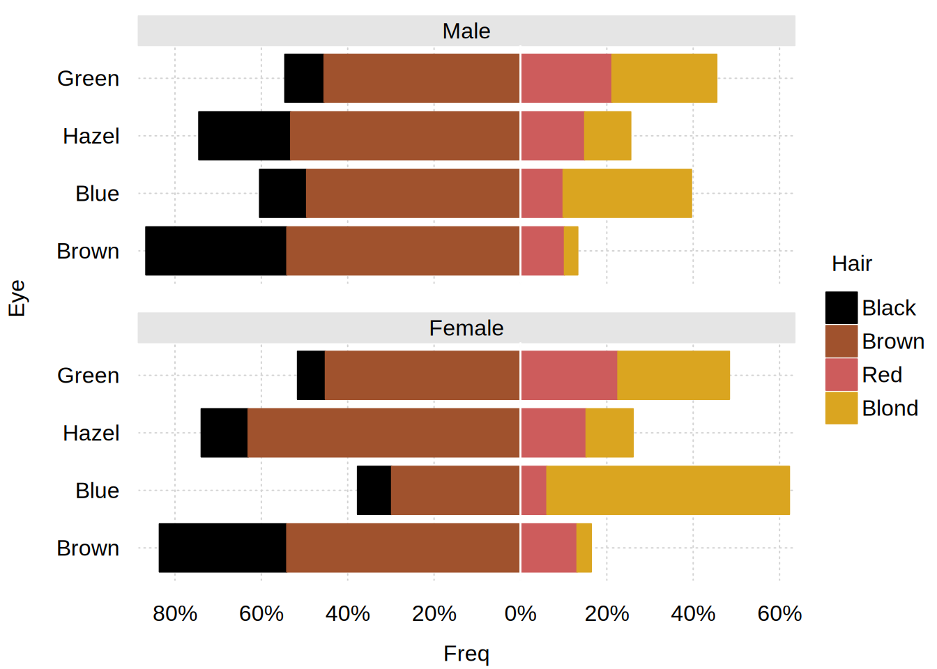
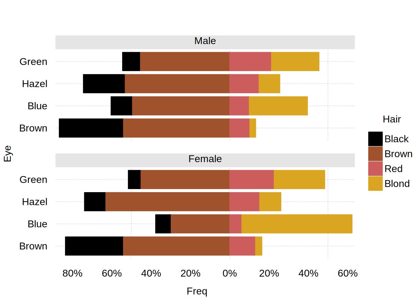
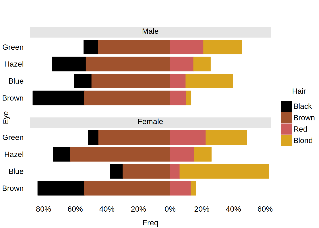
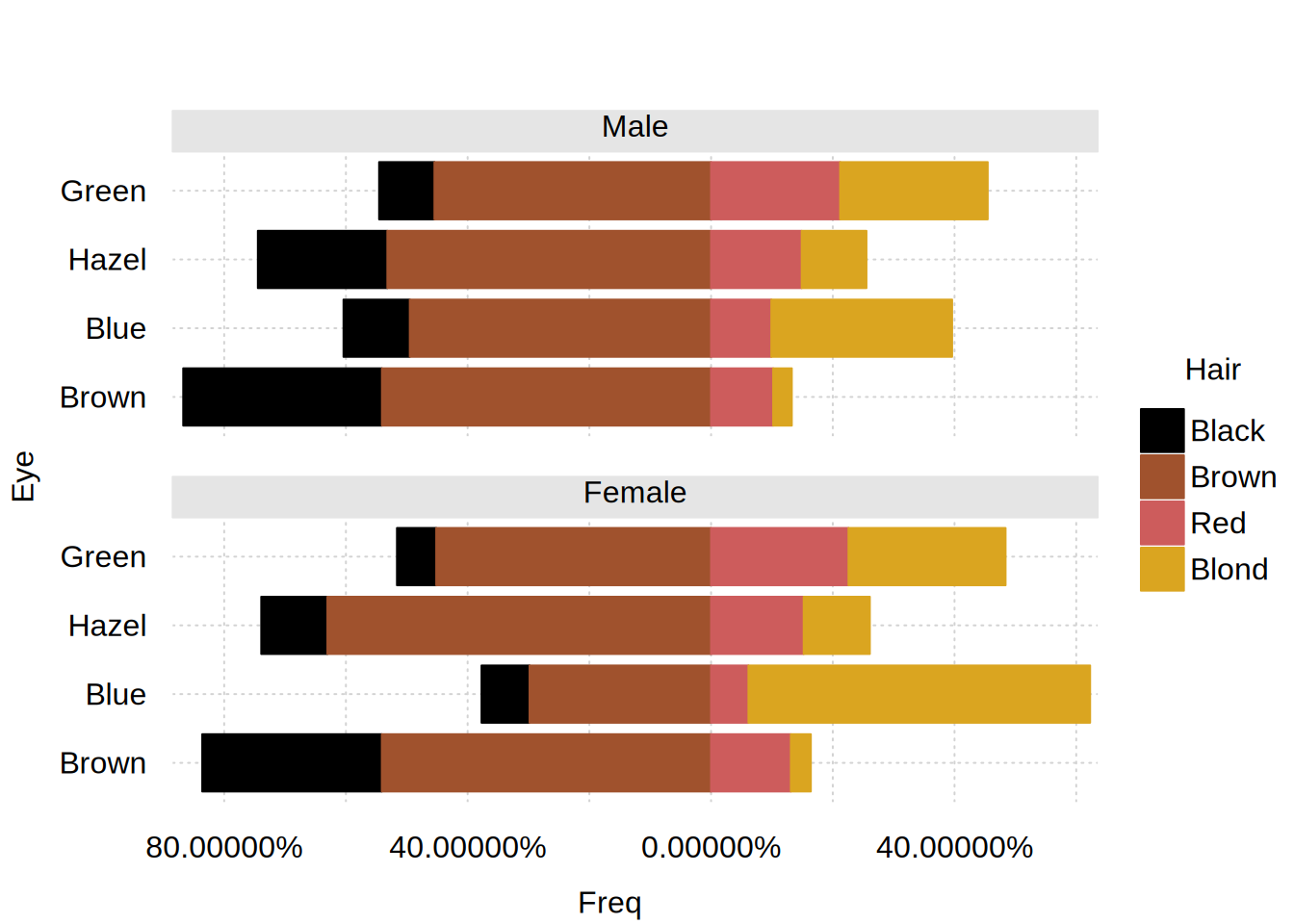
# Centered barplot for conditional proportions of "dark" (black/brown) vs.
# "fair" (red/blond) hair color, conditional on eye color and sex.
# Aside: use `lighten = FALSE` to avoid lightening the bar fill colors.
hec = as.data.frame(proportions(HairEyeColor, 2:3))
hcols = c("black", "sienna", "indianred", "goldenrod")
tinyplot(
  Freq ~ Eye | Hair, data = hec,
  facet = ~ Sex, facet.args = list(ncol = 1),
  type = type_barplot(center = TRUE, lighten = FALSE),
  flip = TRUE, yaxl = "percent",
  theme = list("clean2", palette.qualitative = hcols)
)
tinyplot_add(type = "vline", col = "white")

#
## Offset examples

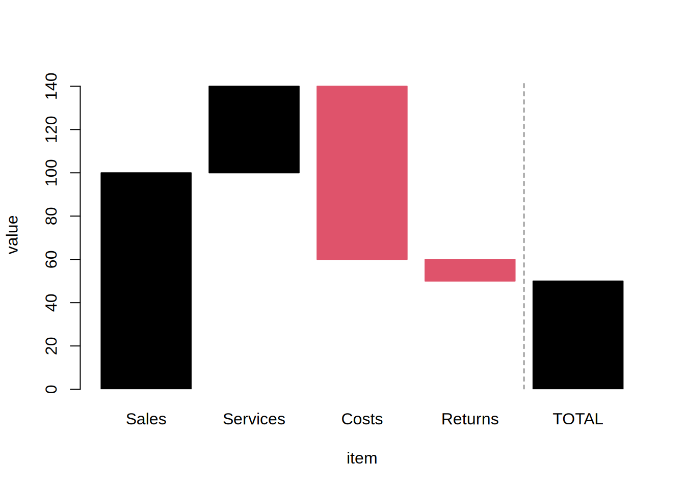
# 1. Waterfall plot
d = data.frame(item = c("Sales", "Services", "Costs", "Returns", "TOTAL"),
               value = c(100, 40, -80, -10, 50))
d$item = factor(d$item, levels = d$item)
d$offset = c(0, cumsum(d$value[1:3]), 0)
tinyplot(
  value ~ item | I(value < 0), data = d,
  type = type_barplot(offset = d$offset, lighten = FALSE),
  legend = FALSE
)
tinyplot_add(type = type_vline(4.5), lty = 2, col = "grey50")
# 2. Diverging/Likert layout: a character (or named numeric) offset "sets
# aside" the named category, pulling it out of the centered stack and drawing
# it as a standalone bar. Here a neutral "Unsure" response is shown apart from
# the diverging agree/disagree scale.
lik = expand.grid(
  question = c("Pay", "Workload", "Manager", "Culture"),
  response = c("Strong disagree", "Disagree", "Agree", "Strong agree", "Unsure")
)
lik$share = c( # proportions summing to 1 within each question
  .10, .25, .05, .15,
  .20, .30, .15, .20,
  .35, .20, .40, .30,
  .25, .15, .35, .20,
  .10, .10, .05, .15
)
# diverging palette: reds (disagree) -> blues (agree), grey for "Unsure"
pal = c("#b2182b", "#ef8a62", "#67a9cf", "#2166ac", "grey")
tinyplot(
  share ~ question | response, data = lik,
  type = type_barplot(center = TRUE, offset = "Unsure", lighten = FALSE),
  flip = TRUE, xlab = NA, ylab = NA, yaxl = "percent",
  legend = list("top!", title = FALSE),
  theme = list("clean2", palette.qualitative = pal),
  main = "Hypothetical Likert example with category offset"
)
tinyplot_add(type = "vline")
tinyplot_add(type = "vline", v = 1, lty = 2)

#
## Implicit zeros and empty cells (see the section of the same name above)

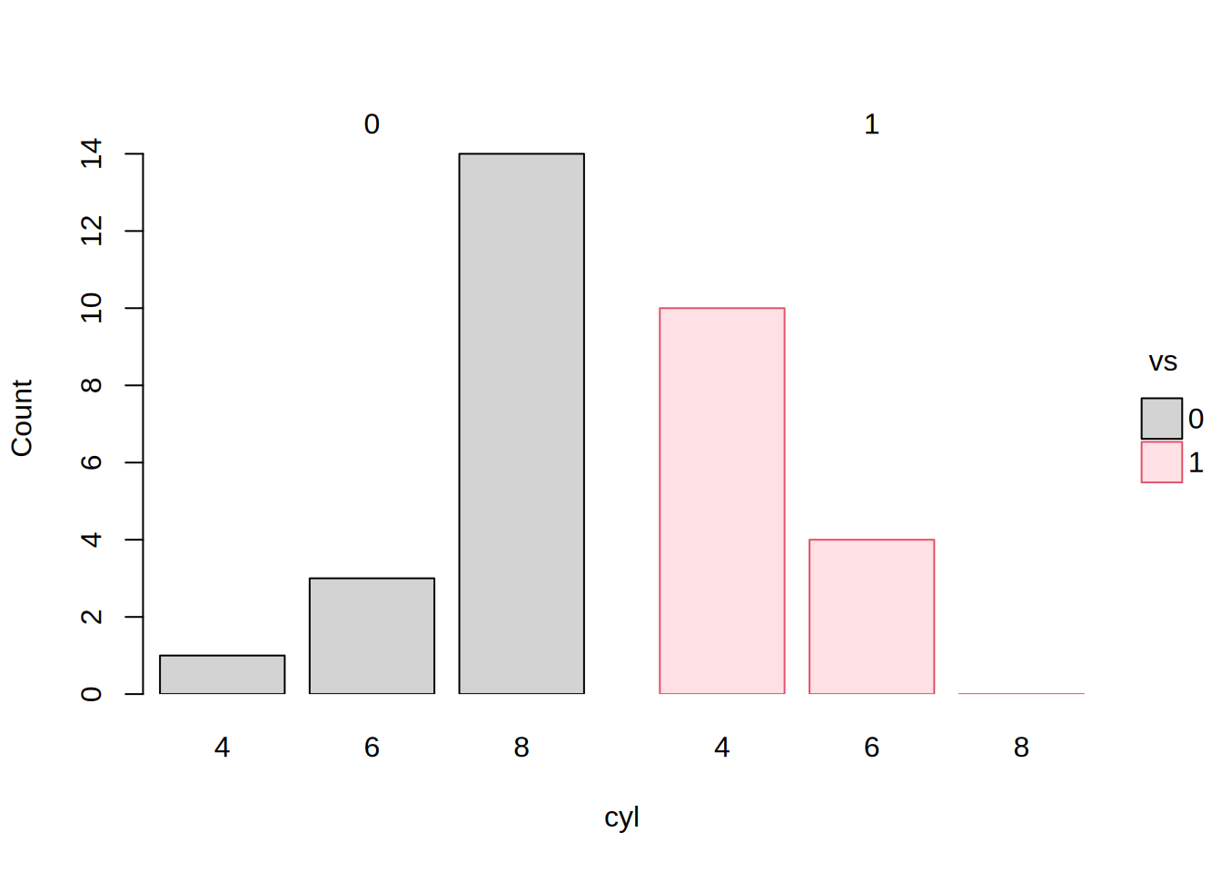
# No (mt)car has 8 cylinders and a straight engine, so that bar is a count
# of zero and is marked as such (flat, along the baseline)
tinyplot(~ cyl | vs, data = mtcars, type = "barplot", facet = "by")
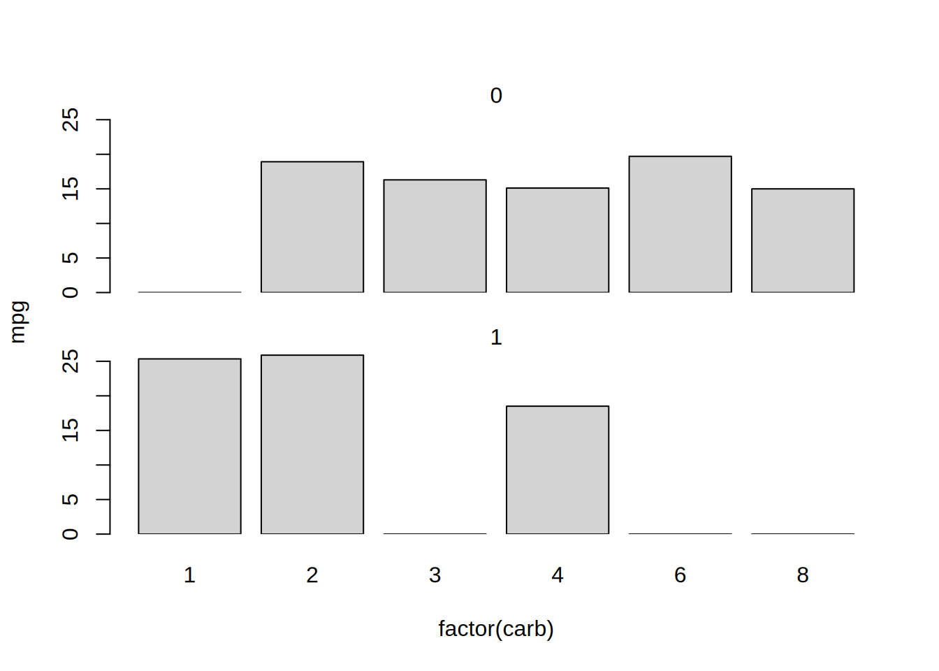
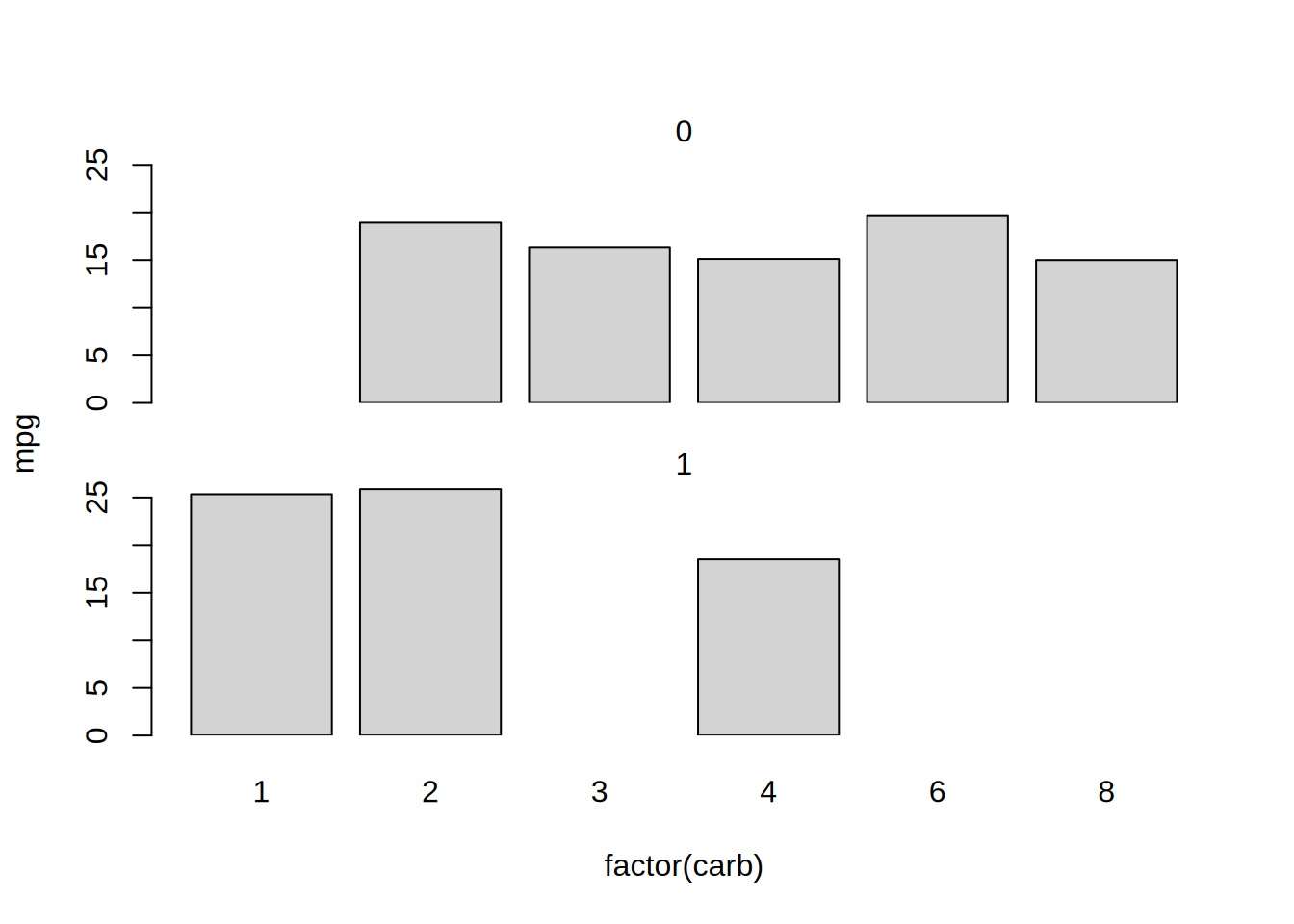
# But in this example, the aggregating statistic is a mean rather than a
# count. The mean of unobserved combinations (e.g.,  carb==1 & vs==0) is
# is undefined, so nothing is drawn for the empty cells
tinyplot(
  mpg ~ factor(carb), data = mtcars,
  type = "barplot",
  facet = ~ vs, facet.args = list(ncol = 1)
)
# ... use na.as.zero to override and mark as (implicit) zeros
tinyplot(
  mpg ~ factor(carb), data = mtcars,
  type = type_barplot(na.as.zero = TRUE),
  facet = ~ vs, facet.args = list(ncol = 1)
)