library(tinyplot)
plt(
  1:10, type = "b",
  draw = rect(
    xleft = 5.5, ybottom = par("usr")[3], xright = 8, ytop = par("usr")[4],
    col = adjustcolor("hotpink", 0.3), border = NA
  )
)
This page collects miscellaneous tips and tricks for tinyplot. By definition, these are workarounds—i.e., techniques that fall outside of standard use cases or features that aren’t (yet) natively supported by the package. Please feel free to suggest or add more tips via our GitHub repo.
In finance and economics, it is common practice to annotate time-series plots by highlighting recessions and other periods of interest. While we don’t provide a dedicated recession bar (“recbar”?) type, achieving this effect in tinyplot is easily done with a standard rect() call. Here’s a simple example where we highlight the window between 5.5 and 8:
library(tinyplot)
plt(
1:10, type = "b",
draw = rect(
xleft = 5.5, ybottom = par("usr")[3], xright = 8, ytop = par("usr")[4],
col = adjustcolor("hotpink", 0.3), border = NA
)
)
The only real trick here is optimizing the height of the rectangle by passing ybottom = par("usr")[3] and ytop = par("usr")[4]. This effectively tells R to maximize the rectangle height so that it extends across the full plotting area regardless of the y-axis numbers.1 (Convenient!)
The cool thing about this approach is that it is fully generalizable (and vectorised). So we could pass a vector of, say, recession start and end dates to highlight multiple recessions. You could even roll it into a simple recbar() function, which is a light wrapper around rect():
recbar = function(start, end, col = "hotpink", alpha = 0.3, border = NA) {
  col = adjustcolor(col, alpha)
  rect(start, par('usr')[3], end, par('usr')[4], col = col, border = border)
}

plt(
  GNP ~ Year, data = longley, type = "l",
  draw = recbar(c(1948, 1953, 1957), c(1949, 1954, 1958))
)
Let’s end this tip with a more sophisticated example using real-life US GDP data from FRED. As a bonus, we’ll pair our simple recbar() function with another get_rec_dates() function that calculates recession dates according to the standard definition of two consecutive quarters of negative growth.
# get 1980+ US GDP data from FRED
url = "https://fred.stlouisfed.org/graph/fredgraph.csv?id=GDPC1&cosd=1980-01-01"
gdp = read.csv(url) |>
  setNames(c("date", "gdp")) |>
  transform(date = as.Date(date))

# function to automatically calculate recession start and end dates, based on
# gdp data and window definition of 2 periods (quarters) of negative growth
get_rec_dates = function(gdp, dates, window = 2) {
  streaks = rle(c(NA, 0 > diff(gdp)))
  rec_flag = streaks$lengths>=window & streaks$values==TRUE
  end = cumsum(streaks$lengths)
  start = end - streaks$lengths # + 1 ## dropping the +1 looks better on a plot
  start = dates[start[rec_flag]]
  end = dates[end[rec_flag]]
  return(data.frame(start = start, end = end))
}

# finally, grab the recession dates and plot
rec_dates = get_rec_dates(gdp$gdp, gdp$date)
plt(
  gdp ~ date, data = gdp, type = "l",
  draw = recbar(rec_dates$start, rec_dates$end),
  main = "US Gross Domestic Product (1980 to present)",
  sub = "Note: Shaded regions denote recessions",
  xlab = "Date", ylab = "Billions of $US (2017)", yaxl = "$",
  theme = "classic"
)
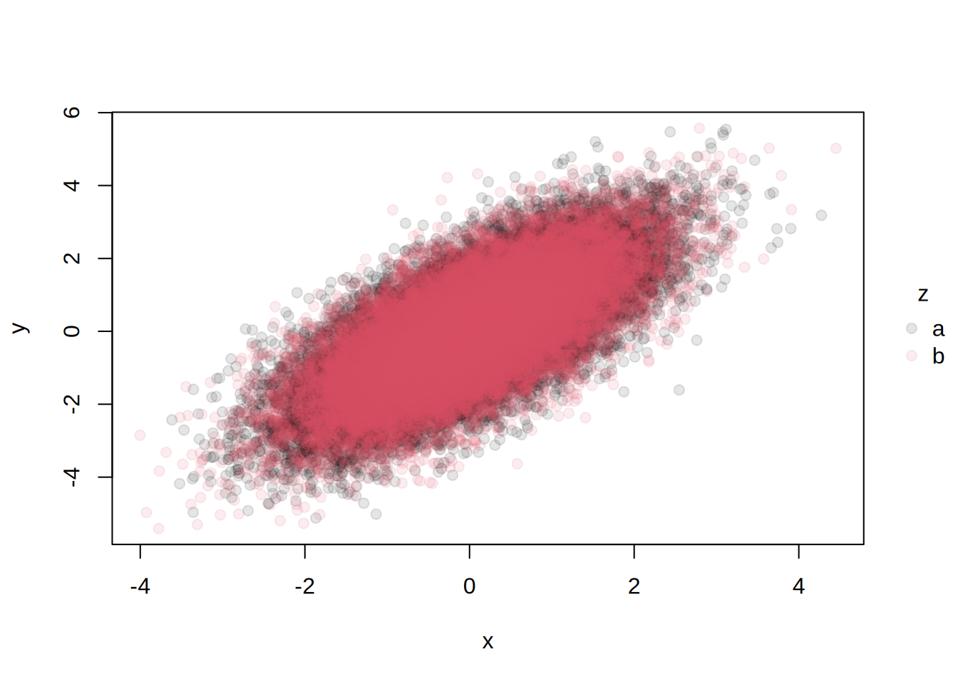
By default, the legend inherits the transparency (alpha) of the plotted elements. In some cases, this may be undesirable. For example, in the following plot, the legend is too light:
library(tinyplot)
n = 50000
x = rnorm(n)
y = x + rnorm(n)
z = sample(c("a", "b"), n, replace = TRUE)
dat = data.frame(x, y, z)
tinyplot(y ~ x | z, data = dat, alpha = .1, pch = 19)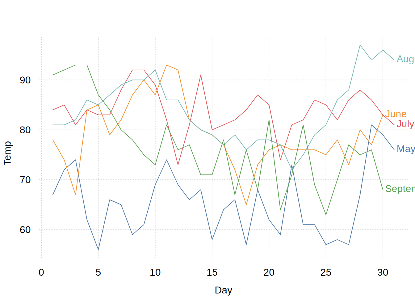
One solution is to draw our plot in two steps. First, we draw an empty plot with the desired (zero transparency) legend. Second, we add the transparent points on top of the existing canvas.
tinyplot(y ~ x | z, data = dat, pch = 19, empty = TRUE)
tinyplot_add(empty = FALSE, alpha = .1)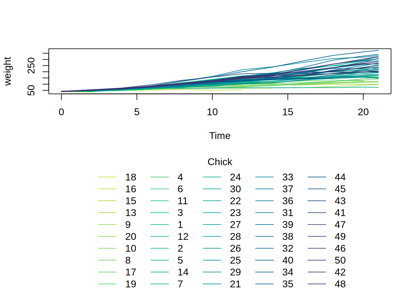
For cases where we have many discrete groups, the default single column legend can overrun the plot limits. For example:
library(tinyplot)

plt(weight ~ Time | Chick, data = ChickWeight, type = "l")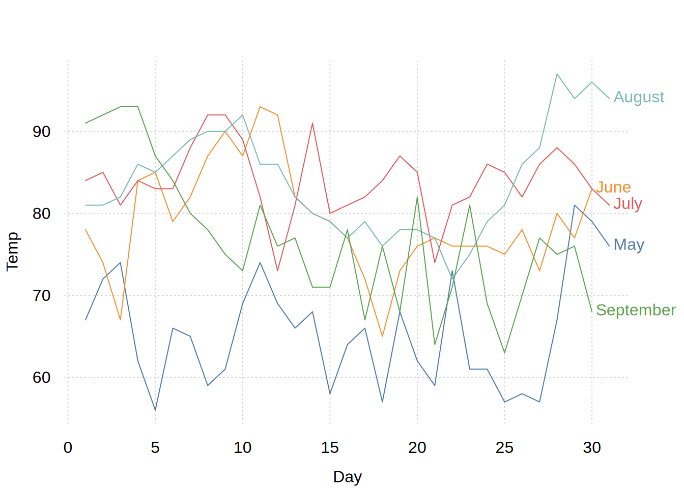
To solve this undesirable behaviour, simply pass an approporiate ncol adjustment as part of your legend (list) argument:
plt(weight ~ Time | Chick, data = ChickWeight, type = "l",
    legend = list(ncol = 3))
The same trick works for horizontal legends and/or legends in other positions, as well for other plot types and themes. For example:
plt(weight ~ Time | Chick, data = ChickWeight, type = "l",
    legend = list("bottom!", ncol = 5))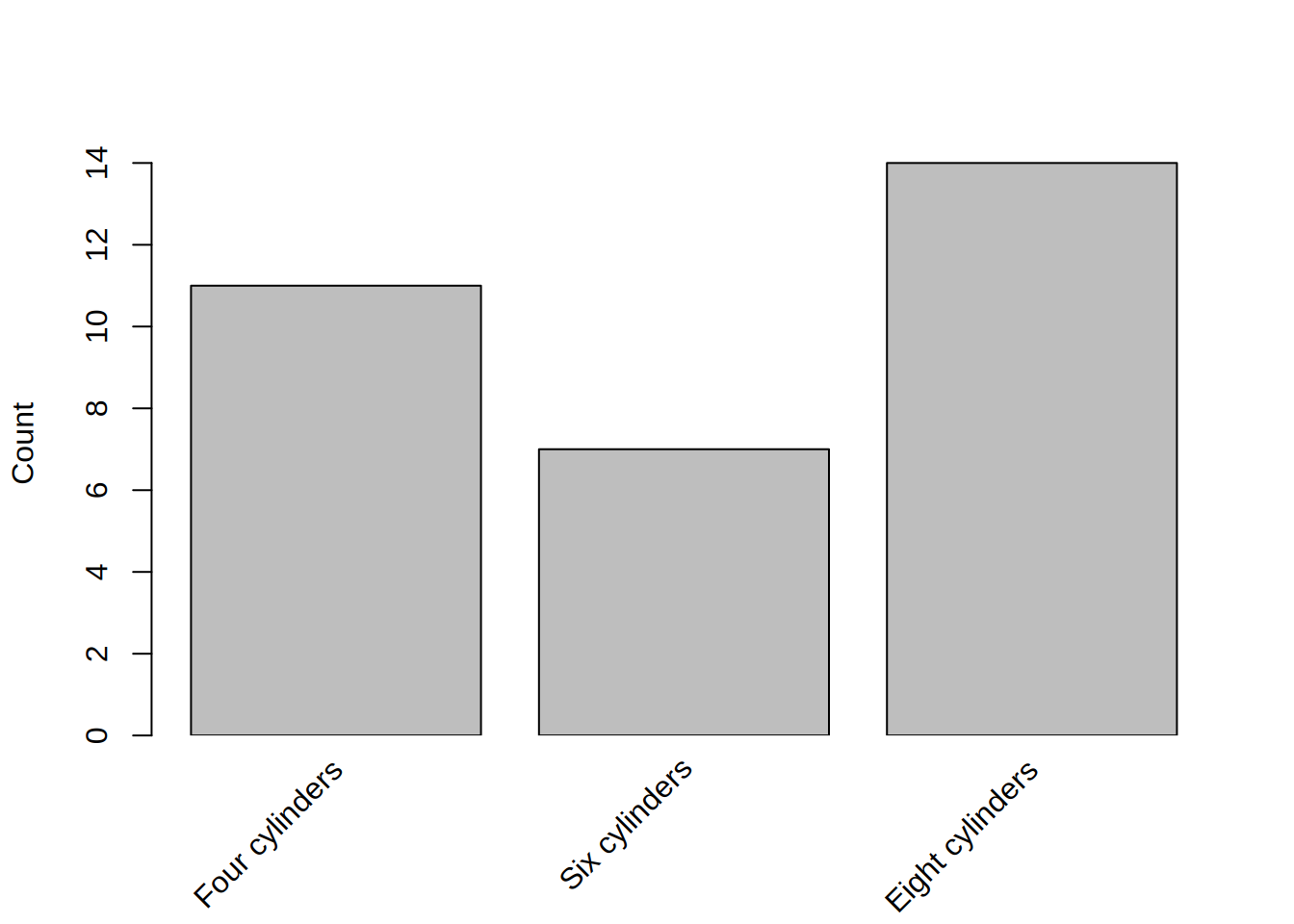
(Admittedly, the end result is a bit compressed here because of the default aspect ratio that we use for figures on our website. But for regular interactive plots, or plots saved to disk, the aesthetic effect should be quite pleasing.)
When category labels are long or overlapping, users may want to rotate them for readability. One option is fully perpendicular (90°) axis labels, which tinyplot supports via themes, e.g. tinytheme("clean", las = 2). If a user wants finer control over the degree of rotation—say, 45°—this requires a bit more manual effort since we do not support custom rotation out of the box. The workaround involves three steps:
xaxt = "n".text() to manually add rotated labels.ylab = "".library(tinyplot)
tinyplot(~cyl, data = mtcars, type = "barplot", xaxt = "n", ylab = "")
text(1:3, 0,
labels = c("Four cylinders", "Six cylinders", "Eight cylinders"),
srt = 45, # rotate text 45 degrees
adj = c(1.1, 1.5), # adjust text alignment
xpd = TRUE) # allow drawing outside plot region
Note that adj and xpd settings may require trial and error to position labels correctly. Also, removing the x-axis label by setting ylab = "" is unintuitive but currently necessary when using formulas like ~ cyl.
P.S. Another option for long axis labels is to wrap them at a designated character length. See the final example in the tinylabel documentation for an example.
As an side, I’m passing the annotation layer through draw = rect(...), rather than plt_add() because I want the shading to be drawn under (before) the main plot line. This isn’t strictly necessary, but a nice aesthetic touch. See the Layers section of the intro tutorial for more.↩︎