library(tinyplot)

aq = airquality
aq$Month = factor(month.abb[aq$Month], levels = month.abb[5:9])Tutorial
The goal of this intro tutorial is to give you a sense of the main features and syntax of tinyplot, a lightweight extension of the base R graphics system. We don’t try to cover everything, but you should come away with a good understanding of how the package works and how it can integrate with your own projects.
We start this tutorial by loading the package and a slightly modified version of the airquality dataset that comes bundled with base R.
Equivalence with plot()
As far as possible, tinyplot tries to be a drop-in replacement for regular plot calls.
par(mfrow = c(1, 2))

plot(0:10, main = "plot")
tinyplot(0:10, main = "tinyplot")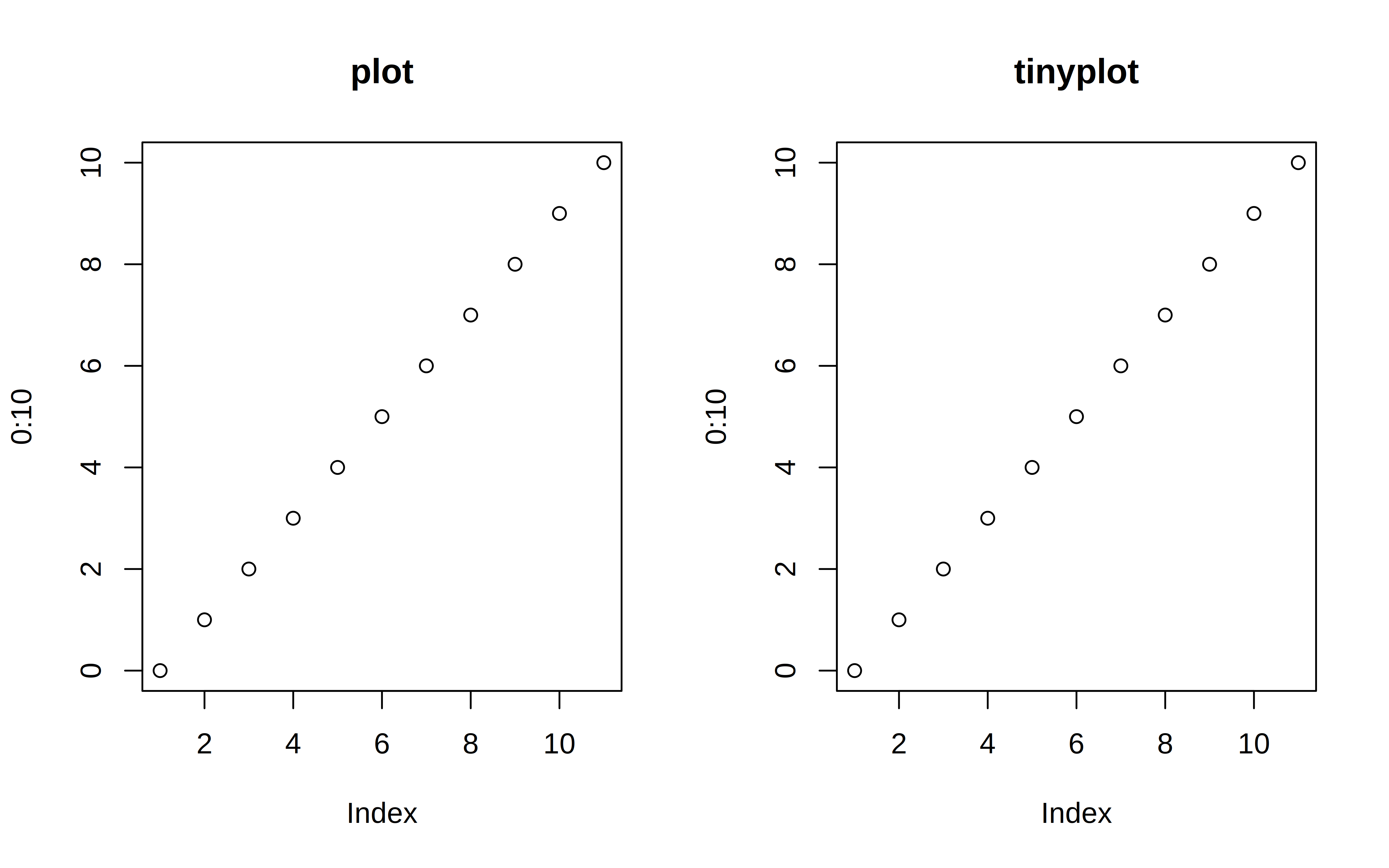
par(mfrow = c(1, 1)) # reset layoutSimilarly, we can plot elements from a data frame using either the atomic or formula methods. Here’s a simple example using the aq dataset that we created earlier.
# with(aq,  tinyplot(Day, Temp)) # atomic method (same as below)
tinyplot(Temp ~ Day, data = aq)  # formula method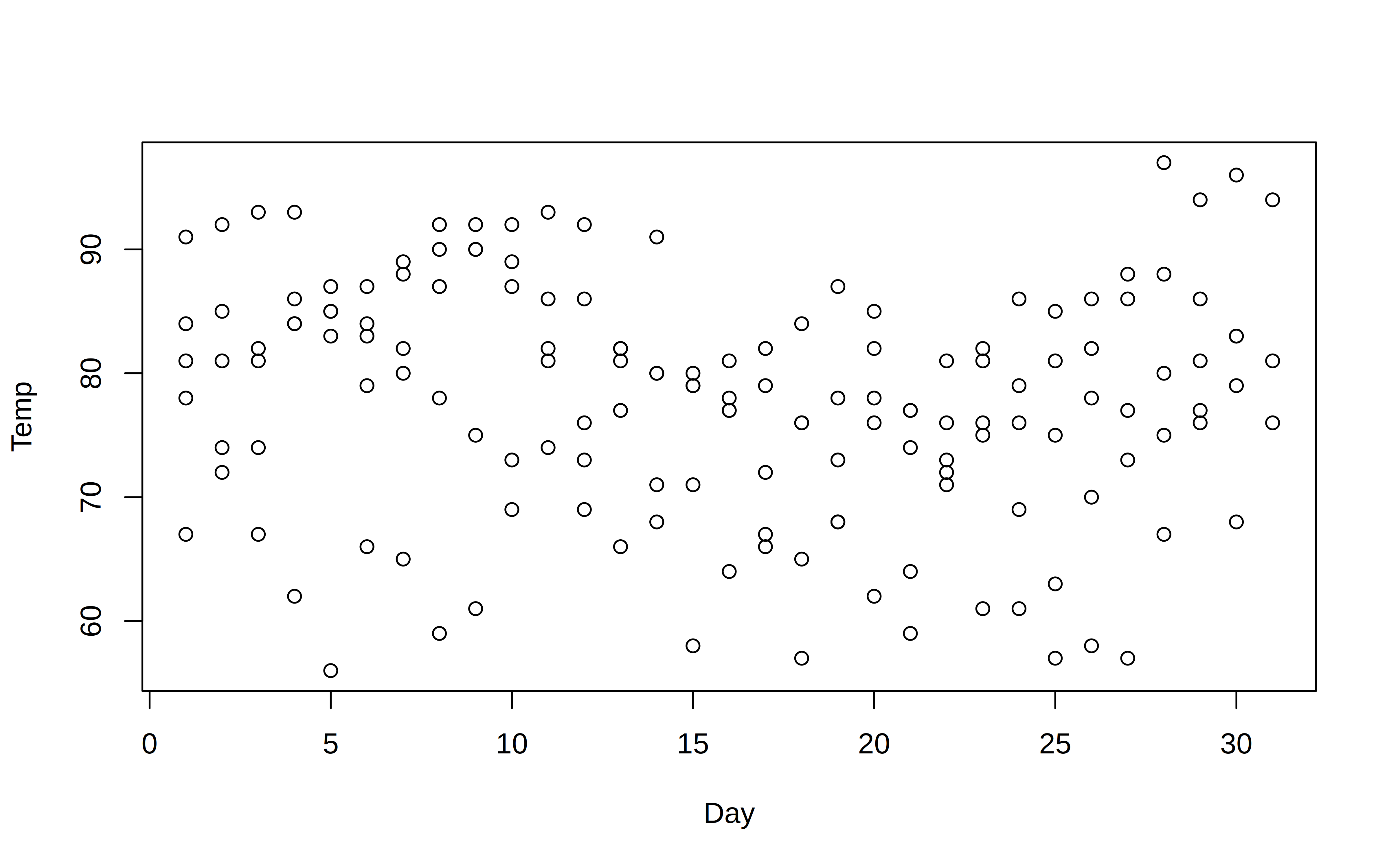
Aside: plt shorthand
If you’d prefer to save on a few keystrokes, you can use the shorthand plt alias instead of typing out tinyplot.
plt(Temp ~ Day, data = aq) # `plt` = shorthand alias for `tinyplot`
Please note that the plt shorthand would work for all of the remaining plot calls below. But we’ll stick to tinyplot to avoid any potential confusion.
Tip
Use the plt() alias instead of tinyplot() to save yourself a few keystrokes.
Grouped data
Where tinyplot starts to diverge from its base counterpart is with respect to grouped data. In particular, tinyplot allows you to characterize groups using the by argument.1
# tinyplot(aq$Day, aq$Temp, by = aq$Month) # same as below
with(aq, tinyplot(Day, Temp, by = Month))
An arguably more convenient approach is to use the equivalent formula syntax. Just place the “by” grouping variable after a vertical bar (i.e., |).
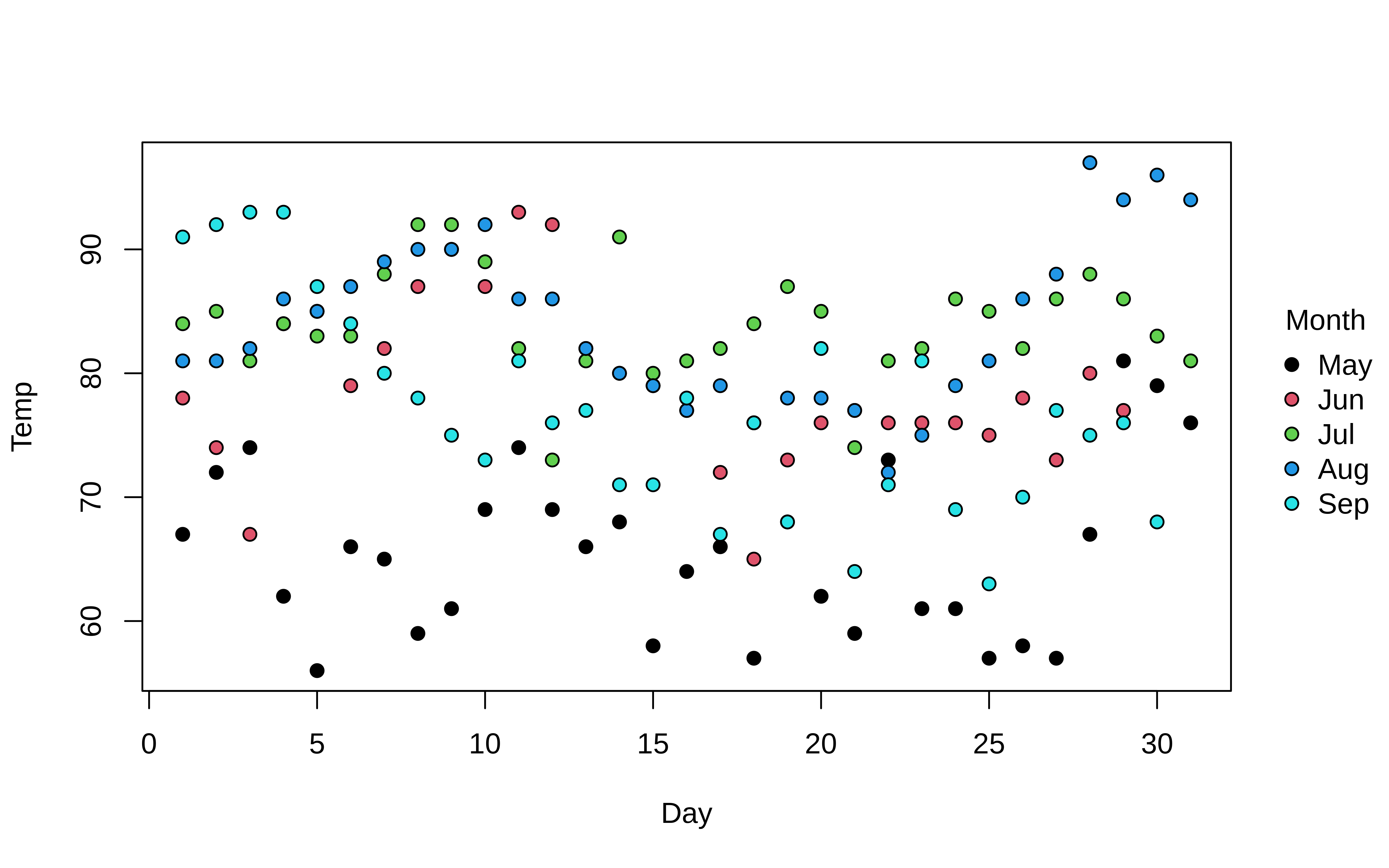
tinyplot(Temp ~ Day | Month, data = aq)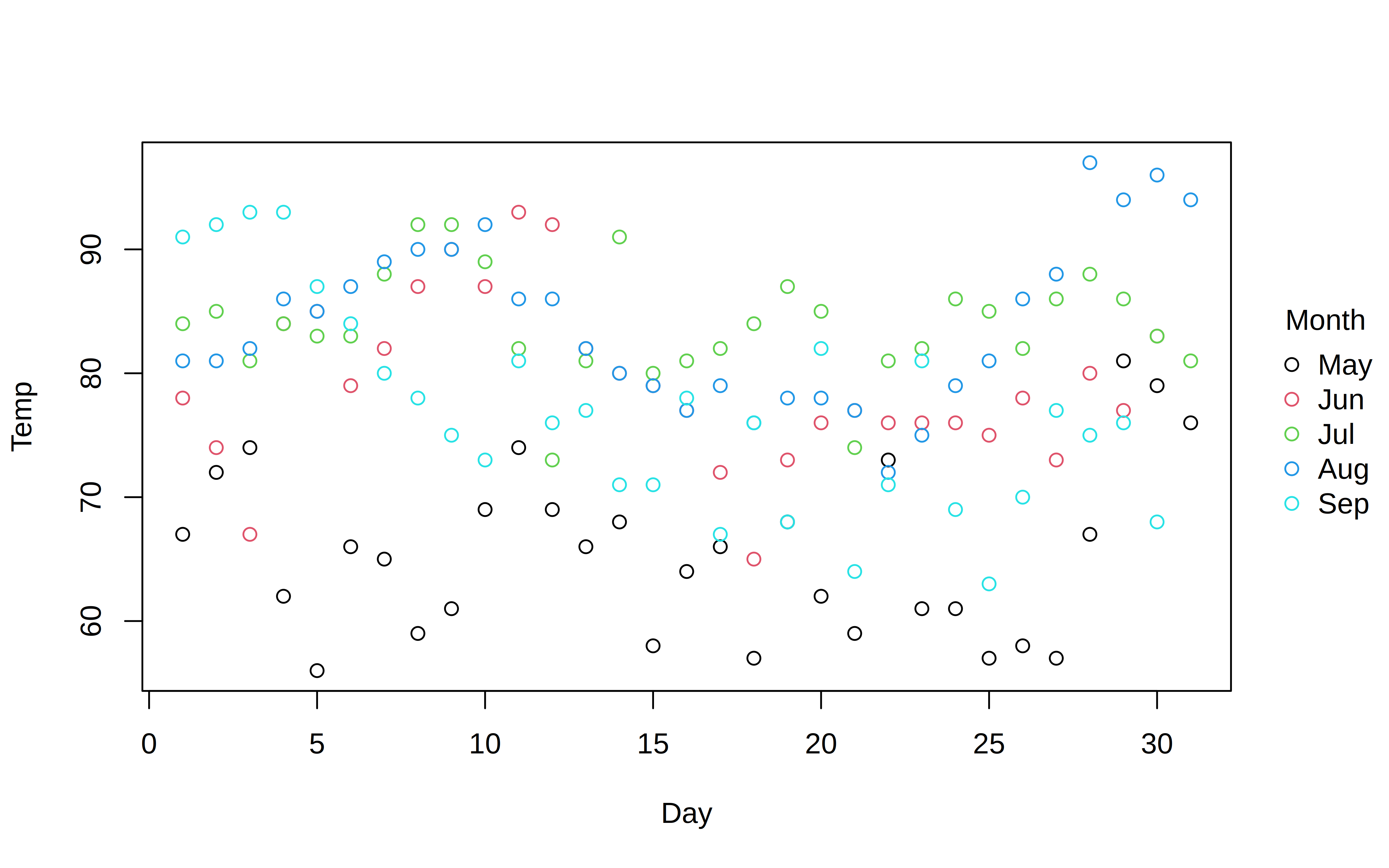
You can use standard base plotting arguments to adjust features of your plot. For example, change pch (plot character) to get filled points and cex (character expansion) to change their size.
tinyplot(
  Temp ~ Day | Month, data = aq,
  pch = 16,
  cex = 2
)
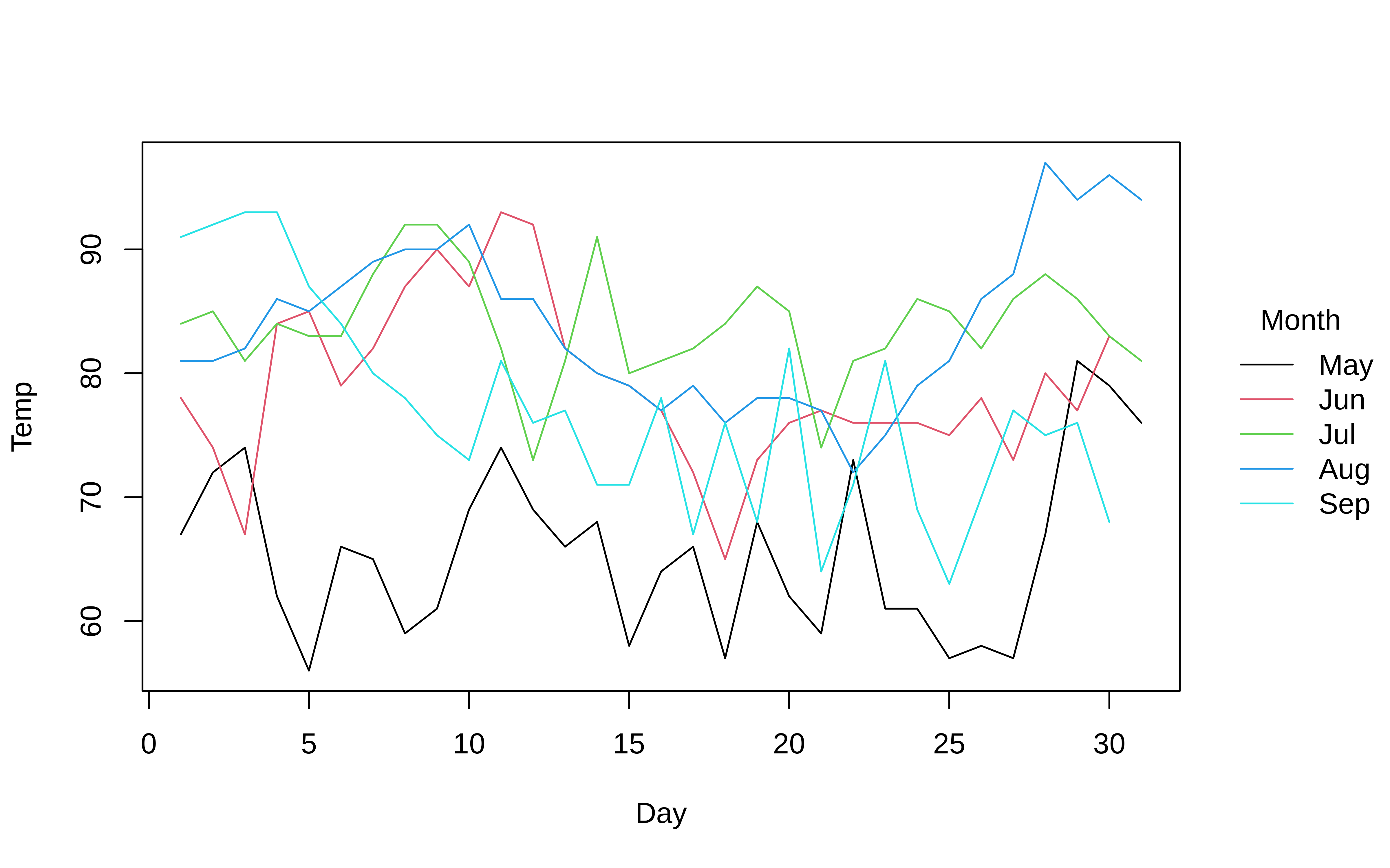
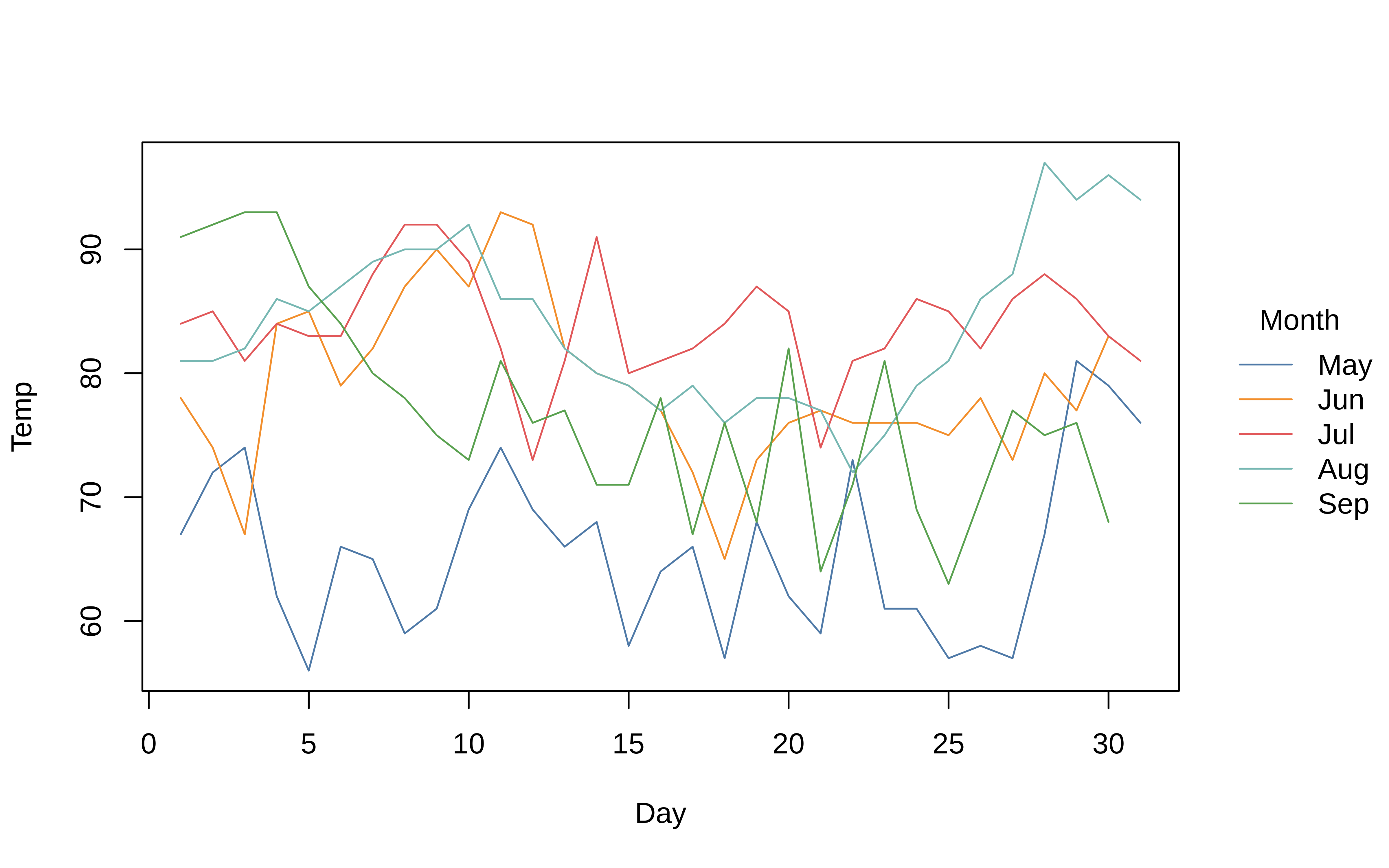
Similarly, converting to a grouped line plot is a simple matter of adjusting the type argument.
tinyplot(
  Temp ~ Day | Month, data = aq,
  type = "l"
)
The default behaviour of tinyplot is to represent groups through colour. However, note that we can automatically adjust pch and lty by groups too by passing the "by" convenience keyword. This can be used in conjunction with the default group colouring. Or, as a replacement for group colouring—an option that may be particularly useful for contexts where colour is expensive or prohibited (e.g., certain academic journals).
tinyplot(
  Temp ~ Day | Month, data = aq,
  type = "l",
  col = "black", # override automatic group colours
  lty = "by"     # change line type by group instead
)
The "by" convenience argument is also available for mapping group colours to background fill bg (alias fill). One use case is to override the grouped border colours for filled plot characters and instead pass them through the background fill.
tinyplot(
  Temp ~ Day | Month, data = aq,
  pch = 21,      # use filled circles
  col = "black", # override automatic group (border) colours of points
  fill = "by"    # use background fill by group instead
)
Colours
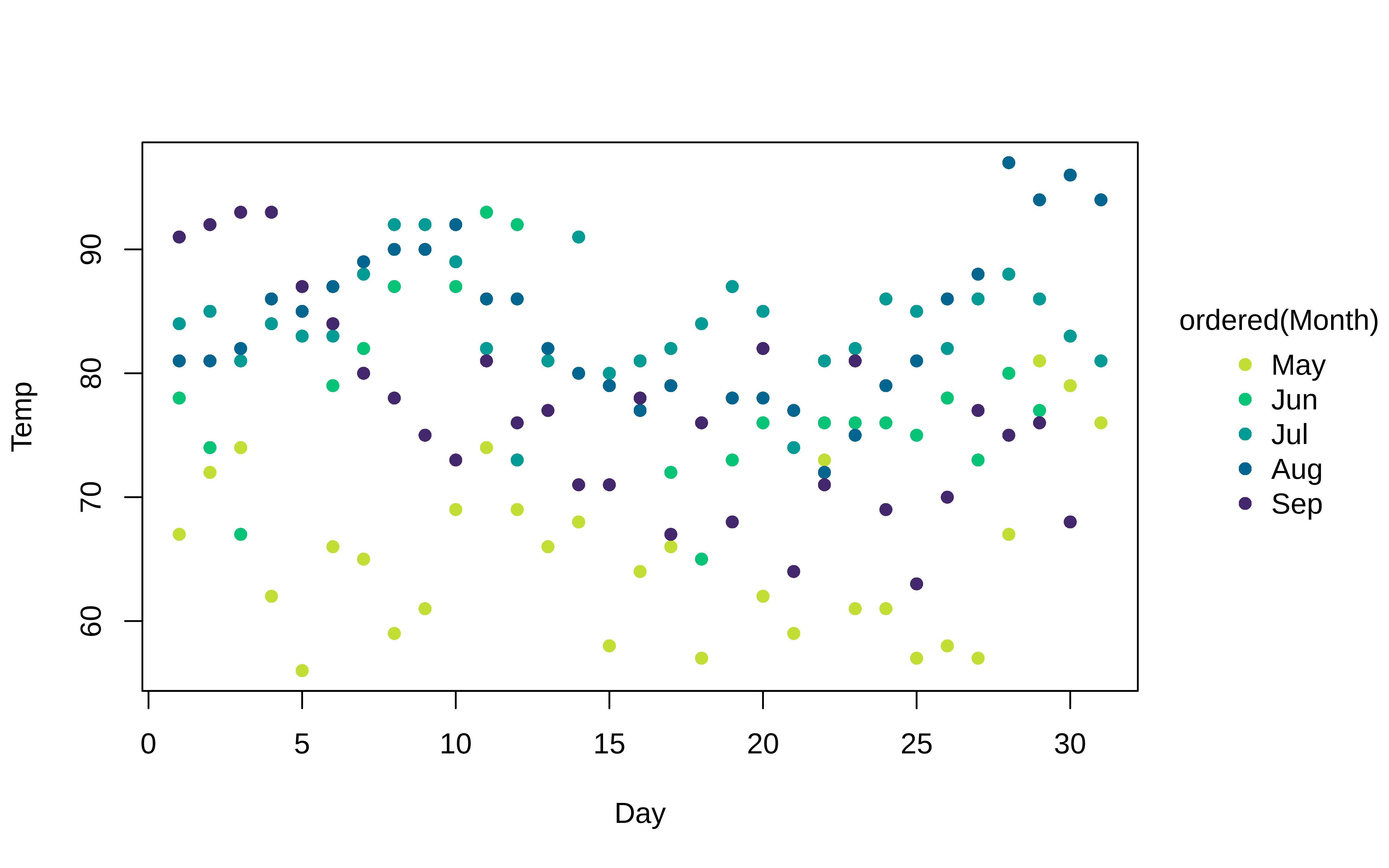
On the subject of group colours, the default palette should adjust automatically depending on the class and cardinality of the grouping variable. For example, a sequential (“viridis”) palette will be used if an ordered factor is detected.
tinyplot(
  Temp ~ Day | ordered(Month), data = aq,
  pch = 16
)
However, this behaviour is easily customized via the palette argument. The default set of discrete colours are inherited from the user’s current global palette. (Most likely the “R4” set of colors; see ?palette). However, all of the various palettes listed by palette.pals() and hcl.pals() are supported as convenience strings.2 Note that case-insensitive, partial matching for these convenience string is allowed. For example:
tinyplot(
  Temp ~ Day | Month, data = aq,
  type = "l",
  palette = "tableau" # or "ggplot", "okabe", "set2", "harmonic", etc.
)
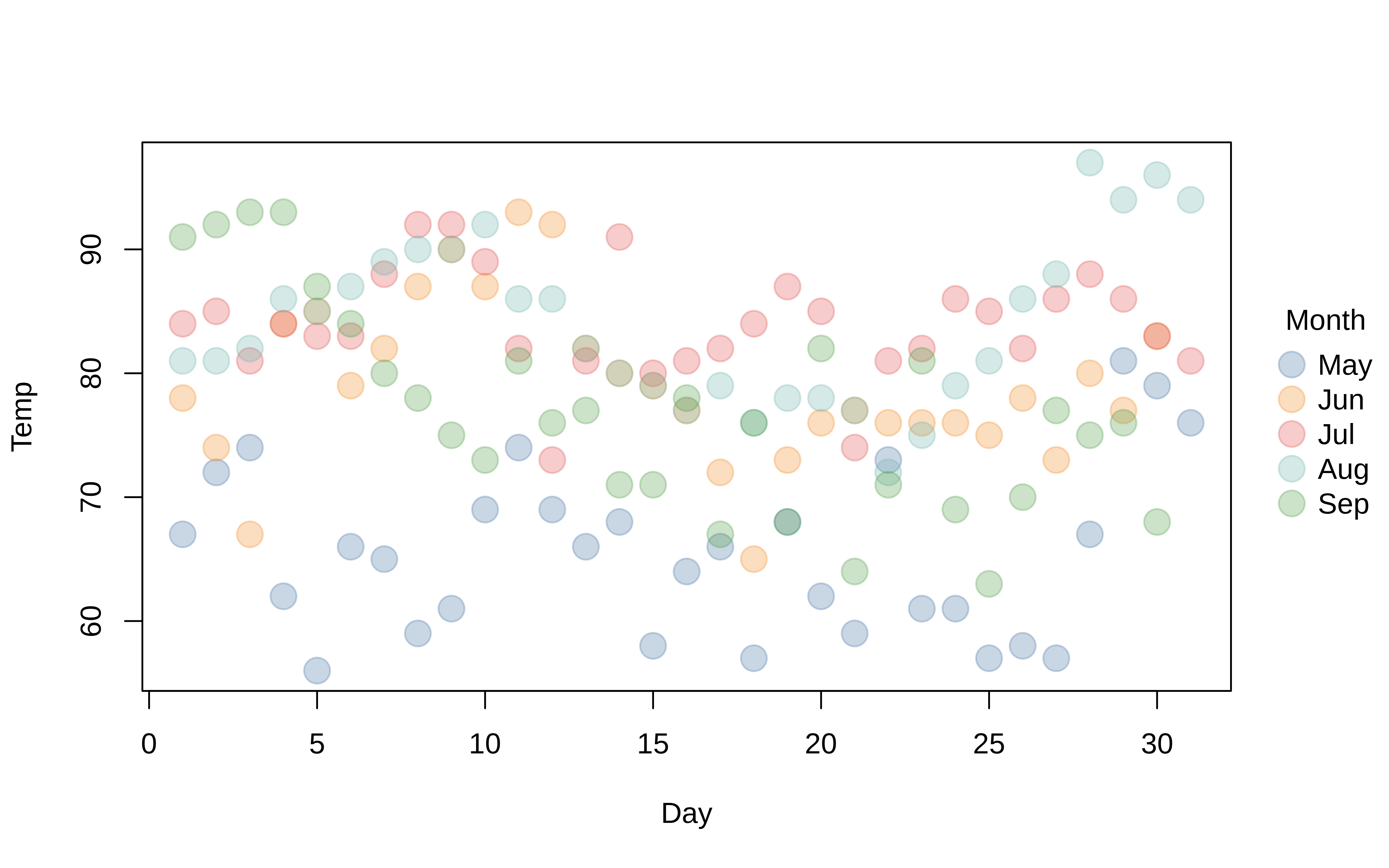
Beyond these convenience strings, users can also supply a valid palette-generating function for finer control and additional options.3 You can also use the alpha argument to adjust the (alpha) transparency of your colours:
tinyplot(
  Temp ~ Day | Month, data = aq,
  pch = 19, cex = 2,
  palette = "tableau",
  alpha = 0.3
)
To underscore what we said earlier, colours are inherited from the user’s current palette. So these can also be set globally, just as they can for the base plot function. The next code chunk will set a new default palette for the remainder of the plots that follow.
# Set the default palette globally via the generic palette function
palette("tableau")
Legend
In all of the preceding plots, you will have noticed that we get an automatic legend. The legend position and look can be customized with the legend argument. At a minimum, you can pass the familiar legend position keywords as a convenience string (“topright”, “bottom”, “left”, etc.). Moreover, a key feature of tinyplot is that we can easily and elegantly place the legend outside the plot area by adding a trailing “!” to these keywords. (As you may have realised, the default legend position is “right!”.) Let’s demonstrate by moving the legend to the left of the plot:
tinyplot(
  Temp ~ Day | Month, data = aq,
  type = "l",
  legend = "left!"
)
Beyond the convenience of these positional keywords, the legend argument also permits additional customization by passing an appropriate function (or, a list of arguments that will be passed on to the standard legend() function internally.) So you can change or turn off the legend title, remove the bounding box, switch the direction of the legend text to horizontal, etc. Here’s a grouped density plot example, where we also add some shading by specifying that the background colour should vary by groups too.
tinyplot(
  ~ Temp | Month,
  data = aq,
  type = "density",
  fill = "by",                         # add fill by groups
  grid = TRUE,                         # add background grid
  legend = list("topright", bty = "o") # change legend features
)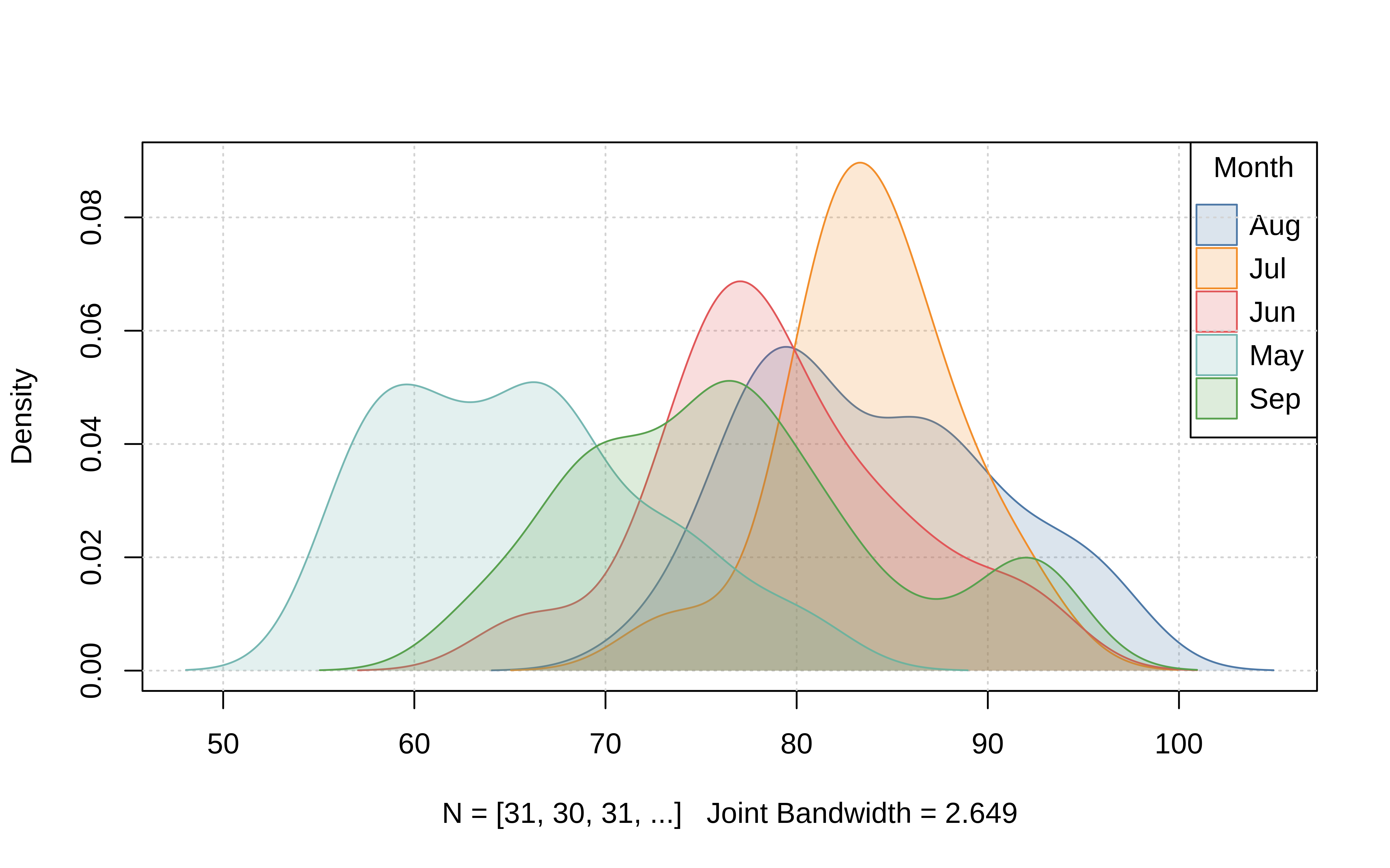
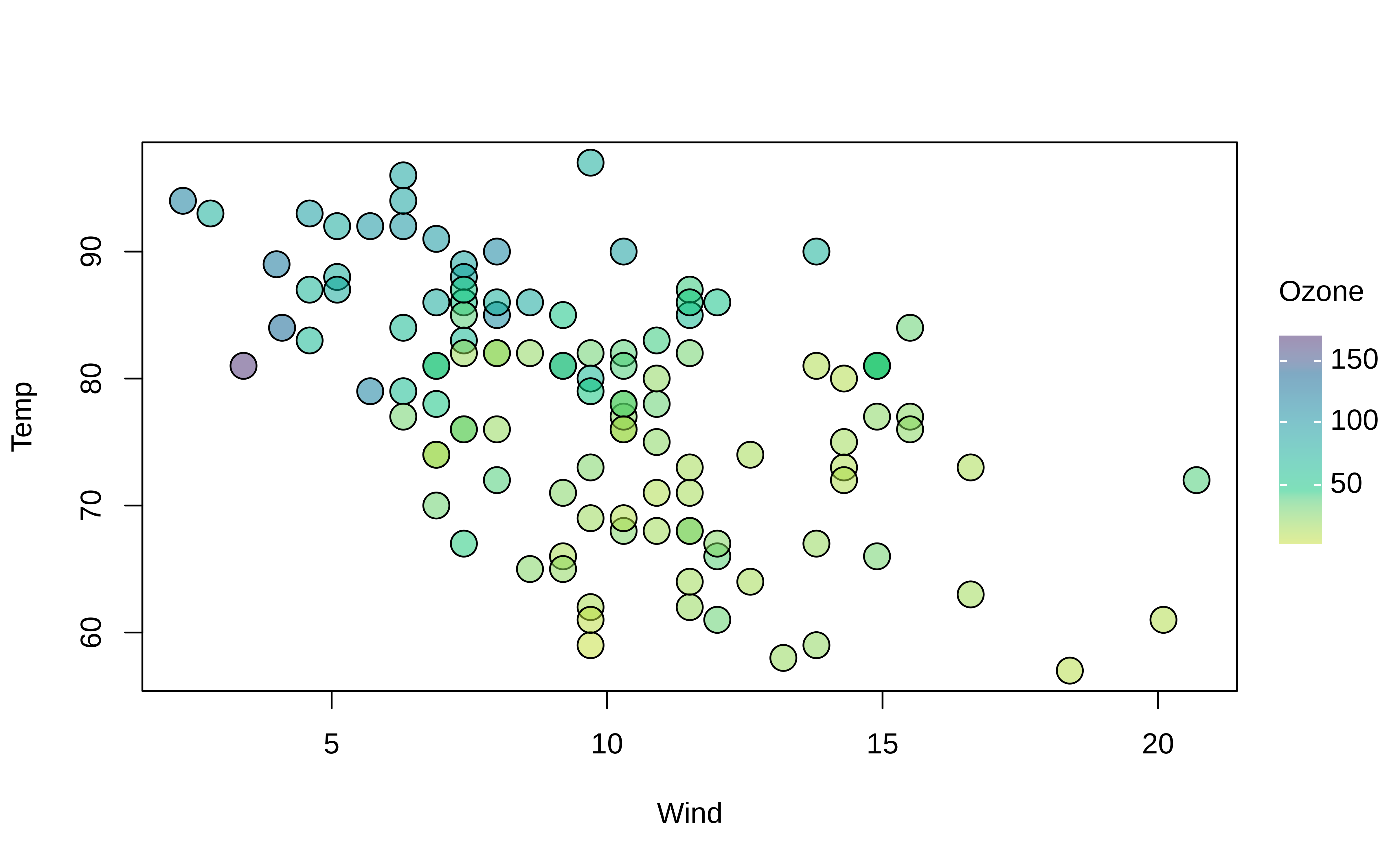
All of the legend examples that we have seen thus far are representations of discrete groups. However, please note that tinyplot also supports grouping by continuous variables, which automatically yield gradient legends.
tinyplot(Temp ~ Wind | Ozone, data = aq, pch = 19)
Gradient legends (and plots) can be customized in an identical manner to discrete legends by adjusting the keyword positioning, palette choice, alpha transparency etc. Here is a quick adaptation of the previous plot to demonstrate. Note that here we pass a special convenience argument to bg/fill; if it detects a numeric in the range of [0,1], then it automatically inherits the grouped colour mappings but with added transparency.
tinyplot(
  Temp ~ Wind | Ozone, data = aq,
  pch  = 21,      # use filled plot character
  cex  = 2,
  col  = "black", # override automatic (grouped) border colour of points
  fill = 0.5,     # use background fill instead with added alpha transparency
)
More plot types
We have already seen several plot types above such as "p" (points), "l" (lines), and "density". In general, tinyplot supports all of the primitive plot types/elements available in base R, as well as a number of additional plot types that can be a bit tedious to code up manually. The full list of supported plot types can be viewed in this pinned GitHub issue, or by checking the ?tinyplot documentation.
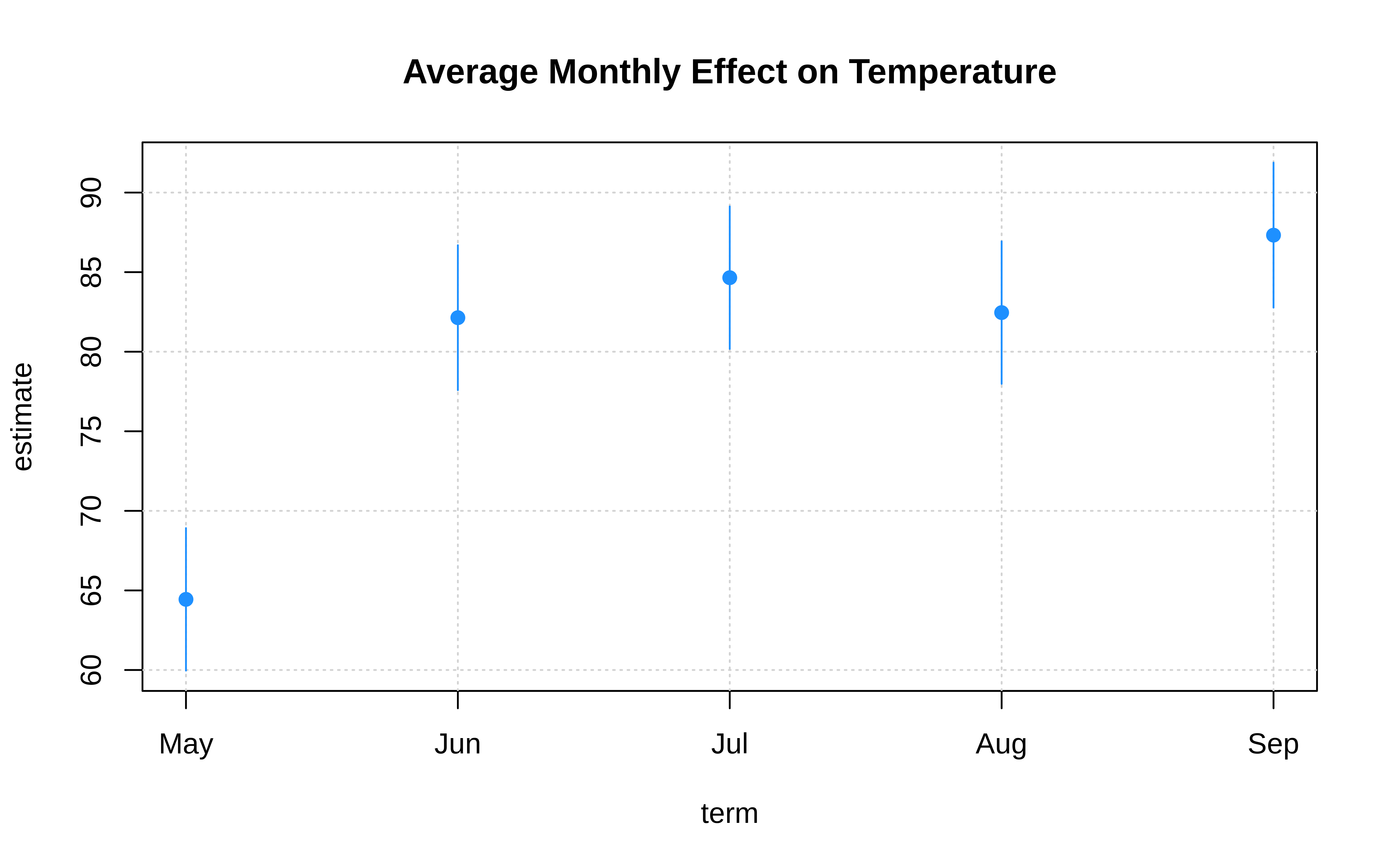
For example, tinyplot support interval plots via the "pointrange", "errorbar", "ribbon" type arguments. A canonical use-case is coefficient plots:
mod = lm(Temp ~ 0 + Month / Day, data = aq)

# grab coefs of interest
monthcoefs = data.frame(
  gsub("Month", "", names(coef(mod))),
  coef(mod),
  confint(mod)
  ) |>
  setNames(c("term", "estimate", "ci_low", "ci_high")) |>
  subset(!grepl("Day", term))

# plot
with(
  monthcoefs,
  tinyplot(
    x = term, y = estimate,
    ymin = ci_low, ymax = ci_high,
    type = "pointrange", # or: "errobar", "ribbon"
    pch = 19, col = "dodgerblue",
    grid = TRUE,
    main = "Average Monthly Effect on Temperature"
  )
)
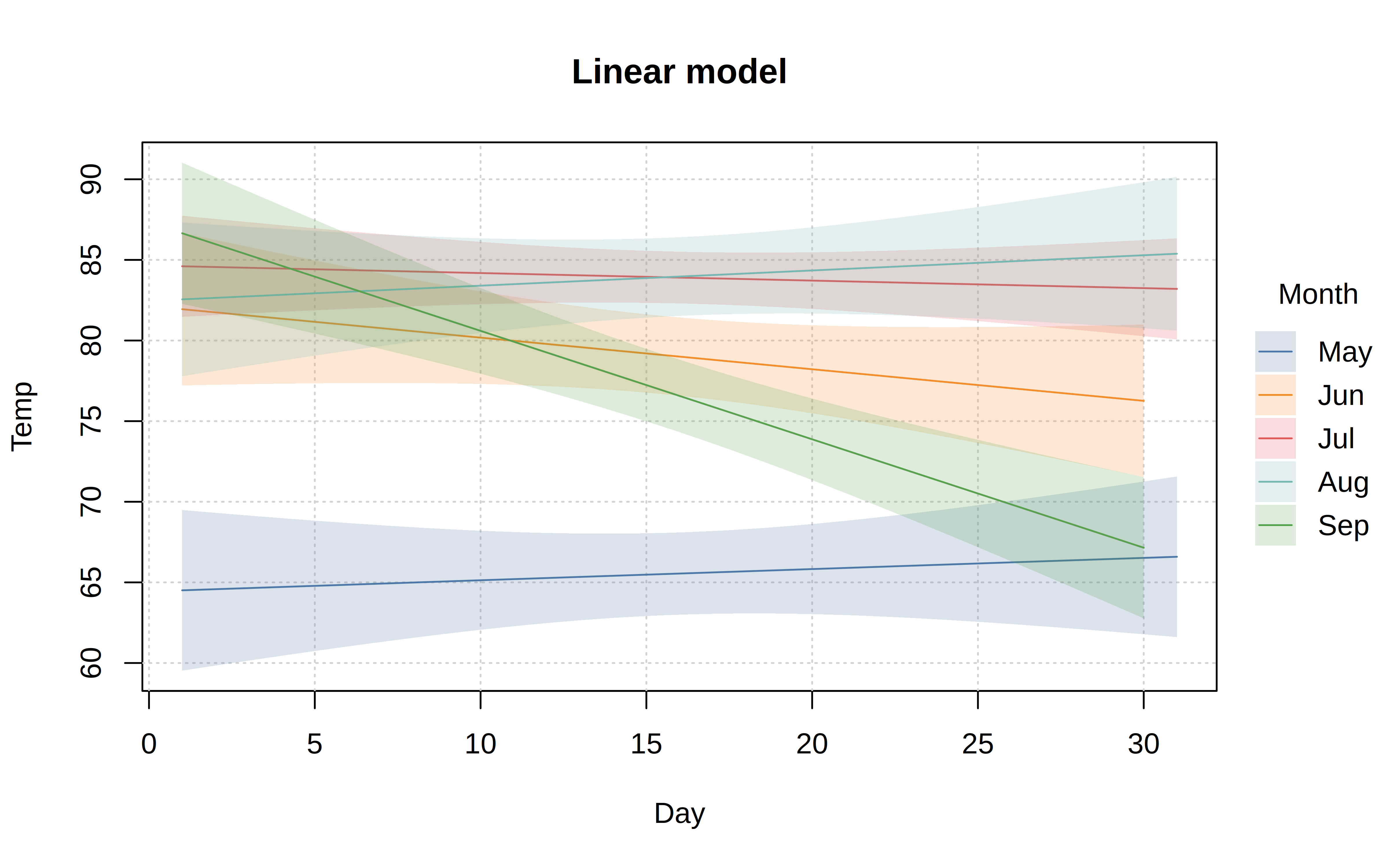
tinyplot also supports special types to fit models and display their predictions, along with confidence intervals. Here is a somewhat silly example where we fit a linear model to predict temperature by day of month.4
tinyplot(
  Temp ~ Day | Month, aq,
  type = "lm",
  grid = TRUE,
  main = "Linear model"
)
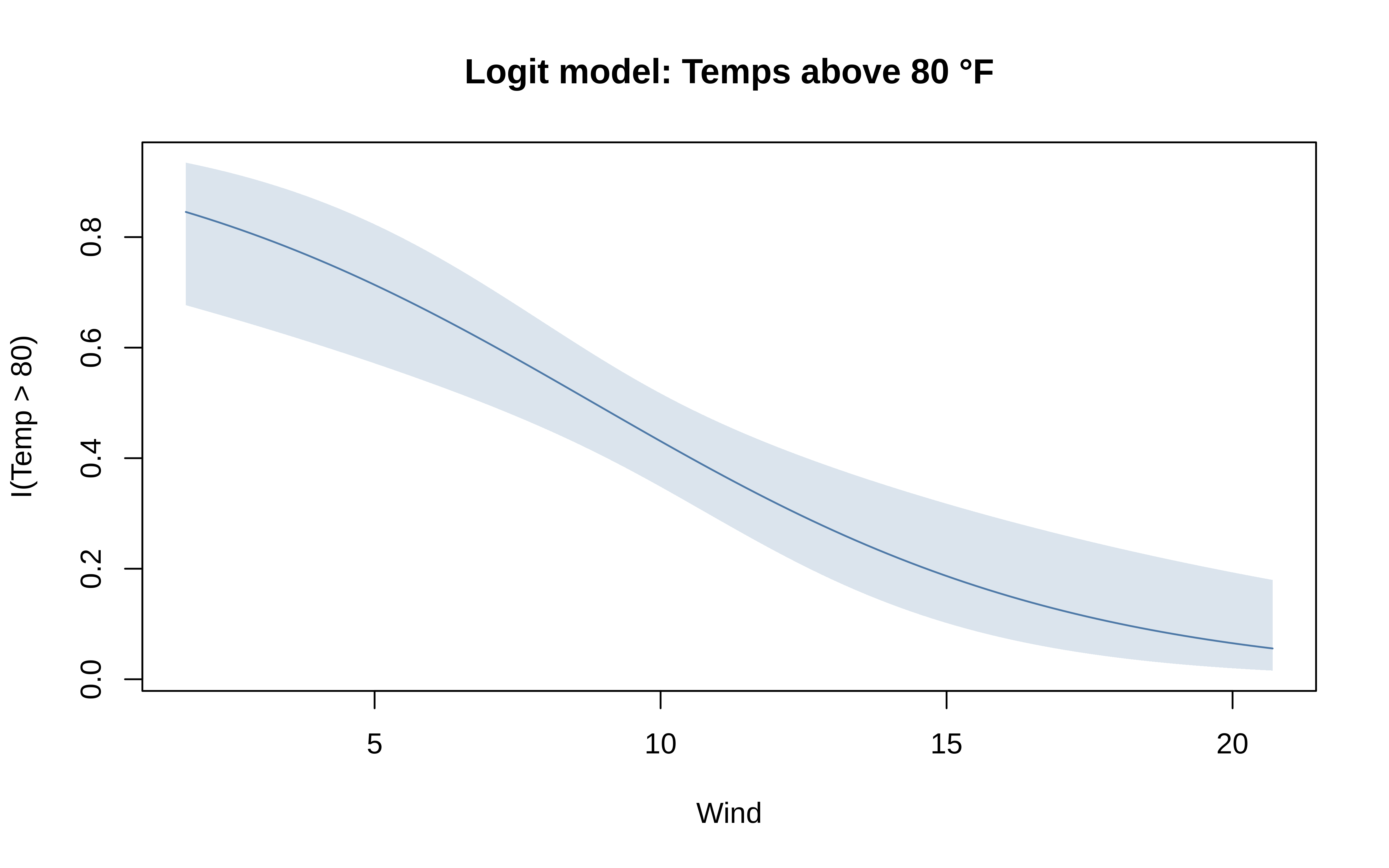
The default behaviour of these model types can be adjusted by passing appropriate arguments to the equivalent functional version of the type in question. These functional types all follow a type_<typename> syntax, so that "lm" is paired with type_lm(), etc. Below we illustrate an adapted generalised linear model, where we passing the binomial family argument and thus fit a logistic regression.
tinyplot(
  I(Temp > 80) ~ Wind, aq,
  type = type_glm(family = binomial),
  main = "Logit model: Temps above 80 °F"
)
We will see examples of more plot types below, including other model prediction types. Please also take a look at the dedicated Plot Types vignette for explicit details about all of the different plot types that tinyplot supports, as well as how to create your own custom types.
Facets
Alongside the standard “by” grouping approach that we have seen thus far, tinyplot also supports faceted plots. Mirroring the main tinyplot function, the facet argument accepts both atomic and formula methods. In general, however, we recommend the formula version as being safer since it does a better job of handling missing values.
tinyplot(
  Temp ~ Day, aq,
  facet = ~Month, ## <= facet, not by
  type = "lm",
  grid = TRUE,
  main = "Predicted air temperatures"
)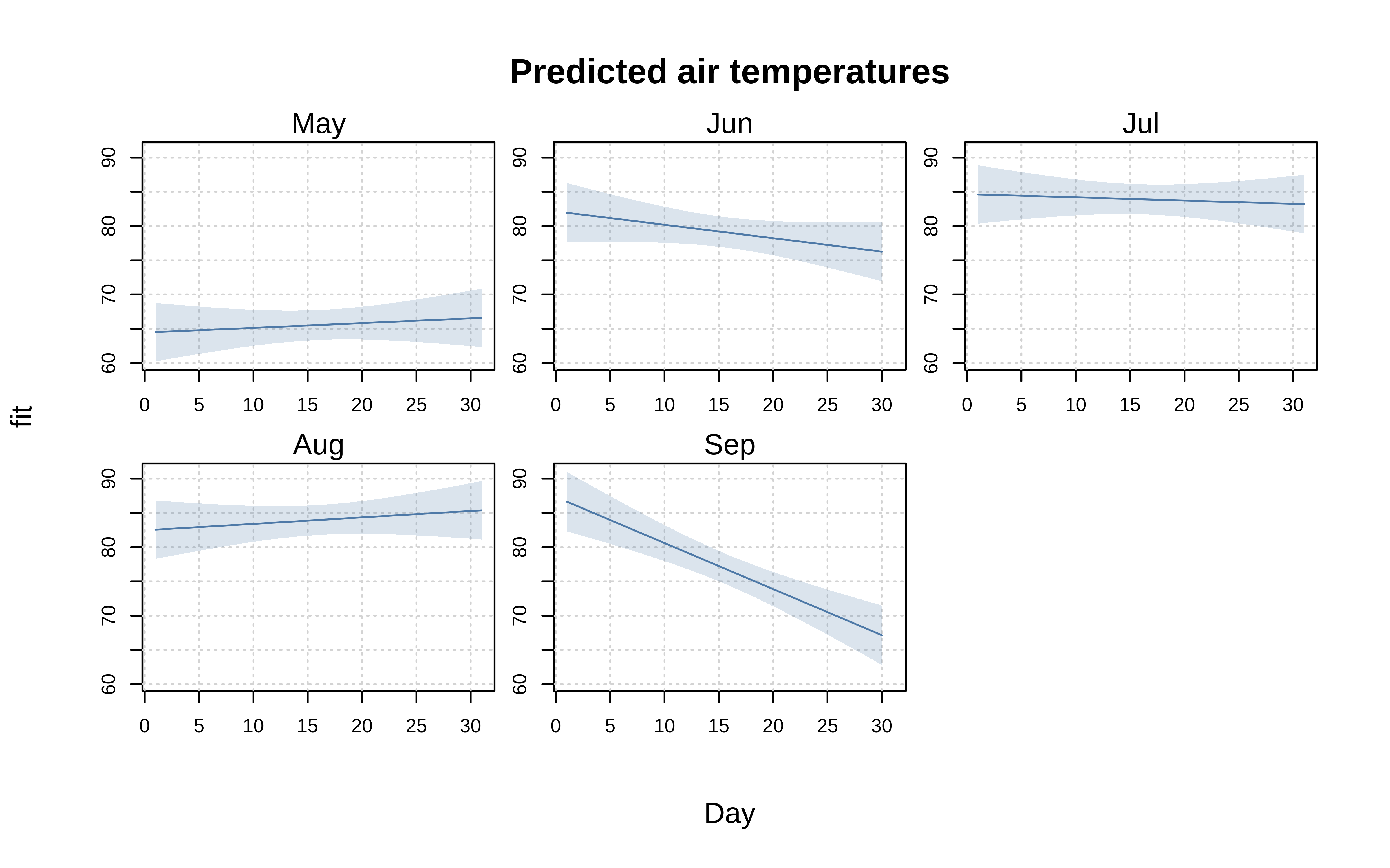
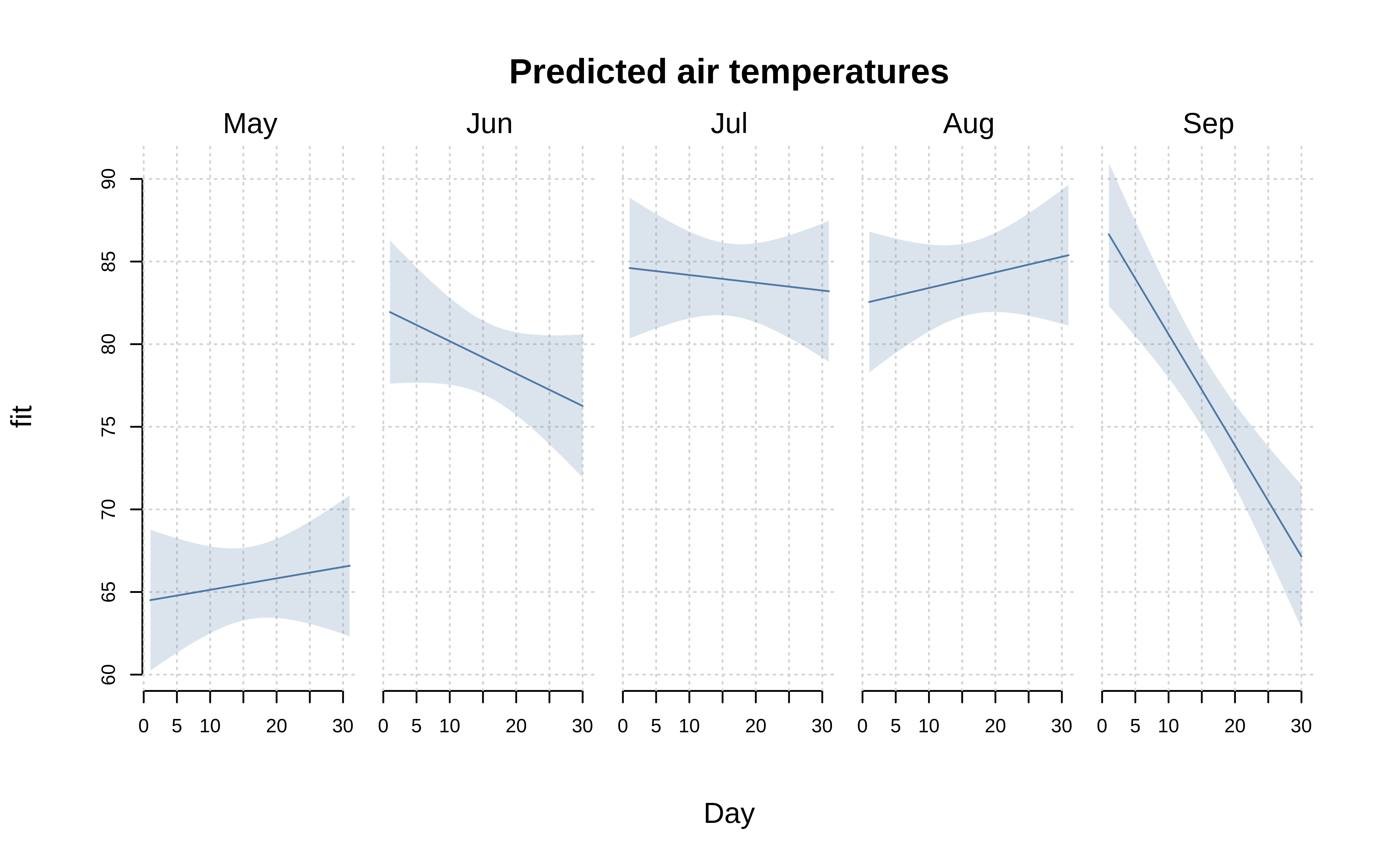
By default, facets will be arranged in a square configuration if more than three facets are detected. Users can override this behaviour by supplying nrow or ncol in the “facet.args” helper function. (The margin padding between individual facets can also be adjusted via the fmar argument.) Note that we can also reduce axis label redundancy by turning off the plot frame.
tinyplot(
  Temp ~ Day, aq,
  facet = ~Month, facet.args = list(nrow = 1),
  type = "lm",
  grid = TRUE,
  frame = FALSE,
  main = "Predicted air temperatures"
)
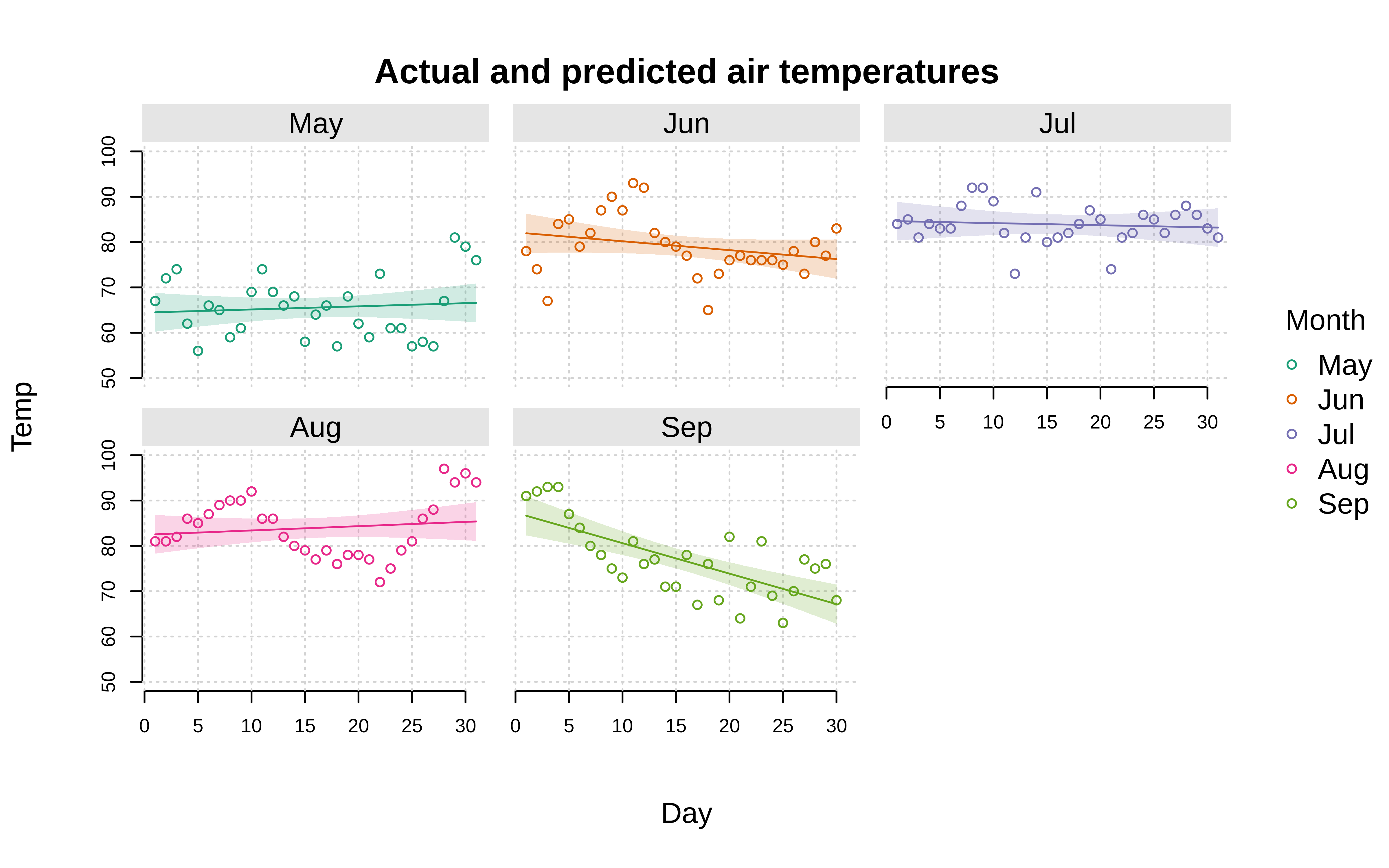
Here’s a slightly fancier version where we combine facets with (by) colour grouping, add a background fill to the facet text, and also overlay the original values alongside our model predictions. For this particular example, we’ll use the facet = "by" convenience shorthand to facet along the same month variable as the colour grouping. But you can easily specify different by and facet variables if that’s what your data support.
tinyplot(
  Temp ~ Day | Month, aq,
  facet = "by", facet.args = list(bg = "grey90"),
  type = "lm",
  palette = "dark2",
  grid = TRUE,
  axes = "l",
  ylim = c(50, 100),
  main = "Actual and predicted air temperatures"
)
tinyplot(
  Temp ~ Day | Month, aq,
  facet = "by", facet.args = list(bg = "grey90"),
  palette = "dark2",
  add = TRUE
)
Note that the facet argument also accepts a two-sided formula for arranging facets in a fixed grid layout. Here’s a simple (if contrived) example.
aq$hot = ifelse(aq$Temp>=75, "hot", "cold")
aq$windy = ifelse(aq$Wind>=15, "windy", "calm")

tinyplot(
 Temp ~ Day, data = aq,
 facet = windy ~ hot,
 # the rest of these arguments are optional...
 facet.args = list(col = "white", bg = "black"),
 pch = 16, col = "dodgerblue",
 grid = TRUE, frame = FALSE, ylim = c(50, 100),
 main = "Daily temperatures vs. wind"
)
The facet.args customizations can also be set globally via the tpar() function, which provides a nice segue to our penultimate section.
Themes
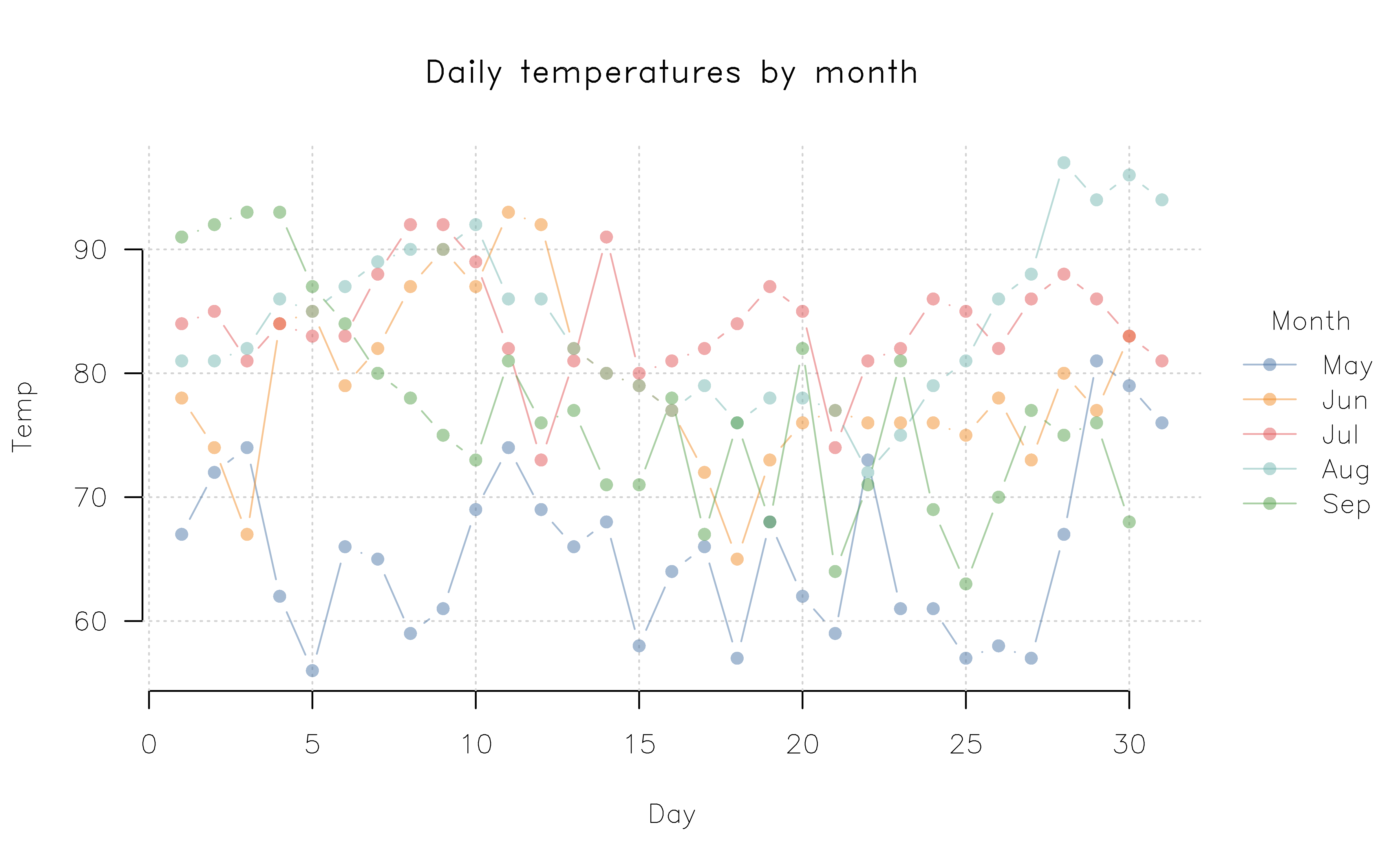
Customizing your plots further is straightforward, whether that is done directly by changing tinyplot arguments for a single plot, or by setting global parameters. For setting global parameters, users can invoke the standard par() arguments. But for improved convenience and integration with the rest of the package, we recommend that users instead go via tpar(), which is an extended version of par() that supports all of the latter’s parameters plus some tinyplot-specific ones. Here’s a quick penultimate example, where we impose several global changes (e.g., rotated axis labels, removed plot frame to get Tufte-style floating axes, etc.) before drawing the plot. change our point character, tick labels, and font family globally, before adding some transparency to our colour palette, and use Tufte-style floating axes with a background panel grid.
op = tpar(
  bty    = "n",           # No box (frame) around the plot
  family = "HersheySans", # Use R's Hershey font instead of Arial default
  grid   = TRUE,          # Add a background grid
  las    = 1,             # Horizontal axis tick labels
  pch    = 16             # Filled points as default
)

tinyplot(
  Temp ~ Day | Month, data = aq,
  type = "b",
  alpha = 0.5,
  main = "Daily temperatures by month"
)
Note: For access to a much wider variety of fonts, you might consider the showtext package (link).
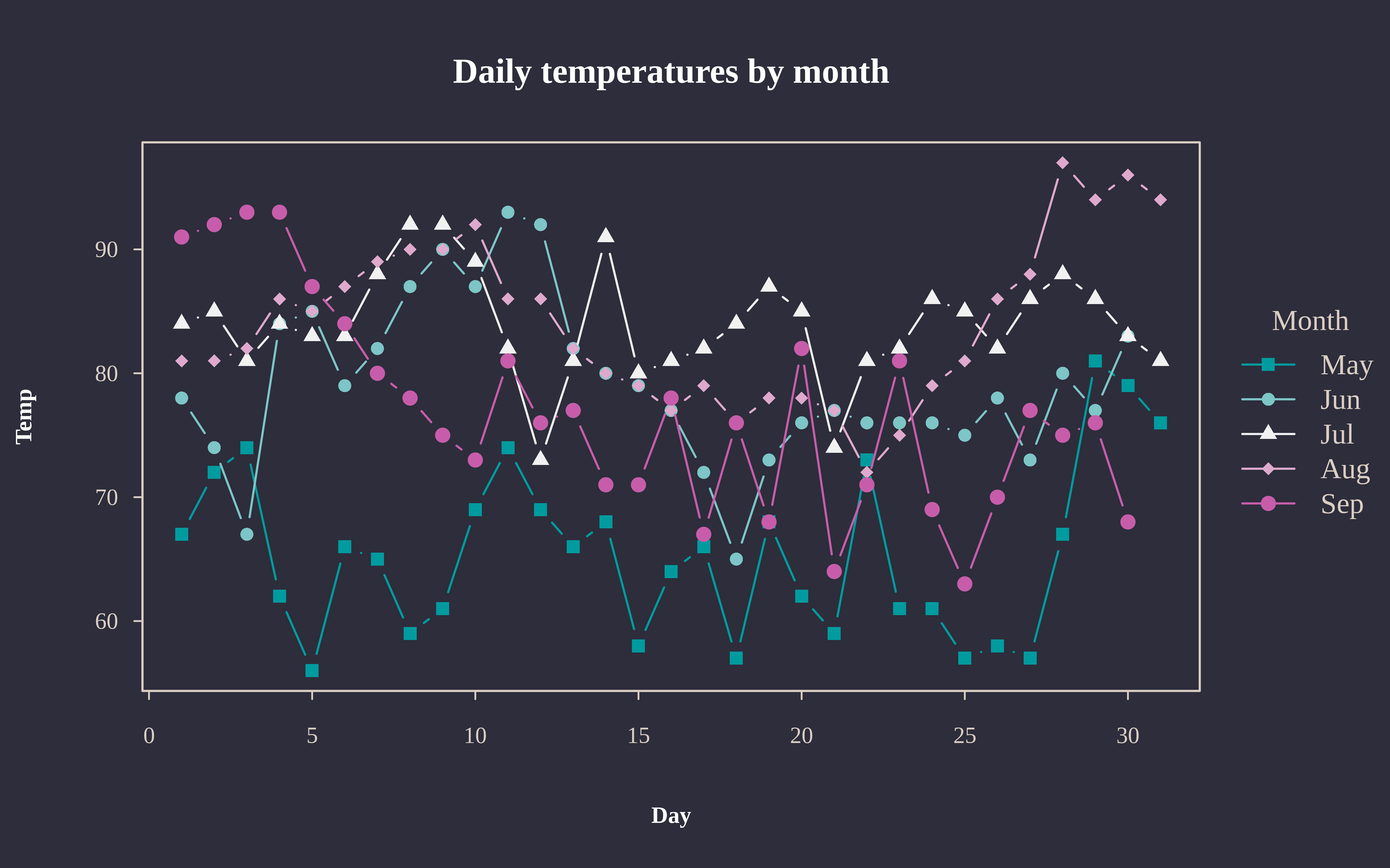
At the risk of repeating ourselves, the use of (t)par in the previous example again underscores the correspondence with the base graphics system. Because tinyplot is effectively a convenience wrapper around base plot, any global elements that you have set for the latter should carry over to the former. For nice out-of-the-box themes, we recommend the basetheme package (link).
tpar(op) # revert global changes from above

library(basetheme)
basetheme("royal") # or "clean", "dark", "ink", "brutal", etc.

tpar(pch = 15) # filled squares as first pch type

tinyplot(
  Temp ~ Day | Month, data = aq,
  type = "b",
  pch = "by",
  palette = "tropic",
  main = "Daily temperatures by month"
)
basetheme(NULL)  # back to default theme
dev.off()
#> null device
#>           1
Saving plots
A final point to note is that tinyplot offers convenience features for exporting plots to disk. Simply invoke the file argument to specify the relevant file path (including the extension type). You can customize the output dimensions (in inches) via the accompanying width and height arguments.5
tinyplot(
  Temp ~ Day | Month, data = aq,
  file = "aq.png", width = 8, height = 5
)

# optional: delete the saved plot
unlink("aq.png")
Alongside convenience, the benefit of this native tinyplot approach (versus the traditional approach of manually opening an external graphics device, e.g. png()) is that all of your current graphic settings are automatically carried over to the exported file. Feel free to try yourself by setting some global graphics parameters via tpar() and then using file to save a plot.
Conclusion
In summary, consider the tinyplot package if you are looking for base R plot functionality with added convenience features. You can use (nearly) the exact same syntax and all of your theme elements should carry over too. It has no dependencies other than base R itself and this should make it an attractive option for package developers, as well as situations where dependency management is expensive (e.g., production pipelines, continuous integration or an R application running in a browser via WebAssembly).
Footnotes
At this point, experienced base plot users might protest that you can colour by groups using the
colargument, e.g.with(aq, plot(Day, Temp, col = Month)). This is true, but there are several limitations. First, you don’t get an automatic legend. Second, the baseplot.formulamethod doesn’t specify the grouping within the formula itself (not a deal-breaker, but not particularly consistent either). Third, and perhaps most importantly, this grouping doesn’t carry over to line plots (i.e., type=“l”). Instead, you have to transpose your data and usematplot. See this old StackOverflow thread for a longer discussion.↩︎See the accompanying help pages of those two functions for more details on the available palettes, or read Zeileis & Murrell (2023, The R Journal, doi:10.32614/RJ-2023-071).↩︎
For example, if you have installed the ggsci package (link) then you could use
palette = ggsci::pal_npg()to generate a palette consistent with those used by the Nature Publishing Group.↩︎The grouped setting here makes this visualization equivalent to
predict(lm(Temp ~ 0 + Month / Day, data = aq), interval = "confidence").↩︎The default dimensions are 7x7, with a resolution of 300 DPI. However, these too can be customized via the
file.width,file.height, andfile.resparameters intpar().↩︎