
Why we need maths in economics 2(b) - Schelling’s segregation model
Slightly later than planned... Here is the second example of a little maths helping to improve our analysis of a real economic problem. I received some complaints about the calculus in my first example being too much for a blog post. As such, I've tried to go for something much simpler this time and the only maths that we'll only be using today is basic arithmetic. Again, however, we're going to see that even a simple setup like this is going to produce very counterintuitive and interesting results. Last thing before continuing: The code for producing the figures in this post can be found here.
===
Topic: The formation of segregated neighbourhoods.
Aim: To show how seemingly innocuous discriminatory preferences among neighbours (in terms of race, sex, etc) can lead to completely segregated outcomes at the aggregate level.
When research has been done in racially segregated neighbourhoods, one interesting (and consistent) finding is that respondents from these areas generally claim to desire more integration. “We don’t want to live in segregated neighbourhoods!” they implore. However, there are usually some important caveats thrown in and a typical response might be, “I want to live in an integrated neighbourhood... just as long as I am not in too much of a minority”. Nevertheless, what if such “very minor” discriminatory preferences are still enough to lead us to completely segregated outcomes?
This is the question that Nobel laureate Thomas Schelling first explored in a seminal paper back in 1969. He later extended his analysis in a series of subsequent books and articles (e.g. here). Alongside his contributions to game theory and conflict strategy, the brilliance of Schelling's work was to examine not only the underlying motivations characterising individual behaviour, but also the implications of individuals acting on each other in the aggregate.
I say “in the aggregate”, though this is a potentially misleading phrase. We have become used to interpreting “aggregates” as something like the average behaviour of individuals. However, much of Schelling’s research has been aimed at proving the exact opposite; i.e. that aggregate results in society are not necessarily simple extrapolations from the individual. Instead, aggregate outcomes are often much more complex since they result from a system of interactions between individuals and their environment. In other words, we impact others and our environment by our actions, while they impact us in turn. These complex interactions can lead to the emergence of surprising and even undesirable outcomes when considered at the societal level. This led Schelling to make the famous distinction between "Micromotives and Macrobehaviour".
Right, so let’s establish the stylised “facts” for the particular model that we’ll be using here. The most important assumptions are as follows:
- People live in different neighbourhoods. If someone is unhappy with their current neighbourhood, then they can costlessly move to a new one. In this model, the only thing that makes people (un)happy about where they live is the racial profile of their neighbours.
- For simplicity we specify a population that consists of only two ethnic groups: greens and reds. In this example, we’ll assume that there are 50 greens in the population and 100 reds.
- Both green and red individuals have a variety of “tolerance levels”, reflecting the maximum ratio of race mixing that each person is prepared to accept in his or her neighbourhood. If the colour ratio exceeds a person’s particular tolerance ratio, then they will move to another neighbourhood where they are satisfied. Those with the highest intolerance will move first.
- Finally, we assume that tolerance levels among greens and reds can be ordered sequentially from high to low. For both groups, let us say that the most tolerant individual will accept a ratio of 2:1. (In other words, he or she would be willing live in a neighbourhood as a one-third minority.) The median individual will then tolerate a ratio of 1:1, while the least tolerant will accept no person of opposite colour in their neighbourhood.
From the above, it should be obvious that there are many greens and reds who would be happy to live in mixed neighbourhoods. However, in order to analyse which particular combinations are most likely to occur, as well as the processes that cause people to leave or join a neighbourhood, we must turn to a little maths.
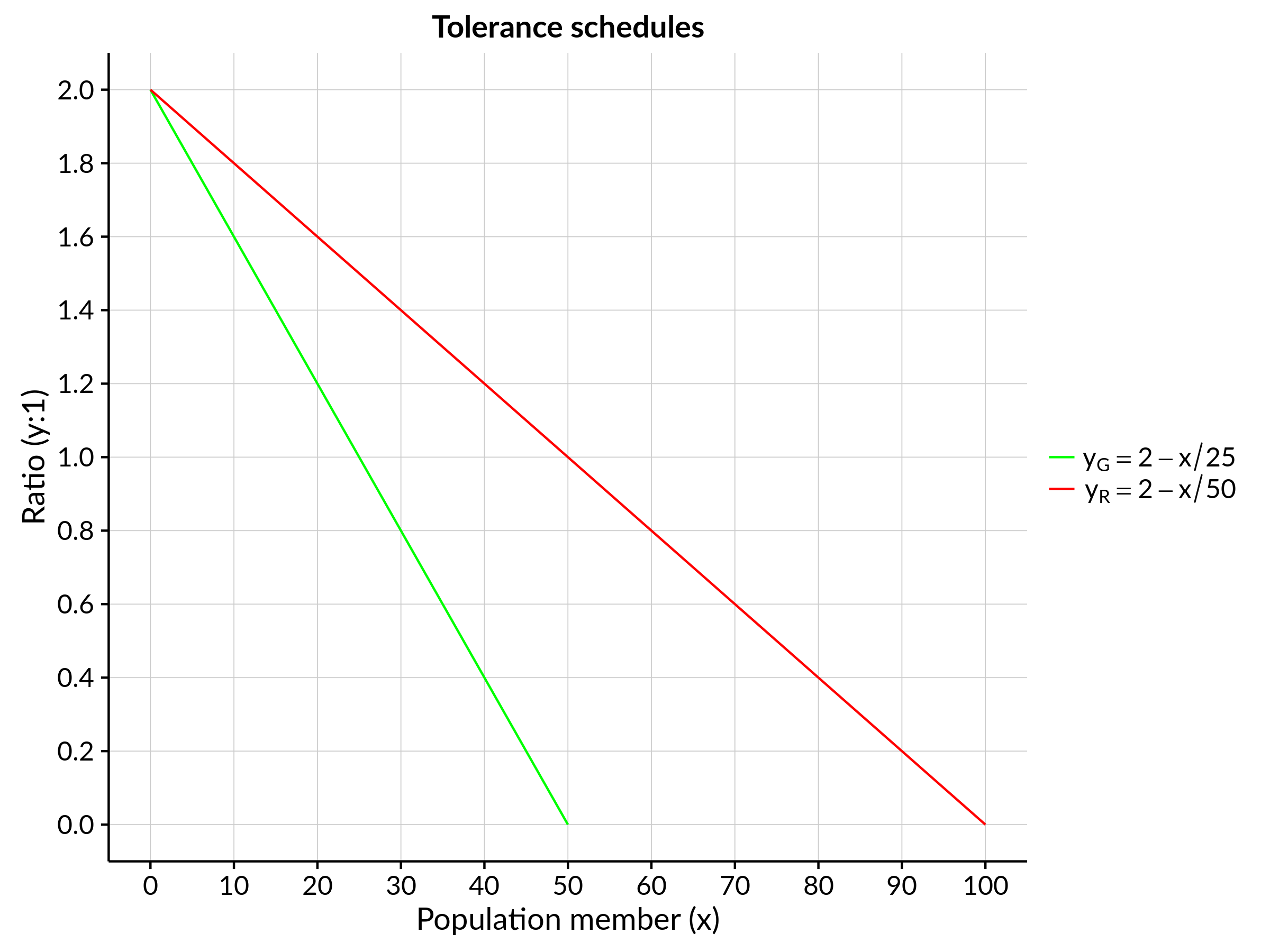
The first thing to do is create tolerance schedules for our two race groups. Recalling our ratios from earlier, we can describe both populations with simple curves: \(y_G = 2 - \frac{1}{25}x\) for greens and \(y_R = 2 - \frac{1}{50}x\) for reds. In graphical form:
Next, we translate these tolerance schedules into “absolute-numbers” curves by simply multiplying the population level by the corresponding tolerance ratio. In other words, we're finding out how many greens each red is prepared to tolerate, and vice versa. The parabolic shape of the resulting curves reflect the diminishing level of tolerance among each population, as you move from the most tolerant individual of the group to the least tolerant:

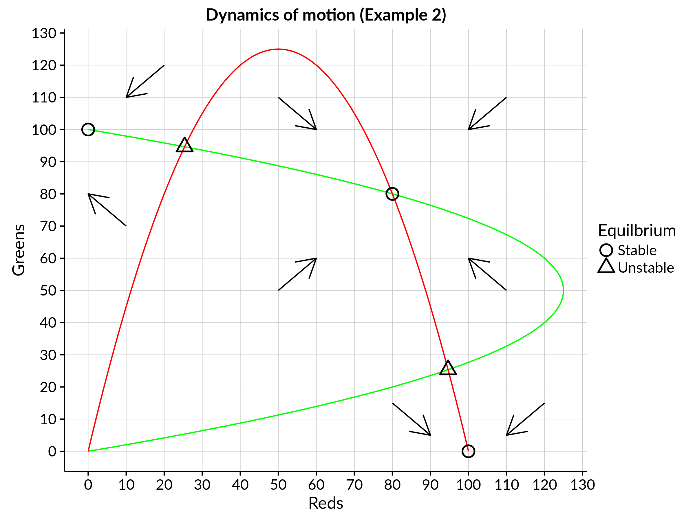
Note the placement of the green population on the vertical axis, and how this allows us to easily compare the interaction with the red population. There are three main areas: 1) The overlap area (bottom left-hand corner) represents a potential mix of reds and greens that can coexist happily in the same neighbourhood. 2) The area beneath the red curve and to the right of the green curve represents a neighbourhood mix where all the reds will be satisfied, but not all the greens. 3) In contrast, the area within the green curve and above the red curve represents a neighbourhood mix where all the greens are satisfied, but not all the reds.
Importantly, the above phase diagram also depicts the dynamics of motion of the system. This is what the arrows are showing us: We can see how the populations of the two groups will be changing at any particular point. For example, the bottom-left arrow (pointing up and to the right) indicates that the numbers of reds and greens will be increasing together at low population levels. However, if reds begin to settle in the neighbourhood at a faster rate than greens, then some greens will be motivated to leave. This in turn exacerbates the problem, since the ratio of greens to reds now becomes even worse which prompts more greens to leave! And so, we inexorably move towards neighbourhood comprised entirely of reds. (This is depicted by the bottom-middle arrow that is pointing down to the right.) In this way, the dynamics of motion show us that we can approach three possible equilibria. However, only two of these — the completely segregated outcomes — are stable. The mixed equilibrium combination is unstable since any disturbance, the departure or arrival of a new neighbour, has the potential to set off a chain reaction that will ultimately lead to one colour completely dominating the neighbourhood!
Importantly, the above phase diagram also depicts the dynamics of motion of the system. This is what the arrows are showing us: We can see how the populations of the two groups will be changing at any particular point. For example, the bottom-left arrow (pointing up and to the right) indicates that the numbers of reds and greens will be increasing together at low population levels. However, if reds begin to settle in the neighbourhood at a faster rate than greens, then some greens will be motivated to leave. This in turn exacerbates the problem, since the ratio of greens to reds now becomes even worse which prompts more greens to leave! And so, we inexorably move towards neighbourhood comprised entirely of reds. (This is depicted by the bottom-middle arrow that is pointing down to the right.) In this way, the dynamics of motion show us that we can approach three possible equilibria. However, only two of these — the completely segregated outcomes — are stable. The mixed equilibrium combination is unstable since any disturbance, the departure or arrival of a new neighbour, has the potential to set off a chain reaction that will ultimately lead to one colour completely dominating the neighbourhood!
Now, of course, this was a rather specific example used for illustration. You might ask whether the segregated outcome depends for instance, on the relative sizes of our green and red populations? The answer to that question is “not really”. A one-colour equilibrium is still the inevitable result even when we have reds and greens in equal numbers. However, having equal numbers together with steeper tolerance schedules will tend to produce a stable equilibrium. For example, if there are 100 reds and greens and they both have a tolerance schedule where the median individual can tolerate being in a 2.5:1 minority, then we end up with the following:
In this alternative schedule, we see that we have three stable equlibria, including one interior solution (a mix of 80 reds and 80 greens). While this interior solution is robust to fairly large perturbations, assuming that we begin at a segregated outcome, then a move towards a stable mixed result will require the concerted entry of more than 25 percent of the other colour.
THOUGHT FOR THE DAY: It’s easy to assume that people living in segregated neighbourhoods are relatively racist. Similarly, we might also assume that people who express a desire to live in integrated neighbourhoods will automatically arrive at such an outcome through conventional market processes. However, the Schelling model shows us that even small preferences for a degree of homogeneity – for just a few of our neighbours to be “like us” – is enough to cause segregated outcomes at the aggregate. The model depicted here is very simplified and hardly perfect, but still provides extremely valuable insights into the emergent dynamics of segregation. It also illustrates how relatively simple maths can be used to deal with complex and counterintuitive phenomena.
PS - The Schelling segration model is usually celebrated as one of the world's first agent-based models (ABMs). It should be said that ABMs differ from conventional, analytical mathematics and rely much more on computation and iteration. (I would, however, argue that the mathematic approach taken here was crucial to proving that Schelling's results held more generally.) While modern ABMs rely on high-powered computation, Schelling used a simple coin and chessboard setup to illustrate his point. You can try that yourself... or, you can use eggs!
Note: Those of you paying attention might notice that this video is slightly different in terms of set-up to the model that I have discussed above, in that it each person (egg's) neighbourhood is limited to the spaces immediately alongside them. Schelling called this a "spatial proximity model". In contrast, the model presented above analyses the make-up of the neighbourhood as a whole and is called the "bounded neighbourhood model".
Comments