This blog post pulls together various tips and suggestions that I’ve left around the place. My main goal is to show you some simple workflows that I use for high-performance geospatial work in R, leaning on the data.table, sf and geos packages.
If you’re the type of person who likes to load everything at once, here are the R libraries and theme settings that I’ll be using in this post. (Don’t worry if not: I’ll be loading them again in the relevant sections below to underscore why I’m calling a specific library.)
Everyone who does spatial work in R is familiar with the wonderful sf package. You know, this one:
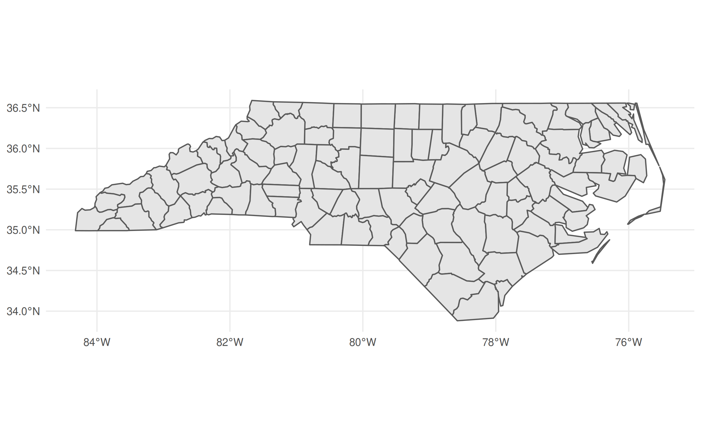
The revolutionary idea of sf was (is) that it allowed you to treat spatial objects as regular data frames, so you can do things like this:
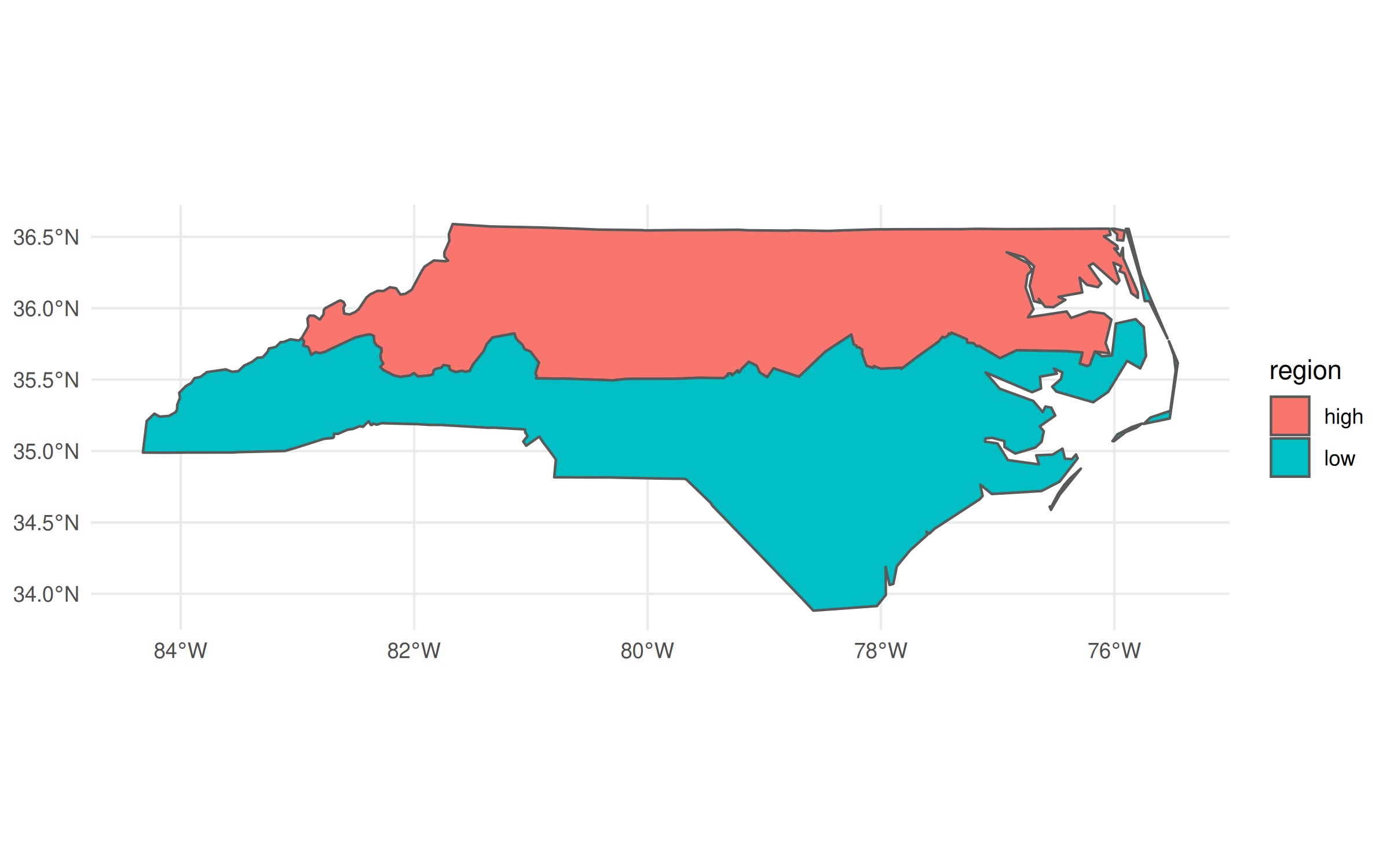
In the above code chunk, I’m using dplyr to do a grouped aggregation on our North Carolina data object. The aggregation itself is pretty silly—i.e. divide the state into two hemispheres—but the same idea extends to virtually all of dplyr’s capabilities. It makes for a very potent and flexible combination that has driven an awful lot of R-based spatial work in recent years.
At the same time, there’s another powerful data wrangling library in R: data.table. This post is not going to rehash the (mostly pointless) debates about which of dplyr or data.table is better.1 But I think it’s fair to say that the latter offers incredible performance that makes it a must-use library for a lot of people, including myself. Yet it seems to me that many data.table users aren’t aware that you can use it for spatial operations in exactly the same way.
If you’re following along on your own computer, make sure to grab the development version (v1.14.3) before continuing:
Okay, let’s create a “data.table” version of our nc
object and take a
quick look at the first few rows and some columns.
At this point, I have to briefly back up to say that the reason I wanted you to
grab the development version of data.table is that it “pretty prints” the
columns by default. This not only includes the columns types and keys (if you’ve
set any), but also the special sfc_MULTIPLOYGON
list columns which is where
the sf magic is hiding. It’s a small cosmetic change that nonetheless
underscores the integration between these two packages.2
Just like we did with dplyr earlier, we can now do grouped spatial operations on this object using data.table’s concise syntax:
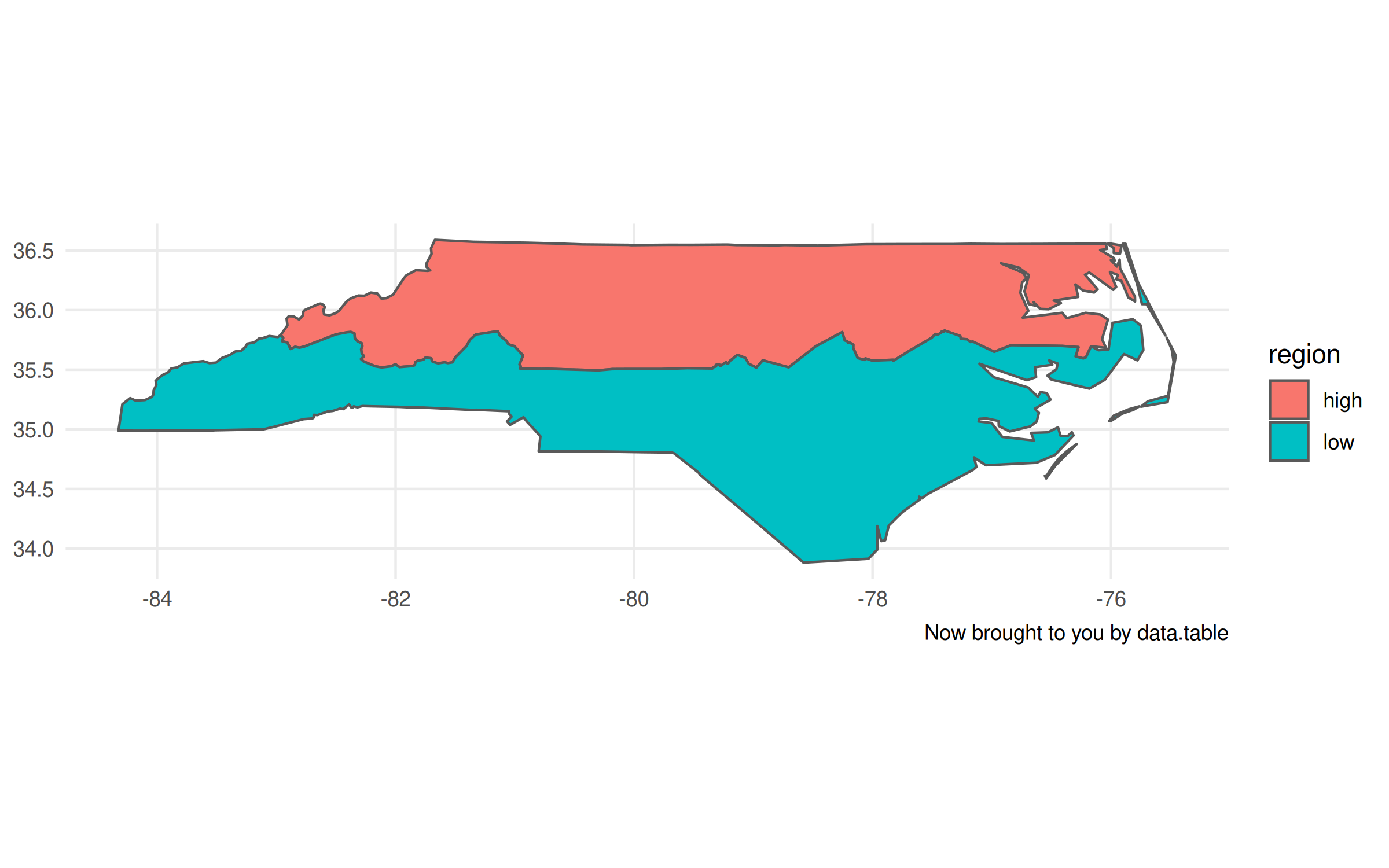
Now, I’ll admit that there are a few tiny tweaks we need to make to the plot
call. Unlike with the non-data.table workflow, this time we have to specify
the geometry aesthetic with aes(geometry=geometry, ...)
. Otherwise,
ggplot2 won’t know what do with this object. The other difference is that it
doesn’t automatically recognise the CRS (i.e. “NAD27”), so the projection is a
little off. Again, however, that information is contained with the geometry
column of our nc_dt
object. It just requires that we provide the CRS
to our plot call explicitly.
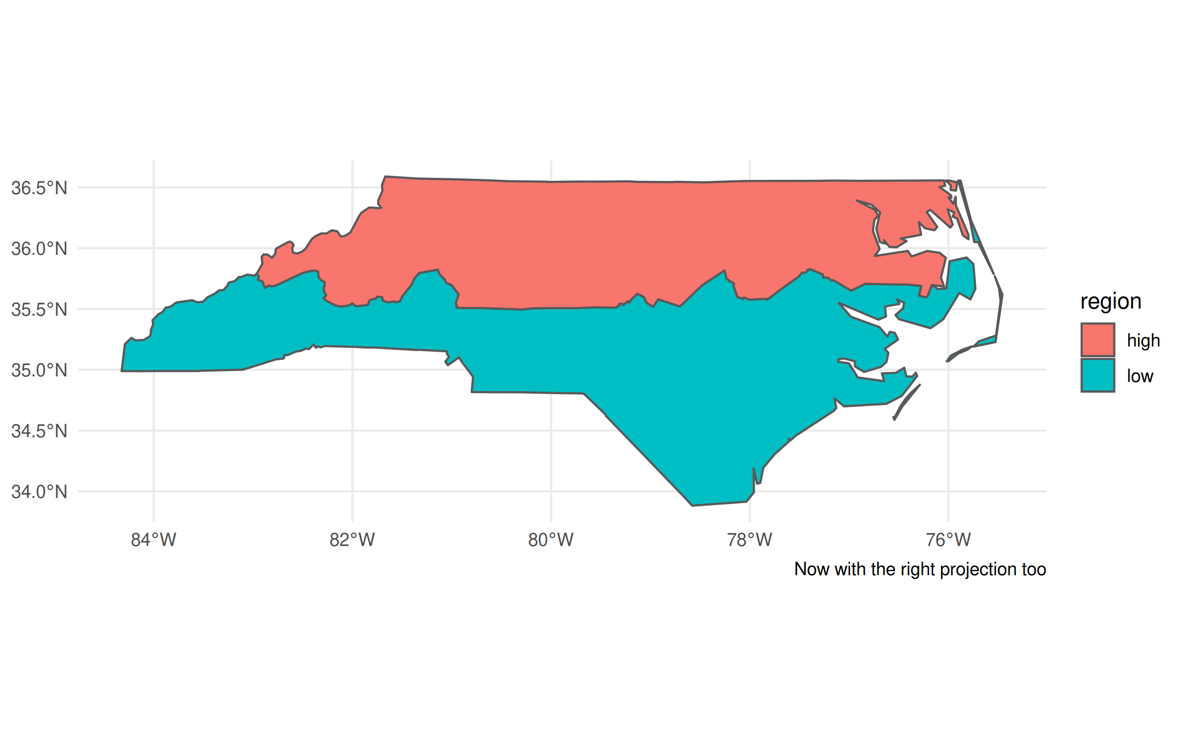
Plotting tweaks aside, I don’t want to lose sight of the main point of this post, namely: sf and data.table play perfectly well together. You can do (grouped) spatial operations and aggregations inside the latter, exactly how you would any other data wrangling task. So if you love data.table’s performance and syntax, then by all means continue using it for your spatial work too. Speaking of performance…
Update (2022-02-16): The benchmarks in this section are a bit unfair, since geos assumes planar (“flat”) geometries, whereas sf assumes spherical (“curved”) geometries by default. See the postscript at the bottom of this post, which corrects for this discrepancy.
As great as sf is, even its most ardent proponents will admit that it can drag a bit when it comes to big geospatial tasks. I don’t want to imply that that it’s “slow”. But I’ve found that it does lag behind geopandas, for example, when I’m doing heavy geospatial computation or working with really large spatial files. Luckily, there’s a new package in town that offers major performance gains and plays very well with the workflow I demonstrated above.
Dewey Dunnington and Edzer Pebesma’s
geos package covers all of
the same basic geospatial
operations as sf.
But it does so by directly wrapping the underlying GEOS
API, which is written
in C and is thus extremely performant. Here’s a simple example, where we
calculate the centroid of each North Carolina county.
A couple of things worth noting. First, the geos centroid calculation
completes orders of magnitude faster than the sf equivalent. Second, the
executing functions are very similar (st_centroid()
vs geos_centroid()
).
Third, we have to do an explicit as_geos_geometry()
coercion before we can
perform any geos operations on the resulting object.
That last point seems the most mundane. (Why aren’t you talking more about how crazy fast geos is?!) But it’s important since it underscores a key difference between the two packages and why the developers view them as complements. Unlike sf, which treats spatial objects as data frames, geos only preserves the geometry attributes. Take a look:
Gone are all those extra columns containing information about county names, FIPS codes, population numbers, etc. etc. We’re just left with the necessary information to do high-performance spatial operations.
Because we’ve dropped all of the sf / data frame attributes, we can’t use ggplot2 to plot anymore. But we can use the base R plotting method:
Actually, that’s not quite true, since an alternative is to convert it back into an
sf object with st_as_sf()
and then call ggplot2. This is particularly
useful because you can hand off some heavy calculation to geos before
bringing it back to sf for any additional functionality. Again, the
developers of these packages designed them to act as complements.
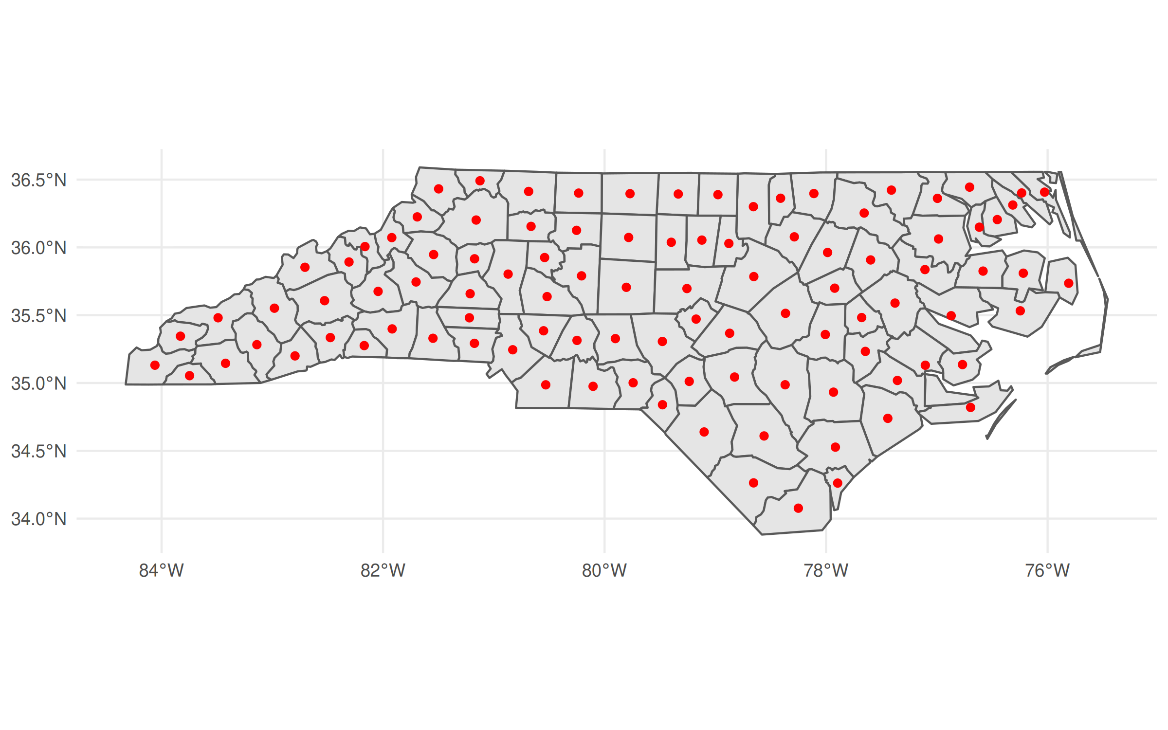
Okay, back to the main post…
Finally, we get to the pièce de résistance of today’s post. The fact that
as_geos_geometry()
creates a GEOS geometry object—rather than
preserving all of the data frame attributes—is a good thing for our
data.table workflow. Why? Well, because we can just include this
geometry object as a list column inside our data.table.3
In turn, this means you can treat spatial operations as you would any other
operation inside a data.table. You can aggregate by group, merge, compare,
and generally combine the power of data.table and geos as you see fit.
(The same is true for regular data frames and tibbles, but we’ll get to that.)
Let’s prove that this idea works by creating a GEOS column in our data.table.
I’ll creatively call this column geo
, but really you could call it anything
you want (including overwriting the existing geometry
column).
GEOS column in hand, we can manipulate or plot it directly from within the data.table. For example, we can recreate our previous centroid plot.
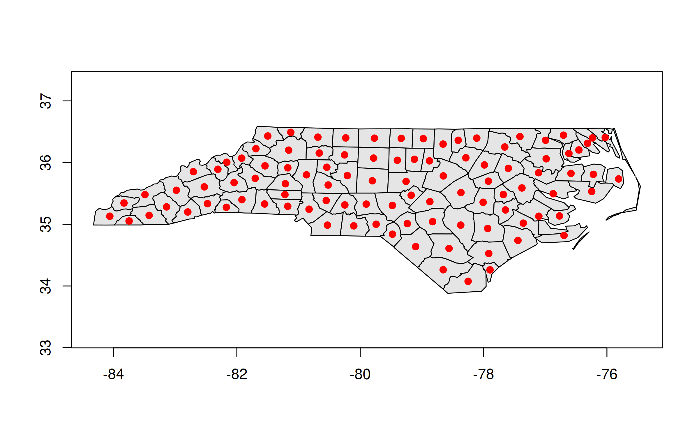
And here’s how we could replicate our earlier “hemisphere” plot:
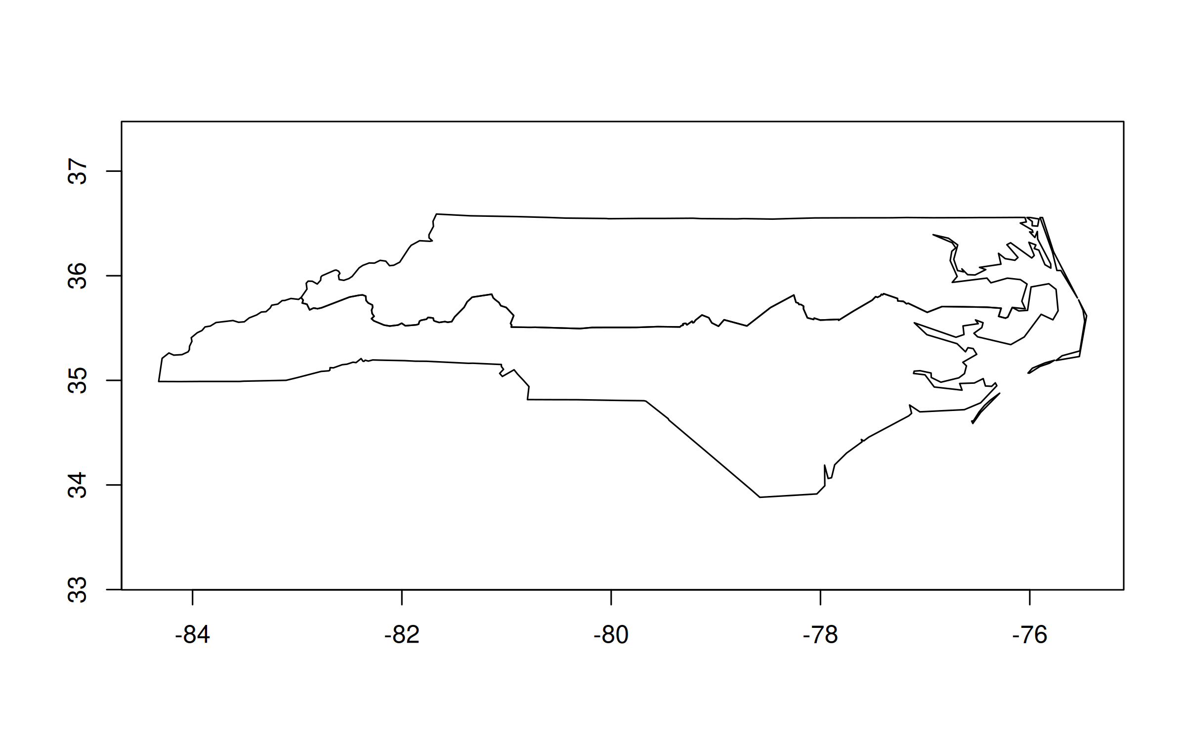
This time around the translation from the equivalent sf code isn’t as
direct. We have one step (st_union()
) vs. two
(geos_make_collection() |> geos_unary_union()
). The second geo_unary_union()
step is clear enough. But it’s the first geos_make_collection()
step that’s
key for our aggregating task. We have to tell geos to treat everything
within the same group (i.e. whatever is in by = ...
) as a collective. This
extra step becomes very natural after you’ve done it a few times and is a small
price to pay for the resulting performance boost.
Speaking of which, it’s nearly time for some final benchmarks. The only extra thing I want to do first is, as promised, include a tibble/dplyr equivalent. The exact same concepts and benefits carry over here, for those of you that prefer the tidyverse syntax and workflow.4
For this final set of benchmarks, I’m going to horserace the same grouped aggregation that we’ve been using throughout.
Result: A 10x speed-up. Nice! While the toy dataset that we’re using here is too small to make a meaningful difference in practice, those same performance benefits will carry over to big geospatial tasks too. Being able to reduce your computation time by a factor of 10 really makes a difference once you’re talking minutes or hours.
My takeaways:
It’s fine to treat sf objects as data.tables (or vice versa) if that’s your preferred workflow. Just remember to specify the geometry column.
For large (or small!) geospatial tasks, give the geos package a go. It integrates very well with both data.table and the tidyverse, and the high-performance benefits carry over to both ecosystems.
By the way, there are more exciting high-performance geospatial developments on the way in R (as well as other languages) like geoarrow. We’re lucky to have these tools at our disposal.
Note: This section was added on 2021-01-16.
As Roger Bivand points out on Twitter, I’m not truly comparing apples with apples in the above benchmarks. geos assumes planar (“flat”) geometries, whereas sf does the more complicated task of calculating spherical (“curved”) geometries. More on that here if you are interested. Below I repeat these same benchmarks, but with sf switched to the same planar backend. The upshot is that geos is still faster, but the gap narrows considerably. A reminder that we’re also dealing with a very small dataset, so I recommend benchmarking on your own datasets to avoid the influence of misleading overhead. But I stand by my comment that these differences persist at scale, based on my own experiences and testing.
Use what you want, people. ↩
None of the actual functionality that I show here requires the dev version of data.table. But I recommend downloading it regardless, since v1.14.3 is set to introduce a bunch of other killer features. I might write up a list of my favourites once the new version hits CRAN. In the meantime, if any DT devs are reading this, please pretty please can we include these two PRs (1, 2) into the next release too. ↩
Yes, yes. I know you can include a (list) column of data frames within a data.table. But just bear with me for the moment. ↩
The important thing is that you explicitly convert it to a tibble. Leaving it as an sf object won’t yield the same speed benefits. ↩
I wanted to quickly follow up on my last post about efficient simulations in R. If you recall, in that post we used data.table and some other tricks to run 40,000 regressions (i.e. 20k simulations with 2 regressions each) in just over 2 seconds. The question before us today is: Can we go even faster using only base R? And it turns out that the answer is, yes, we can.
My motivation for a follow-up is partially the result of this very nice post by Benjamin Elbers, who replicates my simulation using Julia. In so doing, he demonstrates some of Julia’s killer features; most notably the fact that we don’t need to think about vectorisation — e.g. when creating the data — since Julia’s compiler will take care of that for us automatically.1 But Ben also does another interesting thing, which is to show the speed gains that come from defining our own (super lean) regression function. He uses Cholesky decomposition and it’s fairly straightforward to do the same thing in R. (Here is a nice tutorial by Issac Lee.)
I was halfway on my way to doing this myself when I stumbled on a totally different post by R Core member, Martin Maechler. Therein he introduces the .lm.fit()
function (note the leading dot), which incurs even less overhead than the lm.fit()
function I mentioned in my last post. I’m slightly embarrassed to say I had never heard about it until now2, but a quick bit of testing “confirms” Martin’s more rigorous benchmarks: .lm.fit
yields a consistent 30-40% improvement over even lm.fit
.
Now, it would be trivial to amend my previous simulation script to slot in .lm.fit()
and re-run the benchmarks. But I thought I’d make this a bit more interesting by redoing the whole thing using only base R. (I’ll load the parallel package, but that comes bundled with the base distribution so hardly counts as cheating.) Here’s the full script with benchmarks for both sequential and parallel implementations at the bottom.
There you have it. Down to less than a second for a simulation involving 40,000 regressions using only base R.3 On a laptop, no less. Just incredibly impressive.
Conclusion: No grand conclusion today… except a sincere note of gratitude to the R Core team (and Julia devs and so many other OSS maintainers) for providing us with such an incredible base to build from.
P.S. Achim Zeileis (who else?) has another great tip for speeding up simulations where the experimental design is fixed here.
In this house, we stan both R and Julia. ↩
I think Dirk Eddelbuettel had mentioned it to me, but I hadn’t grokked the difference. ↩
Interestingly enough, this knitted R markdown version is a bit slower than when I run the script directly in my R console. But we’re really splitting hairs now. (As an aside: I won’t bother plotting the results, but you’re welcome to run the simulation yourself and confirm that it yields the same insights as my previous post.) ↩
Being able to code up efficient simulations is one of the most useful skills that you can develop as a social (data) scientist. Unfortunately, it’s also something that’s rarely taught in universities or textbooks.1 This post will cover some general principles that I’ve adopted for writing fast simulation code in R.
I should clarify that the type of simulations that I, personally, am most interested in are related to econometrics. For example, Monte Carlo experiments to better understand when a particular estimator or regression specification does well (or poorly). The guidelines here should be considered accordingly and might not map well on to other domains (e.g. agent-based models or numerical computation).
I’m going to illustrate by replicating a simulation result in a paper that I really like: “Interaction effects in econometrics” by Balli & Sørensen (2013) (hereafter, BS13).
BS13 does various things, but one result in particular has had a big impact on my own research. They show that empirical researchers working with panel data are well advised to demean any (continuous) variables that are going to be interacted in a regression. That is, rather than estimating the model in “level” terms…
\[Y_{it} = \mu_i + \beta_1X1_{it} + \beta_2X2_{it} + \beta_3X1_{it} \cdot X2_{it} + \epsilon_{it}\]… you should estimate the “demeaned” version instead2
\[Y_{it} = \beta_0 + \beta_1 (X1_{it} - \overline{X1}_{i.}) + \beta_2 (X2_{it} - \overline{X2}_{i.}) + \beta_3(X1_{it} - \overline{X1}_{i.}) \cdot (X2_{it} - \overline{X2}_{i.}) + \epsilon_{it}\]Here, $\overline{X1}_{i.}$ refers to mean value of variable $X1$ (e.g. GDP over time) for unit $i$ (e.g. country).
We’ll get to the simulations in a second, but BS13 describe the reasons for their recommendation in very intuitive terms. The super short version — again, you really should read the paper — is that the level model can pick up spurious trends in the case of varying slopes. The implications of this insight are fairly profound… if for no other reason that so many applied econometrics papers employ interaction terms in a panel setting.3
Okay, so a potentially big deal. But let’s see a simulation and thereby get the ball rolling for this post. I’m going to run a simulation experiment that exactly mimics one in BS13 (see Table 3). We’ll create a fake dataset where the true interaction is ZERO. However, the slope coefficient of one of the parent terms varies by unit (here: country). If BS13 is right, then including an interaction term in our model could accidentally result in a spurious, non-zero coefficient on this interaction term. The exact model is
\[y_{it} = \alpha + x_{1,it} + 1.5x_{2,it} + \epsilon_{it}\]It will prove convenient for me to create a function that generates an instance of the experimental dataset — i.e. corresponding to one simulation run — which is what you see in the code below. The exact details are not especially important. (I’m going to coerce the return object into a data.table instead of standard data frame, but I’ll get back to that later.) For now, just remember that the coefficient on any interaction term should be zero by design. I’ll preview the resulting dataset at the end of the code.
Let’s run some regressions on one simulated draw of our dataset. Since this is a panel model, I’ll use the (incredible) fixest package to control for country (“id”) fixed-effects.
Well, there you have it. The “level” model spuriously yields a statistically significant coefficient on the interaction term. In comparison, the “demeaned” version avoids this trap and also appears to have better estimated the parent term coefficients.
Cool. But to really be sure, we should repeat our simulation many times. (BS13 do it 20,000 times…) And, so, we now move on to the main purpose of this post: How do we write simulation code that efficiently completes tens of thousands of runs? Here follow some key principles that I try to keep in mind.
Subtitle: lm.fit()
is your friend
The first key principle for writing efficient simulation code is to trim the fat as much as possible. Even small differences start to add up once you’re repeating operations tens of thousands of times. For example, does it really make sense to use fixest::feols()
for this example data? As much as I am a huge fixest stan, in this case I have to say… no. The package is optimised for high-dimensional fixed-effects, clustered errors, etc. Our toy dataset contains just one fixed-effect (comprising two levels) and we are ultimately only interested in extracting a single coefficient for our simulation. We don’t even need to save the standard errors. Most of fixest’s extra features are essentially wasted. We could probably do better just by using a simple lm()
call and specifying the country fixed-effect (“id”) as a factor.
However, lm()
objects still contain quite a lot of information (and invoke extra steps) that we don’t need. We can simplify things even further by directly using the fitting function that lm
calls underneath the hood. Specifically, the lm.fit()
function. This requires a slightly different way of writing our regression model — closer to matrix form — but yields considerable speed gains. Here’s a benchmark to demonstrate.
For this small dataset example, a regular lm()
call is about five times faster than feols()
… and lm.fit()
is a further ten times faster still. Now, we’re talking microseconds here and the difference is not something you’d notice running a single regression. But… once you start running 20,000 of them, then those microseconds start to add up.4 Final thing, just to prove that we’re getting the same coefficients:
The output is less visually appealing a regular regression summary, but we can see the interaction term coefficient of 0.01993247
in the order in which it appeared (i.e. “x4”). FWIW, you can also name the coefficients in the design matrix if you wanted to make it easier to reference a coefficient by name. This is what I’ll be doing in the full simulation right at the end.
Subtitle: It’s much quicker to generate one large dataset than many small ones
One common bottleneck I see in a lot of simulation code is generating a small dataset for each new run of a simulation. This is much less efficient that generating a single large dataset that you can either sample from during each iteration, or subset by a dedicated simulation ID. We’ll get to iteration next, but this second principle really stems from the same core idea: vectorisation in R is much faster than iteration. Here’s a simple benchmark to illustrate, where we generate data for a 100 simulation runs. Note that the relative difference would keep growing as we added more simulations.
Subtitle: Let data.table and co. handle the heavy lifting
The standard approach to coding up a simulation is to run everything as an iteration, either using a for()
loop or an lapply()
call. Experienced R programmers are probably reading this section right now and thinking, “Even better; run everything in parallel.” And it’s true. A Monte Carlo experiment like the one we’re doing here is ideally suited to parallel implementation, because each individual simulation run is independent. It’s a key reason why Monte Carlo experiments are such popular tools for teaching parallel programming concepts. (Guilty as charged.)
But any type of explicit iteration — whether it is a for()
loop or an lapply()
call, or whether it is run sequentially or in parallel — runs up against the same problem as we saw in Principle 2. Specifically, it is slower than vectorisation. So how can we run our simulations in vectorised fashion? Well, it turns out there is a pretty simple way that directly leverages Principle 2’s idea of generating one large dataset: We nest our simulations directly in our large data.table or tibble.
Hadley and Garret’s R for Data Science book has a nice chapter on model nesting with tibbles, and then Vincent has a cool blog post replicating the same workflow with data.table. But, really, the core idea is pretty simple: We can use the advanced data structure and functionality of tibbles or data.tables to run our simulations as grouped operations (i.e. by simulation ID). In other words, just like we can group a data frame and then collapse down to (say) mean values, we can also group a data frame and then run a regression on each subgroup.
Why might this be faster than explicit parallel iteration? Well, basically it boils down to the fact that data.tables and tibbles provide an enhanced structure for returning complex objects (including list columns) and their grouped operations are highly optimised to run in (implicit) parallel at the C++ level.5 The internal code of data.table, in particular, is just so insanely optimised that trying to beat it with some explicit parallel loop can be a fool’s errand.
Okay, so let’s see a benchmark. I’m going to compare three options for simulating 100 draws: 1) sequential iteration with lapply()
, 2) explicit parallel iteration with parallel::mclapply
, and 3) nested (implicit parallel) iteration. For the latter, I’m simply grouping my dataset by simulation ID and then leveraging data.table’s powerful .SD
syntax.6 Note further than I’m going to run regular lm()
calls rather than lm.fit()
— see Principle 1 — because I want to keep things simple and familiar for the moment.
Okay, not a huge difference between the three options for this small benchmark. But — trust me — the difference will grow for the full simulation where we’re comparing the level vs demeaned regressions with UPDATE: Upon reflection, I’m not being quite fair to lm.fit()
.mclapply()
here, because it is being penalised for overhead on a small example. But I definitely stand by my next point. There are also some other reasons why relying on data.table will help us here. For example, parallel::mclapply()
relies on forking, which is only available on Linux or Mac. Sure, you could use a different package like future.apply to provide a parallel backend (PSOCK) for Windows, but that’s going to be slower. Really, the bottom line is that we can outsource all of that parallel overhead to data.table and it will automatically handle everything at the C(++) level. Winning.
Subtitle: Save your simulation from having to do extra conversion work
The primary array format of empirical work is the data frame. It’s what we all use, really, so there’s no point expanding on that. (TL;DR data frames are just very convenient for humans to work with and reason about.) However, regressions are run on matrices. Which is to say that when you run a regression in R — and most other languages for that matter — behind the scenes your input data frame is first converted to an equivalent matrix before any computation gets done. Matrices have several features that make them “faster” to compute on than data frames. For example, every element must be of the same type (say, numeric). But let’s just agree that converting a data frame to a matrix requires at least some computational effort. Consider then what happens when we feed our lm.fit()
function a pre-created design matrix, instead asking it to convert a bunch of data frame columns on the fly.
We’re splitting hairs at this point. I mean, what’s 20 microseconds between friends? And, yet, these 20 microseconds translate to a roughly 40% improvement in relative terms. As I keep saying, even microseconds add up once you multiply them by a couple thousand.
“Okay, Grant.” I can already you you saying. “You just told us to use data.tables and now you’re telling us to switch to matrices. Which is it, man?!” Well, remember what I said earlier about the enhanced structure that data.tables (and tibbles) offer us. We can easily create a list column of matrices inside a data.table (or tibble). We could have done this directly in the gen_data()
function. But I’m going to leave that function as-is, and show you how simple it is to collapse columns of an existing data.table into a matrix list column. Once more we’ll use a standard grouped operation — where we are grouping by sim
— to do the work:
I know the printed output looks a little different, but the key thing to know is that each simulation is now represented by a single row. In this case, we only have one simulation, so our whole data table consists of just one row. Moreover, those fancy list columns contain all of the 500 panel observations — in matrix form — that we need run our regressions. To access whatever is inside one of the list columns, we “unnest” very simply by extracting the first element with brackets, i.e. [[1]]
. For example, to extract the Y
column of our single simulation dataset, we could do:
If you’d like to know more about this approach, than I highly recommend Vincent’s aforementioned blog post on the topic. The very last thing I’m going to show you here (since we’ll soon be adapting it to run our full simulation), is how easily everything carries over to operations inside a nested data table. In short, we just use the magic of .SD
again:
Time to put everything together and run this thing. Like BS13, I’m going to simulate 20,000 runs. I’ll print the time it takes to complete the full simulation at the bottom.
And look at that. Just over 2 seconds to run the full 20k simulations! (Can you beat that? Let me know in the comments… UPDATE: Turns out you can thanks to the even faster .lm.fit()
function. See follow-up post here.)
All that hard work deserves a nice plot, don’t you think?
Here we have replicated the key result in BS13, Table 3. Moral of the story: If you have an interaction effect in a panel setting (e.g. DiD!), it’s always worth demeaning your terms and double-checking that your results don’t change.
Being able to write efficient simulation code is a very valuable skill. In this post we have replicated an actual published result, incorporating several principles that have served me well:
Trim the fat (Subtitle: lm.fit()
is your friend.)
Generate your data once (Subtitle: It’s much quicker to generate one large dataset than many small ones)
Go parallel or nest (Subtitle: Let data.table and co. handle the heavy lifting)
Use matrices for an extra edge (Subtitle: Save your simulation from having to do extra conversion work)
You certainly don’t have to adopt all of these principles to write your own efficient simulation code in R. There may even be cases where it’s more efficient to do something else. But I’m confident that incorporating at least one or two of them will generally make your simulations much faster.
P.S. If you made it this far and still need convincing that simulations are awesome, watch John Rauser’s incredible talk, “Statistics Without The Agonizing Pain”.
Balli, Hatice Ozer, and Bent E. Sørensen. “Interaction effects in econometrics.” Empirical Economics 45, no. 1 (2013): 583-603. Link
Ed Rubin and I are writing a book that will attempt to fill this gap, among other things. Stay tuned! ↩
In their notation, BS13 only demean the interacted terms on $\beta_3$. But demeaning the parent terms on $\beta_1$ and $\beta_2$ is functionally equivalent and, as we shall see later, more convenient when writing the code since we can use R’s *
expansion operator to concisely specify all of the terms. ↩
Got a difference-in-differences model that uses twoway fixed-effects? Ya, that’s just an interaction term in a panel setting. In fact, the demeaning point that BS13 are making here — and actually draw an explicit comparison to later in the paper — is equivalent to the argument that we should control for unit-specific time trends in DiD models. The paper includes additional simulations demonstrating this equivalence, but I don’t want to get sidetracked by that here. ↩
Another thing is that lm.fit()
produces a much more limited, but leaner return object. We’ll be taxing our computer’s memory less as a result. ↩
That’s basically all that vectorisation is; i.e. a loop implemented at the C(++) level. ↩
This will closely mimic a related example in the data.table vignettes, which you should read if you’re interested to learn more. ↩
Consider the following scenario:
A researcher has to adjust the standard errors (SEs) for a regression model that she has already run. Maybe this is to appease a journal referee. Or, maybe it’s because she is busy iterating through the early stages of a project. She’s still getting to grips with her data and wants to understand how sensitive her results are to different modeling assumptions.
Does that sound familiar? I believe it should, because something like that has happened to me on every single one of my empirical projects. I end up estimating multiple versions of the same underlying regression model — even putting them side-by-side in a regression table, where the only difference across columns is slight tweaks to the way that the SEs were calculated.
Confronted by this task, I’m willing to bet that most people do the following:
While this is fine as far as it goes, I’m here to tell you that there’s a better way. Rather than re-running your model multiple times, I’m going to advocate that you run your model only once and then adjust SEs on the backend as needed. This approach — what I’ll call “on-the-fly” SE adjustment — is not only safer, it’s much faster too.
Let’s see some examples.
UPDATE (2021-06-21): You can now automate all of the steps that I show below with a single line of code in the new version(s) of modelsummary. See here.
To the best of my knowledge, on-the-fly SE adjustment was introduced to R by the sandwich package (@Achim Zeilles et al.) This package has been around for well over a decade and is incredibly versatile, providing an object-orientated framework for recomputing variance-covariance (VCOV) matrix estimators — and thus SEs — for a wide array of model objects and classes. At the same time, sandwich just recently got its own website to coincide with some cool new features. So it’s worth exploring what that means for a modern empirical workflow. In the code that follows, I’m going to borrow liberally from the introductory vignette. But I’ll also tack on some additional tips and tricks that I use in my own workflow. (UPDATE (2020-08-23): The vignette has now been updated to include some of the suggestions from this post. Thanks Achim!)
Let’s start by running a simple linear regression on some sample data; namely, the “PetersenCL” dataset that comes bundled with the package.
Our simple model above assumes that the errors are iid. But we can adjust these SEs by calling one of the many alternate VCOV estimators provided by sandwich. For example, to get a robust, or heteroscedasticity-consistent (“HC3”), VCOV matrix we’d use:
To actually substitute the robust VCOV into our original model — so that we can print it in a nice regression table and perform statistical inference — we pair sandwich with its companion package, lmtest. The workhorse function here is lmtest::coeftest
and, as we can see, this yields an object that is similar to a standard model summary in R.
To recap: We ran our base m
model just the once and then adjusted for robust SEs on the backend using sandwich/coeftest.
Now, I’ll admit that the benefits of this workflow aren’t super clear from my simple example yet. Though, we did cut down on copying-and-pasting of duplicate code and this automatically helps to minimize user error. (Remember: DRY!) But we can easily scale things up to get a better sense of its power. For instance, we could imagine calling a whole host of alternate VCOVs to our base model.
You could, of course, print the vc
list to screen now if you so wanted. But I want to go one small step further by showing you how easy it is to create a regression table that encapsulates all of these different models. In the next code chunk, I’m going to create a list of models by passing vc
to an lapply()
call.1 I’m then going to generate a regression table using msummary()
from the excellent modelsummary package (@Vincent Arel-Bundock).
Standard | Sandwich (basic) | Clustered | Clustered (two-way) | HC3 | Andrews' kernel HAC | Newey-West | Bootstrap | Bootstrap (clustered) | |
---|---|---|---|---|---|---|---|---|---|
(Intercept) | 0.030 | 0.030 | 0.030 | 0.030 | 0.030 | 0.030 | 0.030 | 0.030 | 0.030 |
(0.028) | (0.028) | (0.067) | (0.065) | (0.028) | (0.044) | (0.066) | (0.028) | (0.061) | |
x | 1.035 | 1.035 | 1.035 | 1.035 | 1.035 | 1.035 | 1.035 | 1.035 | 1.035 |
(0.029) | (0.028) | (0.051) | (0.054) | (0.028) | (0.035) | (0.048) | (0.029) | (0.052) | |
Num.Obs. | 5000 | 5000 | 5000 | 5000 | 5000 | 5000 | 5000 | 5000 | 5000 |
AIC | 21151.2 | 21151.2 | 21151.2 | 21151.2 | 21151.2 | 21151.2 | 21151.2 | 21151.2 | 21151.2 |
BIC | 21170.8 | 21170.8 | 21170.8 | 21170.8 | 21170.8 | 21170.8 | 21170.8 | 21170.8 | 21170.8 |
Log.Lik. | -10572.604 | -10572.604 | -10572.604 | -10572.604 | -10572.604 | -10572.604 | -10572.604 | -10572.604 | -10572.604 |
If you’re the type of person — like me — that prefers visual representation, then printing a coefficient plot is equally easy with modelsummary::modelplot()
. This creates a ggplot2 object that can be further manipulated as needed. In the code chunk below, I’ll demonstrate this fairly simply by flipping the plot orientation.
And there you have it: An intuitive and helpful comparison across a host of specifications, even though we only “ran” the underlying model once. Simple!
While sandwich covers a wide range of model classes in R, it’s important to know that a number of libraries provide their own specialised methods for on-the-fly SE adjustment. The one that I want to show you for this second example is the fixest package (@Laurent Bergé).
If you follow me on Twitter or have read my lecture notes, you already know that I am a huge fan of this package. It’s very elegantly designed and provides an insanely fast way to estimate high-dimensional fixed effects models. More importantly for today’s post, fixest offers automatic support for on-the-fly SE adjustment. We only need to run our model once and can then adjust the SEs on the backend via a call to either summary(..., se = 'se_type')
or summary(..., cluster = c('cluster_vars')
.2
To demonstrate, I’m going to run some regressions on a subsample of the well-known RITA air traffic data. I’ve already downloaded the dataset from Revolution Analytics and prepped it for the narrow purposes of this blog post. (See the data appendix below for code.) All told we’re looking at 9 variables extending over approximately 1.8 million rows. So, not “big” data by any stretch of the imagination, but my regressions should take at least a few seconds to run on most computers.
The actual regression that I’m going to run on these data is somewhat uninspired: Namely, how does arrival delay depend on departure delay, conditional on the time of day?3 I’ll throw in a bunch of fixed effects to make the computation a bit more interesting/intensive, but it’s fairly standard stuff. Note that I am running a linear fixed effect model by calling fixest::feols()
.
But, really, I don’t want you to get sidetrack by the regression details. The main thing I want to focus your attention on is the fact that I’m only going run the base model once, i.e. for mod1
. Then, I’m going to adjust the SE for two more models, mod2
and mod3
, on the fly via respective summary()
calls.
Before I get to benchmarking, how about a quick coefficient plot? I’ll use modelsummary::modelplot()
again, focusing only on the key “time of day × departure delay” interaction terms.
Great, it worked. But did it save time? To answer this question I’ve benchmarked against three other methods:
feols()
, again from the fixest package, but this time with each of the three models run separately.felm()
from the lfe package.reghdfe
from the reghdfe package (Stata).Note: I’m benchmarking against lfe and reghdfe because these two excellent packages have long set the standard for estimating high-dimensional fixed effects models in the social sciences. In other words, I’m trying to convince you of the benefits of on-the-fly SE adjustment by benchmarking against the methods that most people use.
You can find the benchmarking code for these other methods in the appendix. (Please let me know if you spot any errors.) In the interests of brevity, here are the results.
There are several takeaways from this exercise. For example, fixest::feols()
is the fastest method even if you are (inefficiently) re-running the models separately. But — yet again and once more, dear friends — the key thing that I want to emphasise is the additional time savings brought on by adjusting the SEs on the fly. Indeed, we can see that the on-the-fly feols
approach only takes a third of the time (approximately) that it does to run the models separately. This means that fixest is recomputing the SEs for models 2 and 3 pretty much instantaneously.
To add one last thing about benchmarking, the absolute difference in model run times was not that huge for this particular exercise. There’s maybe two minutes separating the fastest and slowest methods. (Then again, not trivial either…) But if you are like me and find yourself estimating models where each run takes many minutes or hours, or even days and weeks, then the time savings are literally exponential.
There comes a point in almost every empirical project where you have to estimate multiple versions of the same model. Which is to say, the only difference between these multiple versions is how the standard errors were calculated: robust, clustered, etc. Maybe you’re trying to satisfy a referee request before publication. Or, maybe you’re trying to understand how sensitive your results are to different modeling assumptions.
The goal of this blog post has been to show you that there is often a better approach than manually re-running multiple iterations of your model. Instead, I advocate that you run the model once and then adjust your standard errors on the backend, as needed. This “on-the-fly” approach will save you a ton of time if you are working with big datasets. Even if you aren’t working with big data, you will minimize copying and pasting of duplicate code. All of which will help to make your code more readable and cut down on potential errors.
What’s not to like?
P.S. There are a couple of other R libraries with support for on-the-fly SE adjustment, e.g. clubSandwich. Since I’ve used it as a counterfoil in the benchmark, I should add that lfe::felm()
provides its own method for swapping out different SEs post-estimation; see here. Similarly, I’ve focused on R because it’s the software language that I use most often and — as far as I am aware — is the only one to provide methods for on-the-fly SE adjustment across a wide range of models. If anyone knows of equivalent methods or canned routines in other languages, please let me know in the comments.
P.P.S. Look, I’m not saying it’s necessarily “wrong” to specify your SEs in the model call. Particularly if you’ve already settled on a single VCOV to use. Then, by all means, use the convenience of Stata’s , robust
syntax or the R equivalent lm_robust()
(via the estimatr package).
clear
clear matrix
timer clear
set more off
cd "Z:\home\grant"
import delimited air.csv
// Encode strings as numeric factors (Stata struggles with the former)
encode tail_num, generate(tail_num2)
encode dep_tod, generate(dep_tod2)
// Start timer and run regs
timer on 1
qui reghdfe arr_delay i.dep_tod2 i.dep_tod2#c.dep_delay, ///
absorb(month year day_of_week origin_airport_id dest_airport_id) ///
cluster(month)
qui reghdfe arr_delay i.dep_tod2 i.dep_tod2#c.dep_delay, ///
absorb(month year day_of_week origin_airport_id dest_airport_id) ///
cluster(month origin_airport_id)
qui reghdfe arr_delay i.dep_tod2 i.dep_tod2#c.dep_delay, ///
absorb(month year day_of_week origin_airport_id dest_airport_id) ///
cluster(month origin_airport_id tail_num2)
timer off 1
// Export time
drop _all
gen elapsed = .
set obs 1
replace elapsed = r(t1) if _n == 1
outsheet using "reghdfe-ex.csv", replace
You can substitute with a regular for loop or purrr::map()
if you prefer. ↩
You should read the package documentation for a full description, but very briefly: Valid se
arguments are “standard”, “hetero”, “cluster”, “twoway”, “threeway” or “fourway”. The cluster
argument provides an alternative way to be explicit about which variables you want to cluster on. E.g. You would write cluster = c('country', 'year')
instead of se = 'twoway'
. ↩
Note that I’m going to use a dep_tod / dep_delay
expansion on the RHS to get the full marginal effect of the interaction terms. Don’t worry too much about this if you haven’t seen it before (click on the previous link if you want to learn more). ↩
So, alongside the main methods from last time…
data.table::melt
and tidyr::pivot_longer
reshape
, sreshape
(shreshape), and greshape
(gtools)… the additional benchmarks that we’ll be considering today are:
base::reshape()
greshape
with the “dropmiss” and “nochecks” arguments addedpandas.melt
stack
I’ll divide the results into two sections.
Our first task will be to reshape the same (sparse) 1,000 by 1,002 dataset from wide to long. Here are the results and I’ll remind you that the x-axis has been log-transformed to handle scaling.
Once more, we see that data.table rules the roost. However, the newly-added DataFrames (Julia) and pandas (Python) implementations certainly put in a good shout, coming in second and third, respectively. Interestingly enough, my two tidyr benchmarks seemed to have shuffled slightly this time around, but that’s only to be expected for very quick operations like this. (We’ll test again in a moment on a larger dataset.) Adding options to gtools yields a fairly modest if noticeable difference, while the base R reshape()
command doesn’t totally discrace itself. Certainly much faster than the Stata equivalent.
Another thing to ponder is whether the results are sensitive to the relatively small size of the test data. The long-form dataset is “only” 1 million rows deep and the fastest methods complete in only a few milliseconds. So, for this next set of benchmarks, I’ve scaled up to the data by two orders of magnitude: Now we want to reshape a 100,000 by 1,002 dataset from wide to long. In other words, the resulting long-form dataset is 100 million rows deep.2
Without further ado, here are the results. Note that I’m dropping the slowest methods (because I’m not a masochist) and this also means that I won’t need to log-transform the x-axis anymore.
Reassuringly, everything stays pretty much the same from a rankings perspective. The ratios between the different methods are very close to the small data benchmarks. The most notable thing is that gtools manages to claw back time (suggesting some initial overhead penalty), although it still lags the other methods. For reference, the default data.table melt()
method completes in just over a second on my laptop, which is just crazy fast. All of the methods here are impressively quick, to be honest.
Summarizing, here is each language represented by its fastest method.
See my previous post for the data generation and plotting code. (Remember to set n = 1e8
for the large data benchmark.) For the sake of brevity, here is quick recap of the main reshaping functions that I use across the different languages and how I record timing.
# Libraries ---------------------------------------------------------------
library(tidyverse)
library(data.table)
library(microbenchmark)
# Data --------------------------------------------------------------------
d = fread('sparse-wide.csv')
# Base --------------------------------------------------------------------
base_reshape = function() reshape(d, direction='long', varying=3:1002, sep="")
# tidyverse ---------------------------------------------------------------
## Default
tidy_pivot = function() pivot_longer(d, -c(id, grp))
## Default with na.rm argument
tidy_pivot_narm = function() pivot_longer(d, -c(id, grp), values_drop_na = TRUE)
# data.table --------------------------------------------------------------
DT = as.data.table(d)
## Default
dt_melt = function() melt(DT, id.vars = c('id', 'grp'))
## Default with na.rm argument
dt_melt_narm = function() melt(DT, id.vars = c('id', 'grp'), na.rm = TRUE)
# Benchmark ---------------------------------------------------------------
b = microbenchmark(base_reshape(),
tidy_pivot(), tidy_pivot_narm(),
dt_melt(), dt_melt_narm(),
times = 5)
clear
clear matrix
timer clear
set more off
cd "Z:\home\grant\Documents\Projects\reshape-benchmarks"
import delimited "sparse-wide.csv"
// Vanilla Stata
preserve
timer on 1
reshape long x, i(id grp) j(variable)
timer off 1
restore
// sreshape
preserve
timer on 2
sreshape long x, i(id grp) j(variable) missing(drop all)
timer off 2
restore
// gtools
preserve
timer on 3
greshape long x, by(id grp) key(variable)
timer off 3
restore
// gtools (dropmiss)
preserve
timer on 4
greshape long x, by(id grp) key(variable) dropmiss
timer off 4
restore
// gtools (nochecks)
preserve
timer on 5
greshape long x, by(id grp) key(variable) dropmiss nochecks
timer off 5
restore
timer list
drop _all
gen result = .
set obs 5
timer list
forval j = 1/5{
replace result = r(t`j') if _n == `j'
}
outsheet using "reshape-results-stata.csv", replace
import pandas as pd
import numpy as np
df = pd.read_csv('sparse-wide.csv')
result = %timeit -o df.melt(id_vars=['id', 'grp'])
result_df = pd.DataFrame({'result':[np.median(result.timings)]})
result_df.to_csv('reshape-results-python.csv')
using CSV, DataFrames, BenchmarkTools
d = DataFrame(CSV.File("sparse-wide.csv"))
jl_stack = @benchmark stack(d, Not([:id, :grp])) evals=5
CSV.write("reshape-results-julia.csv", DataFrame(result = median(jl_stack)))
Namely: A manual split-apply-combine reshaping approach doesn’t yield the same kind of benefits in R as it does in Stata. You’re much better off sticking to the already-optimised defaults. ↩
Let the record show that I tried running one additional order of magnitude (i.e. a billion rows), but data.table was the only method that reliably completed its benchmark runs without completely swamping my memory (32 GB) and crashing everything. As I said last time, it truly is a marvel for big data work. ↩
Over on Twitter, I was reply-tagged in a tweet thread by Ryan Hill. Ryan shows how he overcomes a problem that arises when reshaping a sparse (i.e. unbalanced) dataset in Stata. Namely, how can you cut down on the computation time that Stata wastes with all the missing values, especially when reshaping really wide data? Ryan’s clever solution is very much in the split-apply-combine mould. Manually split the data into like groups (i.e. sharing the same columns), drop any missing observations, and then reshape on those before recombining everything at the end. It turns out that this is a lot faster than Stata’s default reshape command… and there is even a package (sreshape) that implements this for you.
So far so good. But I was asked what the R equivalent of this approach would be. It’s pretty easy to implement — more on that in a moment — but I expressed scepticism that it would yield the same kind of benefits as the Stata case. There are various reasons for my scepticism, including the fact that R’s reshaping libraries are already highly optimised for this kind of thing and R generally does a better job of handling missing values.1
Sounds like we need a good reshape horserace up in here!
Insert obligatory joke about time spent reading reshape help files.
Similar to Ryan, our task will be to reshape wide data (1000 non-index columns) with a lot of missing observations. I’ll leave my scripts at the bottom of this post, but first a comparison of the “default” reshaping methods. For Stata, that includes the vanilla reshape
command and the aforementioned sreshape
command, as well as greshape
from gtools. For R, we’ll use pivot_longer()
from the tidyverse (i.e. tidyr) and melt()
from data.table. Note the log scale and the fact that I’ve rebased everything relative to the fastest option.
Unsuprisingly, data.table::melt()
is easily the fastest method. However, tidyr::pivot_longer()
gives a very decent account of itself and is about three times as fast as gtools’ greshape
. The base Stata reshape
option is hopelessly slow for this task, demonstrating (among other things) the difficulty it has with missing values.
Defaults out of the way, let’s implement the manual split-apply-combine approach in R. Again, I’ll leave my scripts at the bottom of the post for you to look at, but I’m essentially just following (variants of) the approach that Ryan adroitly lays out. Note that both tidyr::pivot_longer()
and data.table::melt()
provide options to drop missing values, so I’m going to try those out too.
As expected, the manual split-apply-combine approach(es) don’t yield any benefits in the R case. In fact, quite the opposite, with it resulting in a rather sizeable performance loss. (Yes, I know that I could try running things in parallel but I can already tell you that the extra overhead won’t be worth it for this particular example.)
For reshaping sparse data, you can’t really do much better than sticking with the defaults in R. data.table remains a speed marvel, although tidyr gives very good account of itself too. Stata users should definitely switch to gtools if they aren’t using it already.
Update: Follow-up post here with additional benchmarks, including other SW languages and a larger dataset.
As promised, here is the code. Please let me know if you spot any errors.
First, generate the dataset (in R).
# Libraries ---------------------------------------------------------------
library(tidyverse)
library(data.table)
# Data prep ---------------------------------------------------------------
set.seed(10)
n = 1e6
n_col=1e3
d = matrix(sample(LETTERS, n, replace=TRUE), ncol=n_col)
## Randomly replace columns with NA values
for(i in 1:nrow(d)) {
j = sample(2:n_col, 1)
d[i, j:n_col] = NA_character_
}
rm(i, j)
## Ensure at least one row has obs for all columns
d[1, ] = sample(LETTERS, n_col, replace = TRUE)
## Get non-missing obs group (only really needed for the manual split-apply-combine approaches)
grp = apply(d, 1, function(x) sum(!is.na(x)))
## Convert to data frame and name columns
d = as.data.frame(d)
colnames(d) = paste0("x", seq_along(d))
d$grp = grp
d$id = row.names(d)
d = d %>% select(id, grp, everything())
# Export -----------------------------------------------------------------
fwrite(d, '~/sparse-wide.csv')
Next, run the Stata benchmarks.
clear
clear matrix
timer clear
set more off
import delimited "~/sparse-wide.csv"
// Vanilla Stata
preserve
timer on 1
reshape long x, i(id grp) j(variable)
timer off 1
restore
// sreshape
// net install dm0090
preserve
timer on 2
sreshape long x, i(id grp) j(variable) missing(drop all)
timer off 2
restore
// gtools
// ssc install gtools
preserve
timer on 3
greshape long x, by(id grp) key(variable)
timer off 3
restore
timer list
drop _all
gen result = .
set obs 3
timer list
forval j = 1/3{
replace result = r(t`j') if _n == `j'
}
outsheet using "~/sparse-reshape-stata.csv", replace
Finally, let’s run the R benchmarks and compare.
# Libraries ---------------------------------------------------------------
library(tidyverse)
library(data.table)
library(microbenchmark)
library(hrbrthemes)
theme_set(theme_ipsum())
# tidyverse ---------------------------------------------------------------
## Default
tidy_pivot = function() pivot_longer(d, -c(id, grp))
## Default with na.rm argument
tidy_pivot_narm = function() pivot_longer(d, -c(id, grp), values_drop_na = TRUE)
## Manual split-apply-combine approach
tidy_split = function() map_dfr(unique(d$grp), function(i) pivot_longer(filter(d, grp==i)[1:(i+2)], -c(id, grp)))
## Version of manual split-apply-combine approach that uses nesting
tidy_nest = function() {
d %>%
group_nest(grp) %>%
mutate(data = map2(data, grp, ~ select(.x, 1:(.y+1)))) %>%
mutate(data = map(data, ~ pivot_longer(.x, -id))) %>%
unnest(cols = data)
}
# data.table --------------------------------------------------------------
DT = as.data.table(d)
## Default
dt_melt = function() melt(DT, id.vars = c('id', 'grp'))
## Default with na.rm argument
dt_melt_narm = function() melt(DT, id.vars = c('id', 'grp'), na.rm = TRUE)
## Manual split-apply-combine approach
dt_split = function() rbindlist(lapply(unique(DT$grp), function(i) melt(DT[grp==i, 1:(i+2)], id.vars=c('id','grp'))))
# Benchmark ---------------------------------------------------------------
b = microbenchmark(tidy_pivot(), tidy_pivot_narm(), tidy_split(), tidy_nest(),
dt_melt(), dt_melt_narm(), dt_split(),
times = 5)
b
autoplot(b)
# Comparison with Stata results -------------------------------------------
stata = fread('~/sparse-reshape-stata.csv')
stata$method = c('reshape', 'sreshape', 'gtools')
stata$sw = 'Stata'
r = data.table(result = print(b, 's')$median, ## just take the median time
method = gsub('\\(\\)', '', print(b)$expr),
sw = 'R'
)
res = rbind(r, stata)
res[, rel_speed := result/min(result)]
capn = paste0('Task: Wide to long reshaping of an unbalanced (sparse) ', nrow(d),
' × ', ncol(d), ' data frame with two ID variables.')
## Defaults only
ggplot(res[method %chin% c('dt_melt', 'tidy_pivot', 'gtools', 'sreshape', 'reshape')],
aes(x = rel_speed, y = fct_reorder(method, rel_speed), col = sw, fill = sw)) +
geom_col() +
scale_x_log10() +
scale_color_brewer(palette = 'Set1') + scale_fill_brewer(palette = 'Set1') +
labs(x = 'Time (relative to fastest method)', y = 'Method', title = 'Reshape benchmark',
subtitle = 'Default methods only',
caption = capn)
## All
ggplot(res, aes(x = rel_speed, y = fct_reorder(method, rel_speed), col = sw, fill = sw)) +
geom_col() +
scale_x_log10() +
labs(x = 'Time (relative to fastest method)', y = 'Method', title = 'Reshape benchmark',
caption = capn) +
scale_color_brewer(palette = 'Set1') + scale_fill_brewer(palette = 'Set1')
As good as Stata is at handling rectangular data, it’s somewhat notorious for how it handles missing observations. But that’s a subject for another day. ↩
I recently tweeted one of my favourite R tricks for getting the full marginal effect(s) of interaction terms. The short version is that, instead of writing your model as lm(y ~ f1 * x2)
, you write it as lm(y ~ f1 / x2)
. Here’s an example using everyone’s favourite mtcars
dataset.
First, partial marginal effects with the standard f1 * x2
interaction syntax.
Second, full marginal effects with the trick f1 / x2
interaction syntax.
To get the full marginal effect of factor(am)1:wt
in the first case, I have to manually sum up the coefficients on the constituent parts (i.e. factor(am)1=14.8784
+ factor(am)1:wt=-5.2984
). In the second case, I get the full marginal effect of −9.0843 immediately in the model summary. Not only that, but the correct standard errors, p-values, etc. are also automatically calculated for me. (If you don’t remember, manually calculating SEs for multiplicative interaction terms is a huge pain. And that’s before we even get to complications like standard error clustering.)
Note that the lm(y ~ f1 / x2)
syntax is actually shorthand for the more verbose lm(y ~ f1 + f1:x2)
. I’ll get back to this point further below, but I wanted to flag the expanded syntax as important because it demonstrates why this trick “works”. The key idea is to drop the continuous variable parent term (here: x2
) from the regression. This forces all of the remaining child terms relative to the same base. It’s also why this trick can easily be adapted to, say, Julia or Stata (see here).
So far, so good. It’s a great trick that has saved me a bunch of time (say nothing of likely user-error) that I recommend to everyone. Yet, I was prompted to write a separate blog post after being asked whether this trick a) works for higher-order interactions, and b) other non-linear models like logit? The answer in both cases is a happy “Yes!”.
Let’s consider a threeway interaction, since this will demonstrate the general principle for higher-order interactions. First, as a matter of convenience, I’ll create a new dataset so that I don’t have to keep specifying the factor variables.
Now, we run a threeway interaction and view the (naive, partial) marginal effects.
Say we are interested in the full marginal effect of the threeway interaction vs1:am1:wt
. Even summing the correct parent coefficients is a potentially error-prone process of thinking through the underlying math (which terms are excluded from the partial derivative, etc.) And don’t even get me started on the standard errors…
Now, it should be said that there are several existing tools for obtaining this number that don’t require us working through everything by hand. Here I’ll use my favourite such tool — the margins package — to save me the mental arithmetic.
We now at least see that the full (average) marginal effect is −7.7676. Still, while this approach works well in the present example, we can also begin to see some downsides. It requires extra coding steps and comes with its own specialised syntax. Moreover, underneath the hood, margins relies on a numerical delta method that can dramatically increase computation time and memory use for even moderately sized real-world problems. (Is your dataset bigger than 1 GB? Good luck.) Another practical problem is that margins may not even support your model class. (See here.)
So, what about the alternative? Does our little syntax trick work here too? The good news is that, yes, it’s just as simple as it was before.
Again, we get the full marginal effect of −7.7676 (and correct SE of 2.2903) directly in the model object. Much easier, isn’t it?
Where this approach really shines is in combination with plotting. Say, after extracting the coefficients with broom::tidy()
, or simply plotting them directly with modelsummary::modelplot()
. Model results are usually much easier to interpret visually, but this is precisely where we want to depict full marginal effects to our reader. Here I’ll use the modelsummary package to produce a nice coefficient plot of our threeway interaction terms.
The above plot immediately makes clear how automatic transmission exacerbates the impact of vehicle weight on MPG. We also see that the conditional impact of engine shape is more ambiguous. In contrast, I invite you to produce an equivalent plot using our earlier fit1
object and see if you can easily make sense of it. (I certainly can’t.)
On the subject of speed, recall that the lm(y ~ f1 / x2)
syntax is equivalent to the more verbose lm(y ~ f1 + f1:x2)
. This verbose syntax provides a clue for greatly reducing computation time for large models; particularly those with factor variables that contain many levels. We simply need specify the parent factor terms as fixed effects (using a specialised library like fixest). Going back to our introductory twoway interaction example, you would thus write the model as follows.
(I’ll let you confirm for yourself that running the above models gives the correct −9.0843 figure from before.)
In case you’re wondering, the verbose equivalent for the f1 / f2 / x3
threeway interaction is f1 + f2 + f1:f2 + f1:f2:x3
. So we can use the same FE approach for this more complicated case as follows.1
There’s our desired −7.7676 coefficient again. This time, however, we also get the added bonus of clustered standard errors (which are switched on by default in fixest::feols()
models).
Caveat: The above example implicitly presumes that you don’t care about doing inference on the parent term(s), since these are swept away by the underlying fixed-effect procedures. That is clearly not going to be desirable in every case. But, in practice, I often find that it is a perfectly acceptable trade-off for models that I am running. (For example, when I am trying to remove general calender artefacts like monthly effects.)
The last thing I want to demonstrate quickly is that our little trick carries over neatly to other model classes to. Say, that old workhorse of non-linear stats hot! new! machine! learning! classifier: logit models. Again, I’ll let you run these to confirm for yourself:
Okay, I confess: That last code chunk was a trick to see who was staying awake during statistics class. I mean, it will correctly sum the coefficient values. But we all know that the raw coefficient values on generalised linear models like logit cannot be interpreted as marginal effects, regardless of whether there are interactions or not. Instead, we need to convert them via an appropriate link function. In R, the mfx package will do this for us automatically. My real point, then, is to say that we can combine the link function (via mfx) and our syntax trick (in the case of interaction terms). This makes a surprisingly complicated problem much easier to handle.
We don’t always want the full marginal effect of an interaction term. Indeed, there are times where we are specifically interested in evaluating the partial marginal effect. (In a difference-in-differences model, for example.) But in many other cases, the full marginal effect of the interaction terms is exactly what we want. The lm(y ~ f1 / x2)
syntax trick (and its equivalents) is a really useful shortcut to remember in these cases.
PS. In case, I didn’t make it clear: This trick works best when your interaction contains at most one continuous variable. (This is the parent “x” term that gets left out in all of the above examples.) You can still use it when you have more than one continuous variable, but it will implicitly force one of them to zero. Factor variables, on the other hand, get forced relative to the same base (here: the intercept), which is what we want.
Update. Subsequent to posting this, I was made aware of this nice SO answer by Heather Turner, which treads similar ground. I particularly like the definitional contrast between factors that are “crossed” versus those that are “nested”.
For the fixest::feols
case, we don’t have to specify all of the parent terms in the fixed-effects slot — i.e. we just need | am^vs
— because these fixed-effects terms are all swept out of the model simultaneously at estimation time. ↩
I gave such a talk on Tuesday, covering my research on “Big Data and Its Impact on Global Fisheries”. Given the informal setting, I tried to keep it somewhat irreverent and, I hope, entertaining. (The beers helped.) Thanks to everyone who came out!
You can view my slides here.
(Hit F11 to go fullscreen and “p” to see my speaker notes.)
]]>Listen to “The Blue Paradox” on Spreaker.
Can you actually make a problem worse by promising to solve it?
That’s a conundrum that policymakers face — often unwittingly — on a variety of issues. A famous, if controversial, example comes from the gun control debate in the United States, where calls for tougher legislation in the wake of the 2012 Sandy Hook school massacre were followed by a surge in firearm sales. The reason? Gun enthusiasts tried to stockpile firearms before it became harder to purchase them.
In a new paper published in PNAS, we ask whether the same thing can happen with environmental conservation.
The short answer is “yes”. Using data from Global Fishing Watch (GFW), we show that efforts to ban fishing in a large, ecologically sensitive, part of the ocean paradoxically led to more fishing before the ban could be enforced.
We focus on the Phoenix Islands Protected Area (PIPA), a California-sized swathe of ocean in the central Pacific, known for its remarkable and diverse marine ecosystem. Fishing in PIPA has been banned since January 1, 2015, when it was established as one of the world’s largest marine reserves. The success in enforcing this ban has been widely celebrated by conservationists and scientists alike. Indeed, demonstrating this conclusively helped to launch GFW in the first place.
However, it turns out that the story is more complicated than that. We show that there was a dramatic spike in fishing effort in the period leading up to the ban, as fishermen preemptively clamored to harvest resources while they still could. Here’s the key figure from the paper:
Focus on the red and blue lines in the top panel. The red line shows fishing effort in PIPA. The blue line shows fishing effort over a control region that serves as our counterfactual (i.e. it is very similar to PIPA but no ban was ever implemented there). The dashed vertical line shows the date when the fishing ban was enforced, on January 1, 2015. The earlier solid vertical line shows the earliest mention of an eventual PIPA ban that we could find in the news media, on September 1, 2013.
Notice that fishing effort in the two regions are almost identical to that first news coverage, which is reassuring in terms of the validity of our control region. But then notice the dramatic increase in fishing over PIPA from September 1, 2003 to January 1, 2015, relative to the control group. You can see that difference (and the statistical significance of that difference) more clearly in the bottom panel. The area under that purple line is equivalent in terms of extra fishing to 1.5 years of avoided fishing after the ban.
In summary, anticipation of the fishing ban perversely led to more fishing, undermining the very conservation goal that was being sought and likely placing PIPA in a relatively impoverished state before the policy could be enforced. We call this phenomenon the “blue paradox”.
Alongside our headline finding, there are several other things that we think are noteworthy about the paper:
There’s more that we could say, much of which you can find in the paper itself. Please note that our intention is not to denigrate MPAs as a potentially valuable conservation tool, much less claim that PIPA was not worth it. (Far from it!) Rather, our goal is to spark a wider conversation about the tradeoffs involved in designing environmental policies, and the role that new data sources can play in informing those tradeoffs. As we conclude in the paper:
We end on a hopeful note, recognizing that the evidence presented herein would have been impossible only a few years ago due to data limitations. Thanks to the advent of incredibly rich satellite data provided by the likes of GFW, we now have the means to address previously unanswered questions and improve management of our natural resources accordingly.
Note: “The blue paradox: Preemptive overfishing in marine reserves” (PNAS, 2018) is joint work between ourselves, Gavin McDonald and Chris Costello. All of the code and data used in the paper are available at https://github.com/grantmcdermott/blueparadox.
PS — Some nice media coverage of our paper in The Atlantic, Oceana, Phys/UO, Science Daily/UCSB, and the PNAS blog. In addition, here are some radio interviews that I’ve done on the paper.
]]>